1.Brief Introduction to Wendy’s as a Brand
Wendy’s is an American international fast food chain founded by Dave Thomas in 1969, with its first restaurant opening in Columbus, Ohio. The brand quickly distinguished itself from competitors with its fresh, never-frozen beef served in square patties and a focus on high-quality ingredients. This commitment to quality became a cornerstone of Wendy’s brand identity, setting it apart in the fast-food industry dominated by giants like McDonald’s and Burger King. While Wendy’s menu is varied, its core offerings have always revolved around hamburgers, chicken sandwiches, and salads, accompanied by their iconic Frosty desserts.
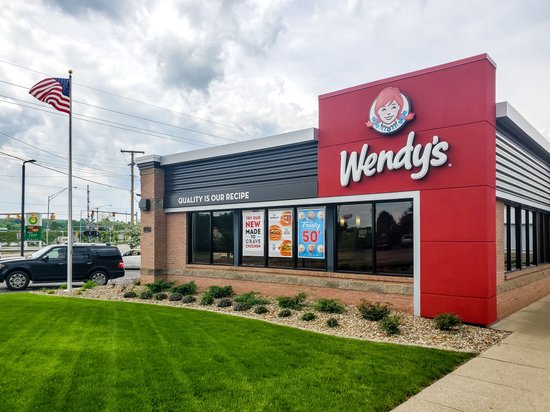
From its inception, Wendy’s has been positioned as a brand that values family and wholesome dining experiences. The chain has cultivated a reputation for providing more than just food—offering a sense of warmth and nostalgia that resonates with customers across generations. In part, this distinct identity and customer loyalty can be attributed to Wendy’s branding, particularly its memorable logo featuring the smiling visage of “Wendy,” which has played a crucial role in establishing and maintaining the brand’s image.
2.The Origins of Wendy’s Logo
Founding of Wendy’s
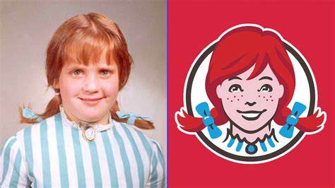
Dave Thomas’s vision for Wendy’s was not just about creating another fast-food chain but about crafting a space where quality and care were evident in every aspect of the dining experience. This ethos began with the brand’s foundation and extended to its visual identity. The logo, an integral part of this identity, was inspired by none other than Thomas’s own daughter, Melinda Lou “Wendy” Thomas.
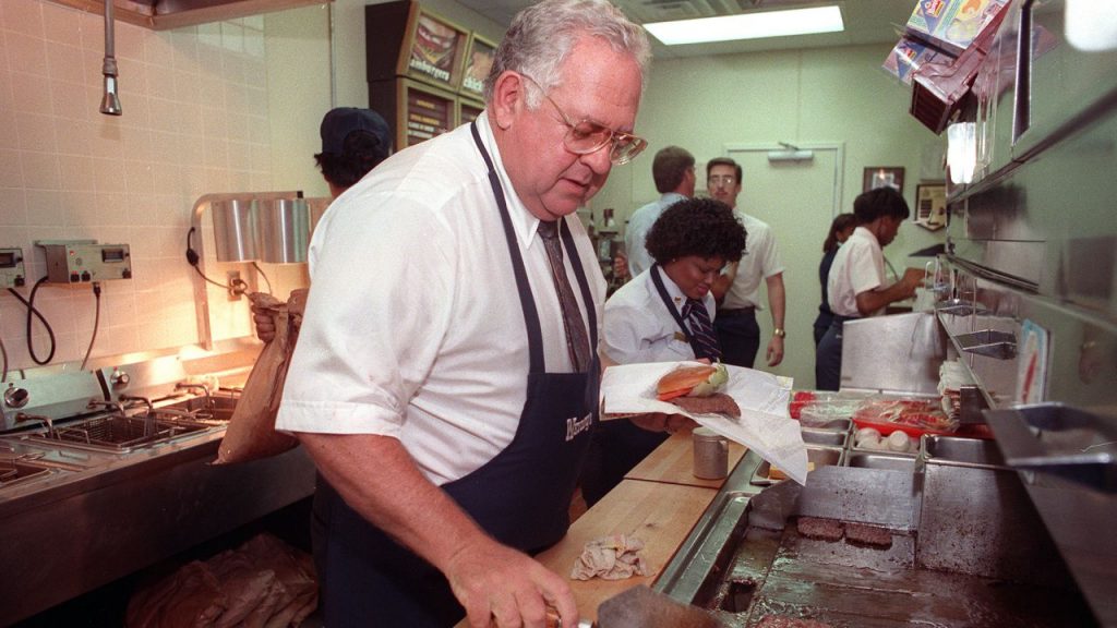
Dave Thomas chose the name “Wendy’s” for its familial warmth and chose to feature his daughter’s likeness to personify the brand’s core values of honesty, genuineness, and friendliness. This personal connection is woven into the company culture and is reflected in its customer service philosophy and marketing messages. The decision to incorporate family into its branding provided an authentic touch that resonated with customers and set the stage for the logo’s central role in expressing Wendy’s brand values.
Initial Logo Design
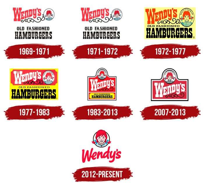
The original Wendy’s logo centered around the image of a young girl with red braids, known for her bright and inviting smile. This image was representative of Wendy Thomas, symbolizing not only youth and vibrancy but also trust and familiarity. The design featured a blue and white striped dress, accented by red—a color often associated with excitement, energy, and passion, making it an excellent choice for attracting attention.
1969 – 1971:
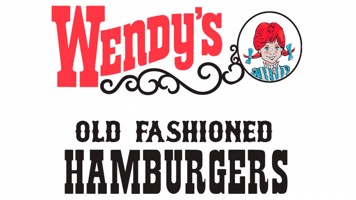
Accompanying Wendy’s image was the iconic slogan “Quality is our Recipe,” succinctly conveying the brand’s commitment to excellence and setting consumer expectations from the onset. This combination of text and imagery worked harmoniously to project Wendy’s as a brand that customers could rely on for quality, friendliness, and a home-like atmosphere. The typography and color choices further reinforced Wendy’s brand identity, balancing professional appearance with approachability—key elements that have been maintained through subsequent redesigns.
3.Wendy’s Logo Evolution: Key Milestones
Major Logo Redesigns
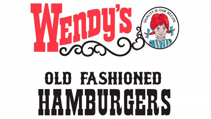
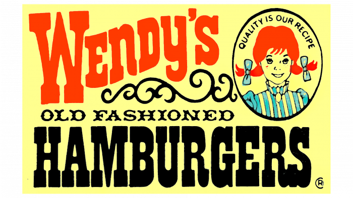
Since its debut, the Wendy’s logo has seen several redesigns to adapt to changing market dynamics and aesthetic trends, all while preserving core elements that reflect the brand’s identity. One of the first major redesigns occurred in the 1970s, when the logo underwent subtle refinements to the typography and layout, while keeping Wendy’s image intact. This era’s logo maintained the nostalgic charm of the original design but updated the visual elements to keep pace with the franchise’s rapid expansion.
1971 – 1972
1972 – 1977
1977 – 1983
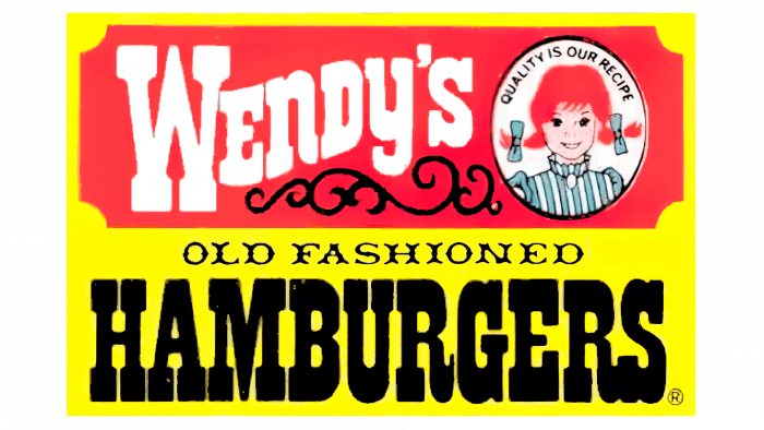
The next significant change happened in 1983, when Wendy’s refreshed its logo to appeal to a broader, more modern audience. This redesign was marked by sleeker typography, and a more stylized rendering of Wendy’s image, aiming to enhance the logo’s scalability and application across various mediums as the brand reached into new markets.
1983 – 2013
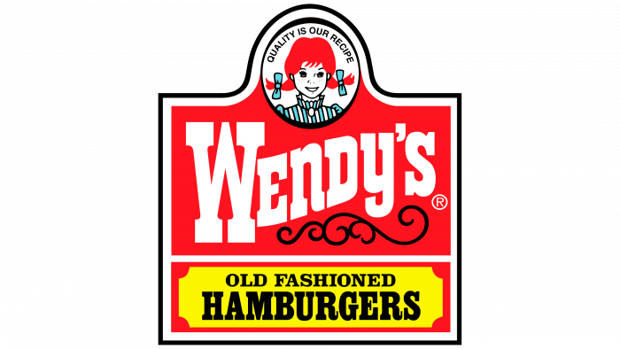
In 2007, the logo was again updated, this time adopting a more nuanced artistic style for the Wendy character, providing a contemporary twist to the traditional image that audiences had come to know and love. The 2007 logo refined the design elements, enhancing its visual appeal while keeping the iconic image of Wendy as the focal point.
2007 – 2013
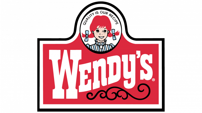
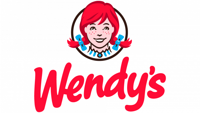
The most recent redesign in 2013 represented a departure from the previous vintage-style typeface to a more streamlined and modern representation. This iteration saw Wendy’s face become more vibrant and expressive, symbolizing the brand’s evolution and alignment with modern consumer expectations. It marked a holistic attempt to craft a logo that embodied both Wendy’s rich heritage and forward-thinking ethos.
2012 – today
Reasons for Logo Changes
The evolution of Wendy’s logo over the decades is deeply interwoven with the brand’s strategic goals and responses to shifting consumer trends. Each redesign was implemented to achieve specific objectives: maintaining relevance in an ever-changing market, refreshing the brand’s visual identity to align with contemporary design aesthetics, and deepening consumer connection by reflecting evolving customer values and tastes.
In the earlier years, updates were driven by the necessity to standardize the visual elements for consistency across a burgeoning number of locations. As Wendy’s grew, so did the need for a logo that retained its clarity and legibility, whether printed on in-store signage or on promotional materials. By modernizing the logo’s elements, Wendy’s ensured that each new iteration could perform effectively in diverse applications and media formats.
Later redesigns were influenced more by consumer-driven changes and internal branding strategies. As customers’ expectations evolved alongside technological advancements, Wendy’s responded by evolving its branding to ensure it met new market standards while preserving brand loyalty. Each logo redesign has walked a fine line: acknowledging the brand’s successful past while striving to meet the demands of its future, all rooted in the overarching commitment to the brand’s founding principles of quality and warmth.
4.Elements of Wendy’s Logo Design
Design Features
The design features of Wendy’s logo have been carefully curated and consistently refined to embody the brand’s core values and ensure that the logo remains immediately recognizable. Central to the logo is the character Wendy herself, whose friendly demeanor and distinctive appearance serve as an enduring symbol of the brand’s commitment to family-friendly dining and high-quality standards.

A dominant feature of Wendy’s logo is its color scheme which uses red, blue, and white. Red is used prominently around the illustrative elements of the logo to convey excitement and energy—a color that is highly effective in attracting consumer attention. Blue and white are supportive colors conveying trust and simplicity, adding a layer of depth to the logo’s emotional appeal.
The typography throughout the iterations of Wendy’s logo has also played a crucial role. Each font choice has been selected to maintain clarity and ensure that the word “Wendy’s” is both easily readable and stylistically inviting. The modern typefaces used in more recent updates complement the overall look while promoting a clean aesthetic that appeals to contemporary design sensibilities.
Incorporated imagery such as the curls in Wendy’s hair and the stripes on her dress are not merely decorative; they serve to enhance recognition and solidify the association between Wendy’s visual identity and its familial, inviting atmosphere. Through these consistent design features, Wendy’s logo stands as a marker of reliability, high standards, and superior taste.
Symbolic Meanings
Each element within Wendy’s logo serves both a promotional and symbolic purpose. Wendy’s smiling face, propelled by her carrot-like braids, is perhaps the most potent of these symbols. It not only reflects the personal family connection behind the brand but also embodies the qualities of trustworthiness, friendliness, and genuine hospitality.
The color red in the logo is deliberately used to create strong impressions. Red is associated with notions of passion and vitality, which can inspire quick purchase decisions—an ideal quality for fast-food marketing. Meanwhile, the calming influence of the blue and crispness of the white elements balance this exuberance, imbuing the logo with elements of professionalism and a sense of stability.
Moreover, certain interpretations of the logo suggest that the subtle inclusion of the word “MOM” in Wendy’s collar underscores a tribute to family values and homemade quality. Whether intentional or not, this nuance has sparked interest and debate among branding experts and consumers alike, adding layers to Wendy’s brand story.
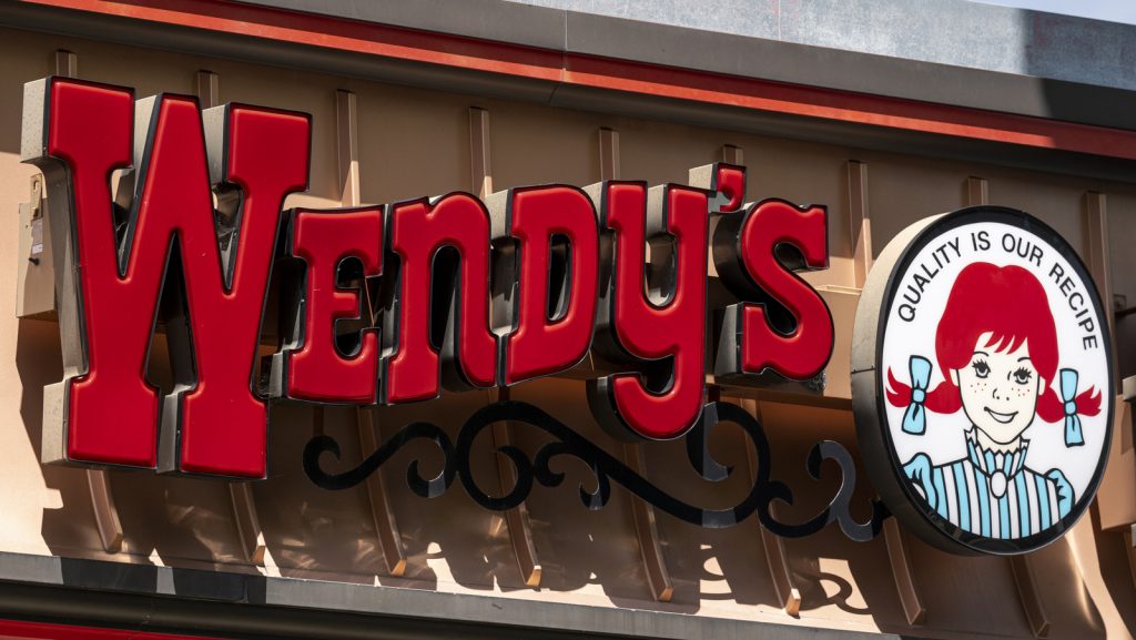
Through these elements, the logo accomplishes its dual objective of being a distinctly memorable brand icon and a symbolic representation of the values that Wendy’s seeks to project: warmth, familial bonds, quality service, and consistent delivery on its promises to customers.
5.Challenges and Achievements
Brand Identity Challenges
Throughout its decades-long history, Wendy’s has encountered several challenges relating to its brand identity and logo redesigns. One major challenge is balancing the desire to remain current with design trends while maintaining the brand’s unique heritage and recognition. The redesigns frequently ran the risk of alienating long-standing customers attached to the original look, sparking potential confusion or backlash from consumers resistant to change.
Additionally, as the brand expanded internationally, it faced the challenge of ensuring that its logo and core branding principles translated effectively across different cultures and consumer preferences. Variability in regional aesthetics and expectations required the brand to negotiate its identity in a way that resonated on a global scale, while still holding onto the characteristics that embody Wendy’s as a uniquely American institution.
Consumer reactions to the various redesigns have been mixed at times. While some appreciated the updates and viewed them as signs of innovation, others expressed discontent, longing for the nostalgia associated with earlier logo designs. The brand had to navigate these waters carefully, ensuring consumer feedback was taken into consideration while keeping its strategic branding objectives at the forefront. This delicate balancing act is one of Wendy’s significant achievements, as evidenced by the brand’s enduring appeal across generations.
Achievements and Recognition
Wendy’s has achieved considerable success and recognition, in part due to its iconic logo and the strong brand identity it imparts. This success is highlighted by the brand’s consistent ranking among the top fast-food chains globally and its firm standing as a beloved consumer brand in numerous markets. Wendy’s creative approaches to marketing, often emphasizing its logo’s elements and the persona of “Wendy,” have earned it industry accolades and a reputation for excellent branding practices.
The brand has been awarded accolades for its advertising campaigns and for its effective use of design in communicating core brand messages. Wendy’s has frequently been praised for its innovation in digital marketing and branding, utilizing its logo and brand’s characteristics to engage with consumers in novel ways across social media platforms. These achievements underscore the importance of a cohesive brand identity in fostering consumer connection and loyalty.
Beyond industry awards, the real testament to Wendy’s successful branding lies in its lasting impact on consumers. Its ability to maintain a positive, trusted image in a fiercely competitive marketplace where trends and consumer tastes change rapidly is reflective of the logo’s inherent strength in conveying the brand’s principles and staying power in the hearts of its customers.
6.Designing a Logo Using AILogoCreator
Introduction to AILogoCreator
AILogoCreator represents an innovative tool that leverages advances in artificial intelligence to streamline and enhance the logo design process. Catering to businesses seeking a unique and cohesive brand identity, this tool offers an intuitive platform through which logos can be developed efficiently without compromising on creativity or quality. AILogoCreator assists in crafting logos that are not only visually captivating but also aligned with a brand’s strategic goals and target audience preferences.
The tool integrates sophisticated design algorithms with user-friendly interfaces, making it accessible to those with varying levels of design expertise. Through a combination of AI-driven insights and customizable templates, businesses can explore numerous design possibilities, refining their logos to fit their specific visual and brand requirements. This leads to logos that resonate deeply with the intended audience, ensuring that message delivery is both consistent and effective.

Designing a Logo Inspired by Wendy’s
Leveraging AILogoCreator to design a logo inspired by Wendy’s iconic branding involves several key steps, aiming to encapsulate the warmth and quality conveyed through Wendy’s own visual identity:
- Step 1: Enter logo name and slogan. Begin by defining the text elements that will form part of the logo. Much like Wendy’s early focus on the phrase “Quality is our Recipe,” identifying a clear, impactful slogan that echoes your brand values is paramount.
- Step 2: Select industry-specific styles and colors. Choose from a wide array of templates and color palettes that align with industry standards and consumer expectations. Drawing inspiration from Wendy’s effective use of colors like red and blue, select hues that invoke the desired emotional response and attract attention.
- Step 3: Customize fonts and icons to create a welcoming design. The typefaces and symbols used should be chosen to reflect brand personality, much like Wendy’s playful, friendly font choices contribute to its inviting image.
- Step 4: Preview, refine, and finalize the logo. Evaluate the drafted logo for clarity, emotional impact, and scalability. Make adjustments as necessary to ensure that the design conveys the intended brand narrative and maintains its charm and readability across all potential use cases.
- Step 5: Download in various formats suited for branding use. AILogoCreator allows for multiple file formats, ensuring the logo is versatile enough for various digital and print media applications, similar to how Wendy’s logo adaptation has enabled consistent branding across multiple formats and mediums.
7.The Legacy of Wendy’s Logo
Impact on Brand Identity and Consumer Perception
Wendy’s logo has become a quintessential part of the brand’s identity, reinforcing its values and mission to deliver quality dining experiences in a welcoming, friendly setting. This logo acts as a visual touchstone for consumers, symbolizing reliability and the nostalgia of dining experiences associated with Wendy’s brand. Over time, the logo has played a pivotal role in shaping consumer perception, fostering a legacy of trust and loyalty that continues to benefit the brand.
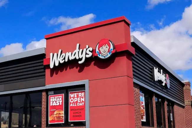
The logo’s consistent visibility across all marketing channels serves as a constant reminder of Wendy’s promise of quality, setting the brand apart in the crowded fast-food landscape. By maintaining elements of the original design while embracing strategic modern updates, the logo helps bridge Wendy’s rich history with its forward-looking brand strategy. Such consistency in branding helps solidify Wendy’s image in consumers’ minds as not just a fast-food outlet, but as a cherished cultural icon.
By continually reinforcing its core values through its logo, Wendy’s has been able to forge deep emotional connections with its customers, enhancing brand affinity and loyalty. The impact is demonstrated not only in consumer surveys and brand rankings but also in the warm reception that Wendy’s marketing campaigns, and their characteristic logo, routinely receive.
Future Outlook
Looking to the future, Wendy’s will likely continue to navigate changes in consumer preferences and trends, using its logo as a key tool in maintaining and evolving its brand narrative. While the need for potential redesigns may arise, Wendy’s is expected to retain those elements that have historically communicated its brand ethos of quality and friendliness effectively.
Future iterations of the logo may explore pushing creative boundaries with the integration of digital and technological enhancements, allowing for more interaction and engagement in digital spaces. As brands increasingly focus on digital experiences, the adaptability of Wendy’s logo will be pivotal in meeting new technological demands while continuing to resonate with its audience.
The logo will remain central to Wendy’s marketing strategies, enabling it to leverage its powerful symbolism in forthcoming campaigns and brand expansions. Whether through subtle refinements or major redesigns, the logo’s ability to evolve while staying true to its core components will ensure that Wendy’s continues to thrive as a dynamic and forward-thinking brand.
8.Q&A
What does the Wendy’s logo represent?
Answer: The Wendy’s logo represents more than just the company’s name; it embodies a commitment to quality and welcoming service which have been hallmarks of the brand since its inception. The friendly visage of Wendy Thomas is emblematic of familial warmth and trust, further illustrated by the vibrant color palettes that invoke a sense of excitement. This blend of imagery and color helps ensure the brand is not only memorable but also resonates with sentiments of reliability and comfort.
Why is Wendy’s mascot a girl?
Answer: The choice of a girl, specifically Wendy Thomas, for the mascot, was both a personal tribute by founder Dave Thomas and a strategic branding decision. By featuring his daughter, the brand inherently incorporates a story of family, adding depth to the brand’s narrative and fostering an emotional bond with consumers. This choice positions Wendy’s as a family-oriented establishment, conveying trustworthiness and nostalgia that appeals widely to a broad customer base.
What is the hidden message in Wendy’s logo?
Answer: An intriguing feature that has captured public imagination is the apparent word “MOM” formed by the ruffles in Wendy’s collar. Although it may not have been intentional, this perceived addition underscores themes of home-cooked meals and caring parental figures. Such interpretations enrich the brand narrative, easily lending themselves to marketing messages that revolve around family values and quality reminiscent of homemade meals, thereby enhancing consumer sentimental attachment to the brand.
Why did Wendy’s change their logo?
Answer: Wendy’s has updated its logo periodically to maintain relevance in a fast-changing market, modernizing its visual representation to better align with contemporary design trends while respecting its traditional roots. Each redesign reflects changes in consumer tastes, technological advances in marketing, and internal objectives to expand brand reach. By progressively refining its logo, Wendy’s manages to keep its brand fresh and appealing, catering to both new and existing audiences who hold comfort and quality dear.
Who is the girl in Wendy’s logo?
Answer: The girl depicted in Wendy’s logo is Melinda Lou “Wendy” Thomas, the daughter of the brand’s founder, Dave Thomas. Her inclusion not only offers a genuine and personal story foundational to the brand but also acts as a personification of the friendly, welcoming attributes the company aims to convey. Her smiling face has become synonymous with the brand’s image of quality service and approachable charm, making it one of the most recognized symbols in the fast-food industry.
How does Wendy’s logo contribute to its brand identity?
Answer: Wendy’s logo is a cornerstone of its brand identity, succinctly encapsulating the essence of what the brand stands for—quality, warmth, and family values. The visual representation of Wendy projects an inviting image, fostering a sense of trust and familiarity among consumers. By consistently using this logo across all touchpoints, from its restaurant facades to marketing materials, Wendy’s ensures that the promise of high standards is continually at the forefront of customer experiences.
What is the historical significance of Wendy’s logo?
Answer: The historical significance of Wendy’s logo lies in its enduring nature and ability to reflect the company’s foundational ethos through various cultural and economic shifts since 1969. As one of the most recognizable faces in fast-food history, it stands as a symbol of innovative branding and demonstrates the power of personal storytelling in creating a robust consumer connection. Its resilience and adaptability serve as a testament to the foresight of its original design principles.
How can businesses design effective logos similar to Wendy’s using AILogoCreator?
Answer: Businesses can harness AILogoCreator to design effective logos by focusing on simplicity, clarity, and emotional resonance—much like Wendy’s successful branding approach. AILogoCreator offers a range of templates and customization options that allow businesses to craft logos that incorporate key brand elements effectively. By leveraging AI-powered design insights, businesses can ensure that their logos convey core values, stand out in the marketplace, and establish a strong, memorable brand identity that resonates with their target audience.


CommentsTake the first comment