I. Introduction: The Journey of the Walmart Logo
Walmart, a retail behemoth founded in 1962 by Sam Walton, has become synonymous with affordable shopping and extensive variety. However, beyond its competitive pricing and vast selection, a critical component of Walmart’s enduring marketplace presence is its branding, particularly its logo. The Walmart logo is more than a visual identifier; it embodies the company’s ethos, values, and evolution. It has evolved significantly over the decades, with changes that reflect strategic shifts in Walmart’s market positioning and corporate philosophy.

The journey of the Walmart logo is a fascinating tale of strategic branding that involves color theory, design adaptability, and consumer psychology. From its original, utilitarian design to its current modern look, the Walmart logo has undergone several transformations in response to changing consumer expectations, company growth, and market dynamics. Each iteration not only marks a pivotal step in Walmart’s history but also offers a vivid narrative of how the company perceives its role in its customers’ lives. Understanding this evolution provides insights into the broader context of brand management and reveals the nuanced decisions behind each logo change.
The Walmart logo’s transformation can be segmented into different phases: the early days marked by a simple, straightforward approach; the transitional years that saw the brand grappling with modernization; and the contemporary era characterized by a blend of tradition and innovation. This progression illustrates Walmart’s journey towards becoming a global retail leader while highlighting the implicit messages conveyed through its visual identity. As we explore this evolution, it becomes clear that the Walmart logo is a microcosm of the company’s broader business strategy and its response to external and internal shifts.
II. The Origins of Walmart’s Blue Logo
During its early years, Walmart’s logo featured a simple blue design that mirrored the company’s operational ethos: straightforward, reliable, and customer-focused. The choice of blue as the primary color was not arbitrary. Blue, a color deeply embedded in psychological and cultural narratives, is often associated with trust, dependability, and stability—qualities that align perfectly with Walmart’s brand promise.
In 1962, the original Walmart logo was introduced with a plain, sans-serif font in deep blue. This basic design underscored Walmart’s commitment to simplicity and affordability, core tenets articulated by Sam Walton himself. The early branding efforts focused less on flashy marketing and more on transmitting the essence of customer satisfaction and low prices.

For Walmart, blue also symbolically represented durability and tradition. It was a reassurance to the American consumer that despite being a new entrant, Walmart was a reliable choice in the retail space. Moreover, in the realm of corporate branding, blue is known to inspire confidence and loyalty, which is essential for a growing company seeking to establish a foothold in the competitive retail industry.
The blue logo was a significant part of Walmart’s strategy to convey a no-frills business model. It helped communicate to consumers that Walmart stores were places where straightforward transactions took precedent over pretentious branding. These early branding decisions set the tone for how Walmart was perceived and were instrumental in laying the foundation for Walmart’s rapid expansion throughout the United States. This era of simplicity also set a precedent for how the company approached future branding changes, always placing consumer perceptions at the forefront of its visual identity.
III. Walmart Logo Evolution: Key Transformations
As Walmart expanded, so too did the demands on its brand image. With each passing decade, strategic adjustments were made to its logo to reflect the company’s growth, evolving goals, and shifting consumer preferences.
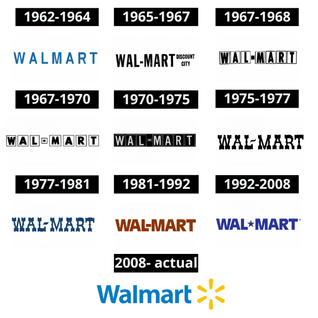
Initial Logo Design (1962)
The initial design of the logo was emblematic of the 1960s, a time when clarity and legibility were paramount in logo design. The deep blue color remained a constant, introducing Walmart as a straightforward and trustworthy choice for consumers looking for discounted products. It was uncomplicated, just like the shopping experience Walmart aspired to offer at the time.
1962-1964
First Major Change (1968)
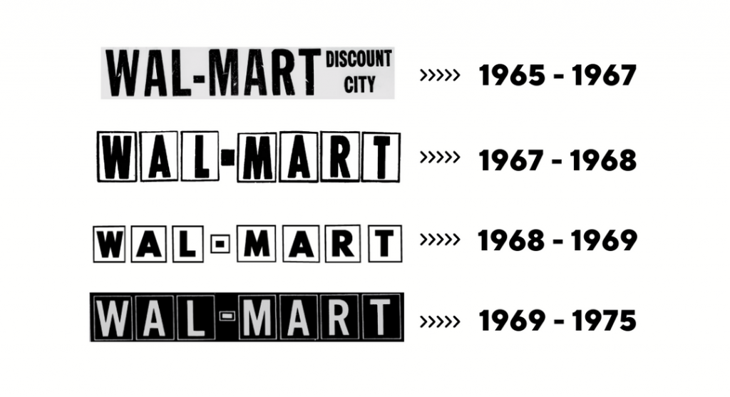
Come 1968, and Walmart faced its first pivotal turning point. The logo underwent noticeable changes, reflecting the company’s burgeoning retail presence. The redesign retained the blue hue but switched to a bolder font that amplified readability and presence. This evolved logo symbolized more than just aesthetic adjustments — it was indicative of Walmart’s expanding brand and intent to create a stronger retail footprint.
1970s to 1980s Modifications
Throughout the 1970s and 1980s, Walmart’s logo underwent subtle yet significant modifications as the company embraced more graphic elements within its visual identity. These changes were reflective of the logo design trends during that period, with the introduction of visual flourishes like stars. Stars were symbolic—representing the aspiration of a growing company. Commensurate with Walmart’s expansion during these decades were enhancements to the logo’s design that maintained its friendly appeal while also making it visually distinct in a crowded marketplace.
1992 Revamp
The 1992 redesign marked a departure from the older, less complex versions, introducing a more contemporary look which better reflected the company’s enormous growth. Notably, Walmart added a star between the “Wal” and “Mart,” providing a unique character to the brand while also differentiating it from competitors. This design change not only enhanced brand recall but also aligned with the visual language of the era, navigating a careful balance between modernity and tradition.

2008 Major Redesign
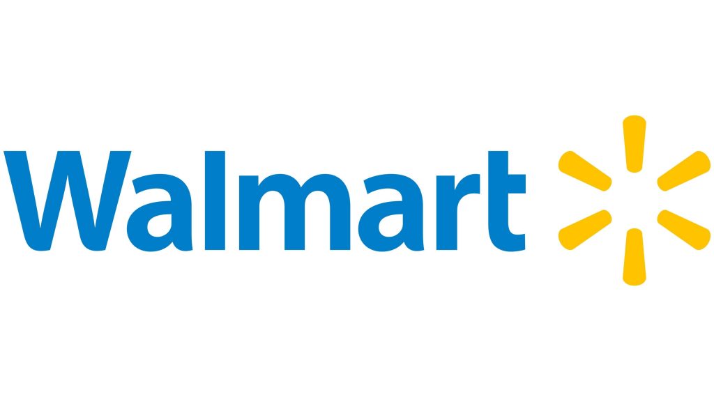
The most profound change came in 2008, coinciding with Walmart’s shift towards modern retail environments and a broader, more global consumer base. This redesign introduced the world to the yellow “spark” symbol, redefining Walmart’s brand identity. The blue shade was softened, and yellow was added to symbolize innovation, warmth, and a renewed approach to customer relations. The logo became less corporate and more inviting, better suited for a company that had grown from a small five-and-dime store into a global retail powerhouse. This change encapsulated a strategic shift that aimed to reposition Walmart as a friendly, approachable retailer in an increasingly competitive retail landscape.
IV. The Transition to Sunshine: Introducing Yellow
The 2008 redesign marked an ambitious departure from Walmart’s purely blue heritage, bringing a more colorful narrative into the brand’s visual identity. The addition of yellow to the Walmart logo was a pivotal decision, driven by both a strategic market evaluation and a desire to align with emerging brand values.
Yellow, in color theory, is associated with positivity, warmth, and energy. It was strategically chosen to convey optimism and innovation, symbolizing Walmart’s commitment to enhancing the shopping experience and customer satisfaction. The introduction of the yellow “spark” carried with it the promise of new beginnings, encapsulating Walmart’s dedication to evolving with changing consumer needs and the dynamic retail market.
The redesign process was comprehensive, involving detailed market research, consumer feedback, and consultations with branding experts. Walmart aimed to update its image to accurately reflect its diverse and modernizing consumer base. Incorporating yellow was a deliberate attempt to breathe new life into the brand and communicate a fresh, modern, and friendly image accessible to all demographics.
This shift wasn’t just about aesthetics; it represented Walmart’s wider strategic direction. As the company embraced digital commerce and expanded its international presence, the new logo mirrored Walmart’s broader vision of being a customer-oriented retail leader. Yellow, as a color, helped humanize the brand, making it more relatable and accessible during an era where consumers were beginning to prioritize the shopping ‘experience’ over just prices.

Additionally, the spark symbol could be interpreted in various ways, acting as a versatile icon that customers worldwide could relate to, regardless of language or culture. Its simplicity made it easy to reproduce across different mediums, ensuring consistent brand recognition across multiple platforms and regions.
The inclusion of yellow presented an image of a modern, dynamic, and proactive company poised to tackle future challenges. It effectively balanced the brand’s roots in affordability and tradition with a forward-looking vision that emphasized innovation and customer-centric solutions. Through this significant visual update, Walmart communicated a renewed commitment to enhancing customer experiences in a globalized world.
V. The Current Walmart Logo: Colors and Composition
The current Walmart logo is a masterclass in modern branding, skillfully combining elements of trust and innovation in a symbol recognizably associated with value and customer-centric service. At the heart of this visual identity are the colors blue and yellow, deliberately chosen to project specific values that Walmart prides itself on.
The present design features a sleek, lowercase typeface that imparts a sense of approachability and simplicity, aligned with Walmart’s commitment to being customer-friendly. The rounded, uncapitalized font suggests accessibility and ease, qualities integral to the Walmart experience. This is complemented by the yellow “spark,” a six-ray design that signifies innovation, potential, and growth—the conceptual pillars supporting Walmart’s market leadership strategy.
Blue remains a cornerstone of the logo’s color scheme, embodying trust, reliability, and professionalism. Its slightly softer shade in this iteration leans into warmth, eschewing the cold, corporate blues of the past. Blue communicates stability and assurance to customers, reinforcing Walmart’s longstanding identity as a dependable choice for affordable, quality goods.
Yellow, meanwhile, represents the transformative energy Walmart has embraced as it adapts to retail’s digital age challenges. It conveys an aura of friendliness and optimism and serves as a visual cue for the innovative, customer-focused services Walmart continues to develop. The color combination, while distinct, is harmonious, reflecting a company poised on the threshold of progress yet rooted in established values.

Together, these colors and design elements ensure the logo is memorable, distinct, and consistent across all marketing materials. Walmart uses this logo as a foundational element across its digital and physical storefronts, packaging, advertisements, and even philanthropic efforts, ensuring comprehensive brand cohesion.
Moreover, the current logo’s simplicity ensures scalability across various formats and platforms, from billboards to smartphone screens—a necessary consideration in today’s multi-channel shopping environment. The design functions well in both digital and print mediums, guaranteeing uniform brand experience irrespective of where or how consumers interact with Walmart.
In essence, the current Walmart logo captures the essence of a modern retail giant that is aware of the foundations that enabled its growth yet remains agile and forward-thinking. This iteration signifies Walmart’s commitment to innovation, consumer accessibility, and its ongoing mission to provide better, affordable services in a changing world. The logo’s colors and composition eloquently encapsulate Walmart’s heritage while shining a light on its future pathways.
VI. Designing a Walmart-Themed Logo with AI Logo Creator
In today’s world, creating a compelling logo is vital to ensuring brand recognition and consistency. Companies, even as expansive as Walmart, must continuously adapt to market trends, cultural shifts, and technological advancements. For businesses aspiring to emulate Walmart’s level of branding success, or for those looking to imbue similar core values into their logos—trust, innovation, and friendliness—the use of advanced tools like AI Logo Creator can be of significant value.

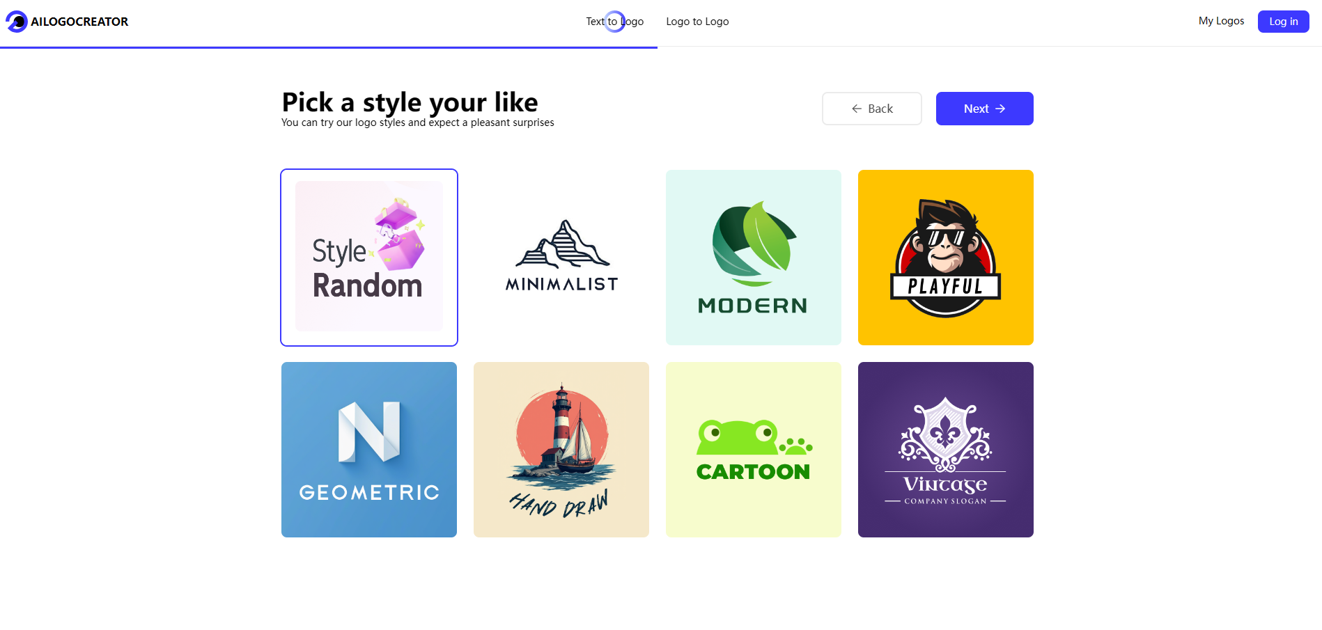
Below is a step-by-step guide to leveraging AILogoCreator to design a Walmart-themed logo while incorporating the same complementary tones of blue and yellow:
- Text to Logo: Begin by entering your company’s name and any associated tagline or slogan into the AI Logo Creator. This initial step sets the stage for how the company’s identity will be visualized.
- Style and Color Selection: Select a style that mirrors Walmart’s principles, focusing on simplicity and clarity. For a Walmart-like essence, emphasize the existing palette of blue and yellow. Blue will enhance trustworthiness, and yellow can evoke warmth and positivity.
- Customization: Tailor the design further by selecting the font style, graphical icons, and layout. Consider incorporating an element analogous to Walmart’s “spark,” which can convey innovation and future readiness. Adjust these components to ensure your brand’s character is both distinctive and familiar.
- Preview and Fine-Tune: After creating an initial design, use the preview option to see how it appears across different settings, such as on business cards, digital platforms, or print media. Fine-tune the elements as necessary to ensure the logo maintains impact and visibility at varying scales.
- Download: Once satisfied with the design, download it in various formats to facilitate versatile usage. Ensure the design is accessible in high-resolution formats suitable for both digital banners and physical merchandising.
Harnessing AI tools like this can allow for an agile approach to brand management, offering creative flexibility while ensuring consistency in brand values. For companies aiming to reflect transparency, reliability, and innovation—much like Walmart—this methodology can assist in creating an enduring visual identity.
It is crucial, however, to periodically reassess and revitalize the logo in response to evolving market trends, consumer expectations, and competitive landscapes. By maintaining a dynamic approach to logo design and enhancement, businesses can potentially strengthen their market position and consumer loyalty, echoing Walmart’s successful branding journey.
VII. The Impact of Color on Consumer Behavior
Color psychology plays a pivotal role in logo design, capable of influencing customer perceptions and driving brand recognition significantly. For Walmart, the strategic use of color has been integral to crafting a recognizable and relatable brand identity, resonating with consumers on both an emotional and psychological level.
Blue is a color that evokes a sense of calmness and reliability. It is associated with the sky and sea, instilling confidence and stability—attributes crucial to Walmart’s value proposition. As a dominant color in the original Walmart logo, blue conveyed a message of trust and dependability. Consumers were assured that Walmart was a consistent presence, a cornerstone of everyday shopping life providing predictable value without unnecessary complexities.
Yellow, on the other hand, is the color of sunshine—a universal symbol of happiness, hope, and vitality. Integrating yellow into its logo enabled Walmart to project an image of warmth and optimism. The yellow “spark,” introduced in the 2008 logo redesign, embodied the friendly energy and innovation that Walmart sought to integrate into its retail experience.
These colors, working in tandem, produce a harmonious and appealing visual identity that transcends cultural boundaries and market segments. Research in color psychology suggests that such combinations can evoke trust, encourage positive customer attitudes, and enhance brand loyalty—vital factors in retail success.
The psychological impact of these colors is further illustrated by how they contrast and complement other brands within the retail sector. For example, the energetic red of Target suggests excitement and urgency, while Amazon’s black and orange conveys sophistication alongside playfulness. In contrast, Walmart’s blue and yellow seeks to communicate assurance and warmth, appealing to consumers’ aspirations for consistency and positivity in a shopping experience.
Moreover, color effectiveness can be quantitatively measured, as demonstrated in various case studies. Commercial research has highlighted increased consumer engagement and preference attributable directly to the strategic use of color in branding. Walmart’s case underscores the importance of color choices in establishing a brand’s emotional connection with its audience, ultimately affecting purchasing behaviors and brand perception.
Overall, the use of blue and yellow in the Walmart logo is not merely an aesthetic choice but a foundational element of its marketing and branding strategy. It exemplifies how colors are instrumental in forging an enduring bond with consumers, encouraging repeated engagement, and conveying the underlying values of the brand. This approach offers salient lessons for businesses seeking to leverage color psychology in crafting compelling brand identities.
VIII. Challenges and Criticism in Logo Redesign
Rebranding, particularly logo redesign, is rarely a straightforward process. For a conglomerate like Walmart, each logo transition came with its share of challenges and criticisms, reflecting the complexities inherent in altering a brand’s visual identity while maintaining its established market presence.
During every logo transformation, Walmart faced significant public scrutiny, with reactions ranging from enthusiastic approval to outright skepticism. Logo changes can often polarize public opinion, with long-time customers showing reluctance toward changes that depart from traditional aesthetics. Each redesign was met with mixed sentiments, as some consumers expressed nostalgia for earlier versions while others embraced the refreshed look.
One major challenge during redesign phases is maintaining brand consistency across thousands of stores and global markets, ensuring the transition is seamless without diluting the brand identity. The logistical demand of updating signage, marketing materials, and digital assets requires comprehensive strategies and considerable investment, demanding meticulous planning and execution.
Moreover, internal challenges include aligning diverse departmental perspectives and managing internal stakeholder expectations. Redesign efforts necessitate collaboration across various facets of the business, from corporate communications to store operations, each carrying separate objectives and considerations.
Criticism often centered on the perception of losing authenticity or alienating loyal customers. However, Walmart approached these challenges by communicating the reasoning behind each change, focusing on how new designs supported Walmart’s mission of enhancing consumer experiences and meeting modern expectations.
To manage criticism, Walmart implemented transparent communication strategies, informing stakeholders of the motives and expected outcomes of the redesigns. This approach fostered an understanding of the company’s broader vision, alleviating apprehensions and facilitating acceptance of the new branding elements.
Furthermore, Walmart incorporated extensive market research and consumer feedback processes to ensure that the logo resonated with its intended audience. By integrating insights from these assessments, Walmart successfully navigated the complexities of redesign without sacrificing brand integrity.
Through these efforts, Walmart demonstrated an adaptive strategy, using each redesign to reinforce its brand sovereignty while keeping pace with contemporary design standards and consumer preferences. This iterative process highlights the importance of balancing innovation with brand heritage, ensuring every facet of the redesign aligns with overarching corporate goals.
Walmart’s experience illustrates that while logo redesigns can be fraught with potential challenges and criticism, they also present opportunities for brands to redefine their market stance and connection with consumers. By taking a thoughtful, comprehensive approach to updating visual identities, businesses can overcome obstacles and leverage redesigns as catalysts for renewed brand engagement and growth.
IX. A Symbol of Trust and Value: The Legacy of Walmart’s Colors
The use of blue and yellow in the Walmart logo extends beyond mere aesthetic appeal—it is a representation of Walmart’s legacy, symbolizing trust, innovation, and value that have defined the brand for decades. As a global retail leader, Walmart has utilized these colors to communicate its enduring commitment to customer satisfaction and corporate integrity.
Blue has remained crucial in expressing Walmart’s foundational attributes of trustworthiness and consistency. As Walmart expanded its footprint across international markets, this color reinforced an image of reliability that transcends cultural and geographic boundaries. Blue instantly evokes a sense of security and balance, qualities essential for maintaining customer trust in a retail environment increasingly defined by choice and dynamism.
The incorporation of yellow introduced a new dimension to Walmart’s brand narrative. The color heralded a period of transformation and customer-centric innovation, embodying warmth and affordability. Yellow conveys a sense of approachability and upliftment, encouraging consumers to associate the Walmart brand with positive shopping experiences and easy access to household needs.
Walmart’s adept use of these colors supports its marketing ethos that extends beyond commerce, portraying the company as a benefactor of communities through ease of access to affordable, quality goods. This has enabled Walmart to foster consumer loyalty and advocacy, distinguishing its stores as hubs of value and connection.
Additionally, the powerful visual identity enhanced by these colors plays a critical role in Walmart’s philanthropic and corporate social responsibility initiatives, bolstering the brand’s image as a company invested in societal wellbeing. Transparency and mutual value are communicated through the logo’s color palette, ensuring alignment with Walmart’s broader mission of corporate stewardship.
As Walmart looks to the future, its commitment to utilizing blue and yellow will likely endure as both a nod to its storied past and a beacon guiding future innovation. These colors encapsulate Walmart’s brand philosophy effectively, serving as a reminder of its oath to deliver consistent value while pioneering new solutions in the retail landscape.
The legacy of Walmart’s colors lies in their versatility and symbolic power, a testament to the company’s expertise in iconography and marketing strategy. They cement the brand’s position not only as a leader in retail but also as an institution dedicated to fostering positive experiences for all its stakeholders. As the industry continues to evolve, Walmart’s colors will remain integral, signaling continuity and trust while inspiring optimism and progress.
X. Questions and Answers
Understanding the nuances behind the Walmart logo’s evolution involves addressing common inquiries that often arise regarding its changes, themes, and symbolism. Here are some of the high-volume questions along with thoughtful responses:
Why did Walmart change its logo to include yellow?
- The addition of yellow to Walmart’s logo during the 2008 redesign was strategic, aiming to invigorate the brand with warmth and optimism. Yellow symbolizes innovation and friendliness, elements that Walmart incorporated to illustrate its dedication to a customer-focused shopping experience. This color shift aligned with Walmart’s broader mission to provide approachable and accessible service while adopting a modern, global retail perspective.
What does the star/spark in the Walmart logo signify?
- The yellow “spark” introduced in the 2008 logo carries significant symbolic weight. It represents ideas of inspiration, insight, and positive energy. More than just a graphic element, it signifies the company’s trajectory of growth, innovation, and commitment to meeting evolving consumer needs. It is a visual metaphor for Walmart’s brand promise to deliver affordable quality with an emphasis on enhancing the retail experience.
How frequently do companies like Walmart update their logos?
- On average, major companies undertake brand reevaluations, including logo updates, every 5-10 years. This timeline can vary depending on the market conditions, changes in the company’s strategic direction, or the need to remain contemporarily relevant. For Walmart, each logo update has reflected shifts in retail trends, consumer behavior, and corporate objectives, ensuring that their visual identity remains aligned with their overarching business ethos.
Is color psychology important in logo design?
- Yes, color psychology is vital in logo design as it affects how consumers perceive a brand. Specific colors can evoke various emotions and associations, thereby influencing customer attitudes and potentially their buying behavior. For Walmart, the strategic choice of blue and yellow taps into deeply ingrained cultural and psychological responses that foster trust, indicate value, and spark ideas of positivity and warmth.
Can AI tools effectively mimic established logo color schemes?
- AI tools are increasingly proficient at mimicking established logo color schemes, allowing brands to ensure consistency and cohesion across their visual identities. These tools offer sophisticated design capabilities that enable the precise replication of specific color palettes, ensuring brand integrity is maintained across various applications. By facilitating advances in branding technology, AI tools offer businesses enhanced agility in responding to design trends and market shifts.



CommentsTake the first comment