The Miami Dolphins, a pillar in the National Football League (NFL), stand out not only for their sporting prowess but also for their emblematic logo, which has become a symbol of identity and pride. Logos in sports serve as the visual embodiment of a team’s spirit, history, and ethos. They are essential in branding, serving as the primary visual concept that fans associate with the team. Much like a flag for a nation, a logo is a rallying point for pride and belonging among fans.
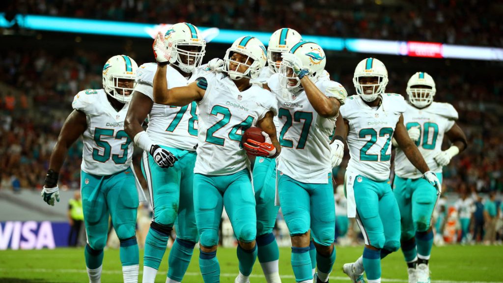
The Miami Dolphins logo is particularly intriguing due to its dynamic evolution over the years. Each iteration of the logo tells a story of adaptation and commitment to staying relevant while preserving the essence that defines the team’s identity. The journey of its logo is a reflection of broader changes in visual culture and the city’s own evolution. From its original design in the 1960s to the sleek, modern iteration we see today, the Miami Dolphins logo illustrates an ongoing dialogue between tradition and progress.

As a case study, the Dolphins logo offers valuable insights into how sports teams navigate the delicate balance of honoring heritage while appealing to a modern audience. This balance is crucial, as it underlines the role of design in influencing fan perception and engagement. The comprehensive examination of the Miami Dolphins logo’s history, symbolism, and impact provides a lens through which to explore the broader themes of logo evolution in sports branding.
The Birth of the Miami Dolphins Logo
Established in 1966, the Miami Dolphins were the result of the AFL’s expansion into the southeast region of the United States, a decision driven by the area’s rich sporting culture and rapidly growing population. The team’s inception was a momentous event not only for Miami but also for the NFL as it brought professional football to Florida, a state known for its passion for sports and vibrant culture.
The original logo featured a playful yet athletic leaping dolphin, adorned with a football helmet complete with an “M” insignia. This design was set against the backdrop of a stylized sunburst, which represented the vibrant sunshine of Miami—a city known for its sunny beaches and lively spirit. The dolphin, chosen as the mascot, symbolized agility, grace, and speed—qualities the team aspired to on the field.
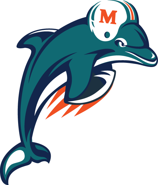
Color played a significant role right from the start. The palette of aqua and coral not only aligned aesthetically with the city’s beach and marine culture but also stood out amidst the more common color schemes used by other NFL teams. This strategic use of colors was a powerful branding decision, ensuring immediate and lasting visual recognition.
This initial design set the groundwork for the team’s identity and branding. It projected a message of vitality and dynamism, connected the team to its Floridian roots, and established an emotional connection with the community. This bond was crucial for a fledgling team looking to cultivate a dedicated fan base. The logo became a symbol of local pride and competitive prowess, encapsulating the spirit of a team ready to take on challenges with the enthusiasm of its namesake sea creature.
Symbolism in the Miami Dolphins Logo
The symbolism of the Miami Dolphins logo extends beyond its initial aesthetic appeal, serving as a rich tapestry of meaning that resonates with both the team and its fans. The dolphin, as the central mascot of the logo, was carefully selected for its associations with intelligence, agility, and social nature. These attributes are mirrored in the ideal qualities desired in a football team, where strategic thinking, quick maneuverability, and teamwork are essential for success.
Choosing such an intelligent and social creature as a mascot also had a psychological effect on the fan base, establishing a narrative that celebrated these traits. The dolphin’s inherent characteristics fostered a sense of identity and aspiration, which resonated with the community and fans, quickly embedding the logo into the cultural ethos of Miami’s sports narrative.
Aside from the mascot, the colors used in the Miami Dolphins logo are rich in symbolism. The primary color, aqua, not only represents the surrounding ocean and sky but also conveys a sense of vitality and freshness, reflecting the youthful and energetic spirit of the Dolphins upon their inception. Aqua is complemented by coral, which ties the logo to the coastal geography of Florida and evokes the warmth and friendliness associated with the state. These colors work in harmony to project an image that is both inviting and exhilarating, enhancing the overall identity of the team.
Cultural and regional elements are also intricately woven into the design. The sunburst backdrop acts as a visual homage to the “Sunshine State,” encapsulating the warmth, light, and ambiance of Miami. This integration of local elements into the logo’s design further strengthened the Dolphins’ bond with their hometown, creating a sense of place that extends the logo’s significance beyond sports and into community identity.

These carefully considered symbolic layers of the Miami Dolphins logo paved the way for a strong brand identity that not only helped establish but also sustain the team’s relevance and connection to its fan base over the decades. The symbolism within the logo serves as both a branding tool and a source of pride for Miami’s local community, fortifying the lasting impact of the Dolphins’ imagery throughout sports history.
Historical Changes and Modernization
The Miami Dolphins’ logo has undergone several significant redesigns since the team’s inception, each reflecting shifts in cultural trends, branding strategies, and technological advancements in design. The timeline of these changes not only charts the evolution of a sports logo but also mirrors broader trends in graphic design and marketing.
The first major redesign came in 1974, a subtle update that adjusted the dolphin’s position and the colors to make them more vibrant and suitable for merchandise printing techniques of the time. This change was more about enhancing visibility and adaptability rather than overhauling the core design elements. It maintained the fundamental components that fans had come to recognize and love, ensuring continuity in brand identity.
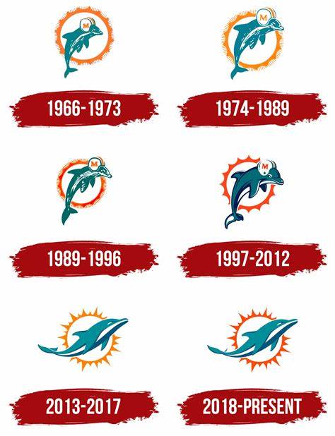
The next redesign in 1997 marked a more significant departure, reflecting a period in the late 20th century where sports teams across the country were modernizing their logos. This version featured a more refined dolphin, with streamlined lines and a sleeker silhouette, while the sunburst was adjusted to be more graphic and bold. This iteration aligned with the graphic design trends of the 1990s that favored cleaner and less cluttered visuals.
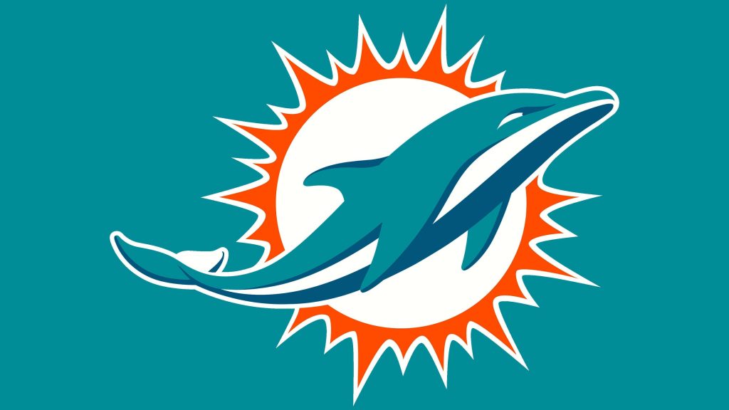
In 2013, under new ownership and a drive to create a brand adored by a new generation, the Dolphins updated their logo once again. This redesign was the most dramatic to date, removing the helmet from the dolphin and opting for a more naturalistic depiction of the creature. The sunburst was subdued to accentuate the theme of fluidity and modernity. Modern design tools allowed for subtle gradients and a polished aqua that reflected advances in digital media. The aim was to appeal to younger fans while retaining the emotional legacy of past designs.
Modernity Meets Tradition
The current Miami Dolphins logo adeptly balances modernity and tradition, showing how a natural evolution can honor historical sentiments while embracing contemporary design practices. This redesigned logo encapsulates the franchise’s commitment to the future while honoring its storied past. As in many design narratives, achieving this balance required a keen understanding of what each generation of fans valued about the logo. By blending modern minimalist trends with the cherished traditional motifs, the Dolphins successfully created a logo that spoke to existing fans while appealing to new followers.
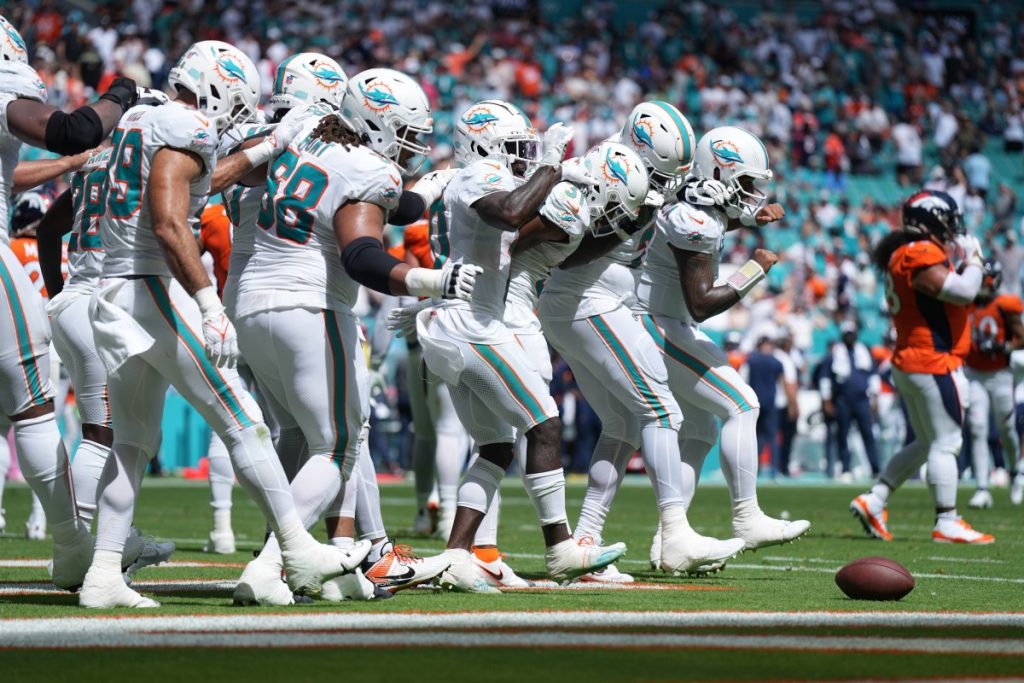
The journey from the original 1966 design to the present day encapsulates the Miami Dolphins’ narrative not just as a football team, but as a cultural institution that evolves with its community and the broader artistic movements that shape our senses of identity and affinity. This evolution of their logo stands as a testament to the dynamic nature of brand identity in sports, demonstrating the intricate dance between innovation and tradition.
The Impact of the Miami Dolphins Logo
The Miami Dolphins logo is more than just a brand identifier; it is a powerful visual symbol that has resonated deeply with the fandom and has had substantial commercial and cultural impacts beyond its original intent. One of the notable areas of impact is in merchandise and fan apparel. The logo has been a significant driver of sales, with its iconic colors and design easily recognizable on a myriad of products like jerseys, hats, and memorabilia. This wide reach has allowed the Dolphins to cement their brand internationally, expanding their fan base far beyond the Miami area.
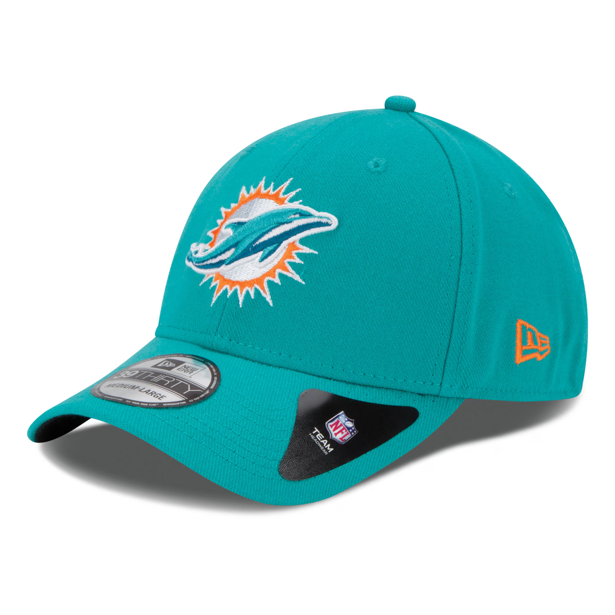
Furthermore, the logo’s presence in media and cultural references has amplified its influence. The Miami Dolphins’ logo has appeared in numerous films, television series, and other media, becoming a symbol of Miami’s vibrant culture and identity. This presence in popular culture goes a long way in maintaining the team’s visibility and relevance. It also enhances fan engagement, offering a sentimental connection for those who associate the logo with particular memories or moments in entertainment.
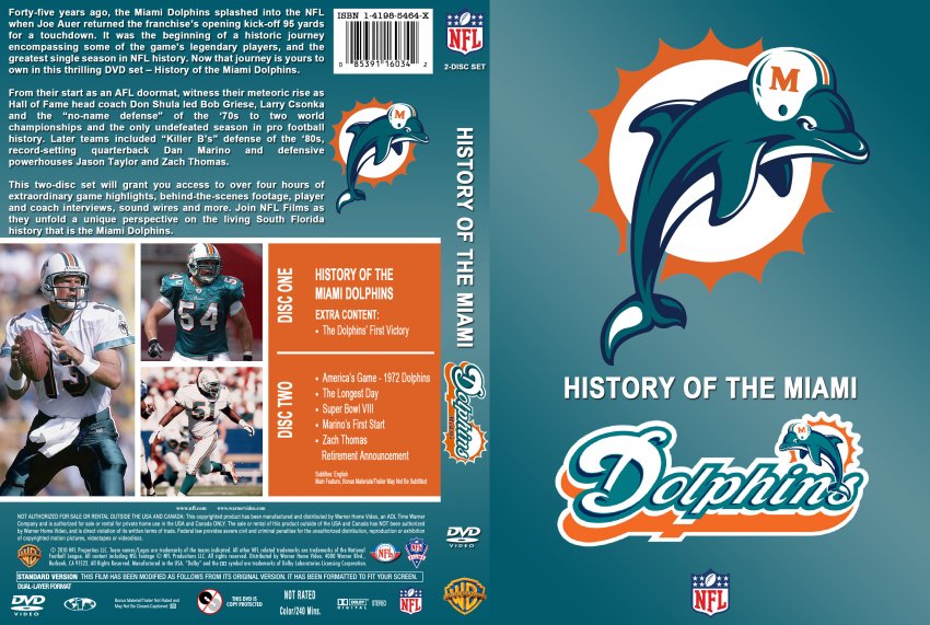
Moreover, the logo plays an inspirational role in sports marketing and brand engagement strategies. Within the sports industry, logos are essential for team identity, and the Dolphins’ logo offers a case study in building a timeless brand image that combines local flair with broad appeal. This is reflected in how other teams and sports marketers view the Dolphins as a model for balancing historical legacy with contemporary aesthetics.
In the sport of American football, where team identity is crucial, the Miami Dolphins logo provides its fans with a sense of belonging and continuity. It acts as both a rallying symbol in times of challenge and a mark of victory in moments of triumph. In broader cultural terms, the Miami Dolphins logo has become a part of Miami’s identity, influencing how residents view their city and its sporting heritage.
Overall, the impact of the Miami Dolphins logo is far-reaching, transcending its function as a mere branding element to become an enduring part of fan identity and local culture. Its design and legacy showcase the powerful role logos play in sports and community.
The Peloton Logo: A Case Study in Contrast
Exploring other iconic logos provides valuable comparative insights, such as the Peloton logo—widely recognized in the realm of fitness technology. Unlike the Miami Dolphins logo, which emphasizes traditional sports team themes and legacy narratives, the Peloton logo is a hyper-modern design reflecting the brand’s cutting-edge technological ethos.

The Peloton logo is minimalist and sleek, embodying the modern fitness brand’s emphasis on energy and motion. This aligns with its core mission of transforming traditional exercise into interactive, tech-driven experiences. The brand’s logo is typified by clean lines, evoking a sense of movement and speed, which connects seamlessly with the company’s philosophy. The “P” in the Peloton logo, resembling a bike crank, cleverly implies the cycling component of the brand while simultaneously suggesting perpetual motion and innovation.
In contrast, the Miami Dolphins logo is deeply entrenched in tradition, featuring elements like the sun and ocean that speak to regional identity and team history. While modernization has refined its lines and colors, the emblem continues to reflect the team’s foundational values: agility, enthusiasm, and a strong connection to Miami’s vibrant atmosphere.
The differences in design reflect the distinct industrial contexts and target audiences of the two logos. While the Dolphins’ logo intersects sports heritage with contemporary appeal to foster community identity, the Peloton logo represents a forward-thinking brand breaking from traditional workout paradigms. In essence, these logos highlight how design elements are leveraged to encapsulate different brand stories and consumer relationships.
Through these comparisons, one can appreciate the diverse approaches to logo design and understand how a logo serves as more than just a visual identifier; it is a narrative tool that broadcasts a brand’s values and missions.
Designing a Miami Dolphins Logo-Inspired Graphic Using ailogocreator.io
Creating a graphic inspired by the Miami Dolphins logo is an endeavor that invites creativity while leveraging technology such as ailogocreator.io to realize one’s vision efficiently. This process involves a few straightforward steps that allow users to blend personal flair with professional design standards:
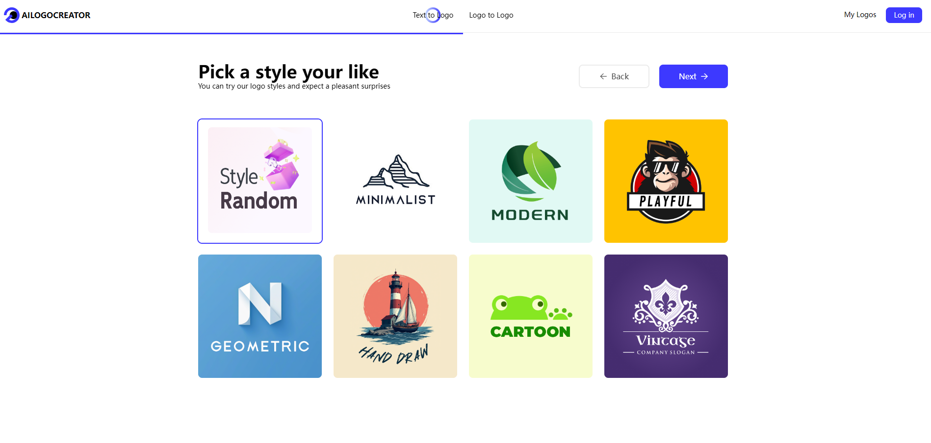
- Enter the Core Idea: Start by conceptualizing the main theme that inspires your logo. Given the task involves a Dolphins-inspired graphic, introduce elements like dolphins and oceanic or sun-based motifs. This step roots the creative process in a clearly defined vision tied to the essence of the Dolphins’ branding.
- Selection of Colors and Styles: Choose colors that resonate with the Miami Dolphins palette—predominantly aqua and coral—which evoke the marine and energetic aspects of the original logo. This color selection not only bolsters thematic consistency but also ensures the design is immediately recognizable and evocative of the Dolphins’ spirit.
- Customization: Use ailogocreator.io’s tools to customize aspects of your logo. This could involve tweaking the shapes of dolphins, adjusting backgrounds to mimic ocean waves or sunbursts, or exploring font styles that convey athleticism and energy. The aim is to encapsulate the speed and vibrance reflective of the team’s character.
- Preview and Adjustments: With the customization complete, preview the design within the platform. This step is crucial for ensuring that the logo communicates the intended message and retains visual appeal. Make any necessary adjustments until the design aligns perfectly with the envisioned outcome.
- Download and Format Options: Once satisfied with the design, download the logo files in your required formats, whether it be for digital or print use. Ailogocreator.io offers a range of file types ensuring compatibility across various marketing or merchandise applications.
By following these steps, crafting a Miami Dolphins-inspired graphic becomes an accessible task, allowing users to draw on professional-grade tools to bring their creative ideas to life while paying homage to one of the most iconic logos in sports history.
Far-reaching Implications and Cultural Significance
The Miami Dolphins logo transcends its role as a team emblem to become a cultural artifact with enduring implications in both sports history and local identity. Over time, the logo has transformed into a conduit of storytelling and connection, not only for fans but also for the broader Miami community. In showcasing the dolphins surrounded by the sun’s embrace, the logo embodies the convergence of natural beauty and team dynamism. It pays tribute to the local environment while promoting the universal values of teamwork and perseverance.

The cultural impact of the Dolphins logo within Miami cannot be overstated. It is deeply intertwined with regional pride and identity, symbolizing Miami’s spirit and serving as an emblem of the city’s embrace of both diversity and vitality. This affinity extends to the sports community at large, as other franchises evaluate their brand evolution through the lens of Miami’s adept balance of modernization and tradition.
Beyond Miami, the Dolphins logo has garnered international recognition, partially due to the team’s successful campaigns and the proliferation of NFL’s branding power. It serves as a visual touchstone that connects Dolphins fans worldwide, bridging geographical and cultural divides through shared loyalty and experience.
In sports tourism, the logo functions as an attraction in itself, drawing enthusiasts to explore the storied legacy of the team in Miami. It reflects broader narratives in sports branding—how iconic imagery can transcend its medium to become artifacts that inform social and cultural movement. The far-reaching implications of the Dolphins logo underscore elements of sports diplomacy, where shared symbols foster unity and continuity among diverse populations.
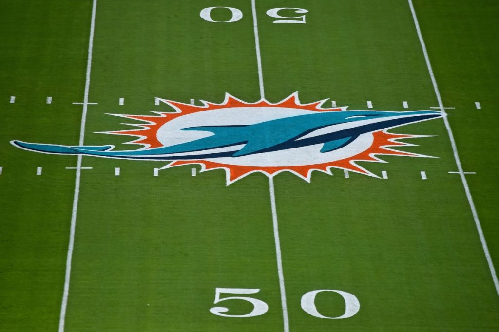
In sum, the Miami Dolphins logo stands as a robust example of how a well-crafted emblem can have far-reaching cultural significance. It reflects broad social themes of unity and perseverance while setting a precedent for the strategic use of design elements in sports branding.
Reflecting on Tradition and Innovation
The Miami Dolphins logo stands as an iconic figure at the intersection of tradition and innovation. Its evolution and impact reflect the broader challenges and opportunities faced by organizations seeking to balance these seemingly opposing forces. Over the years, the updated logo has navigated a path of preserving the essence of the Dolphins’ identity while embracing modern design sensibilities.
Traditionally, the Dolphins logo maintained elements that fans identified with—the dolphin mascot, and the vibrant aqua and coral colors reflecting Miami’s ambiance. These constants provided continuity, allowing fans to anchor their loyalty and emotional connections through visual familiarity. Additionally, these elements serve as powerful storytelling devices, invoking narratives of legacy and consistency that resonate deeply with fans who share longstanding allegiance to the team.
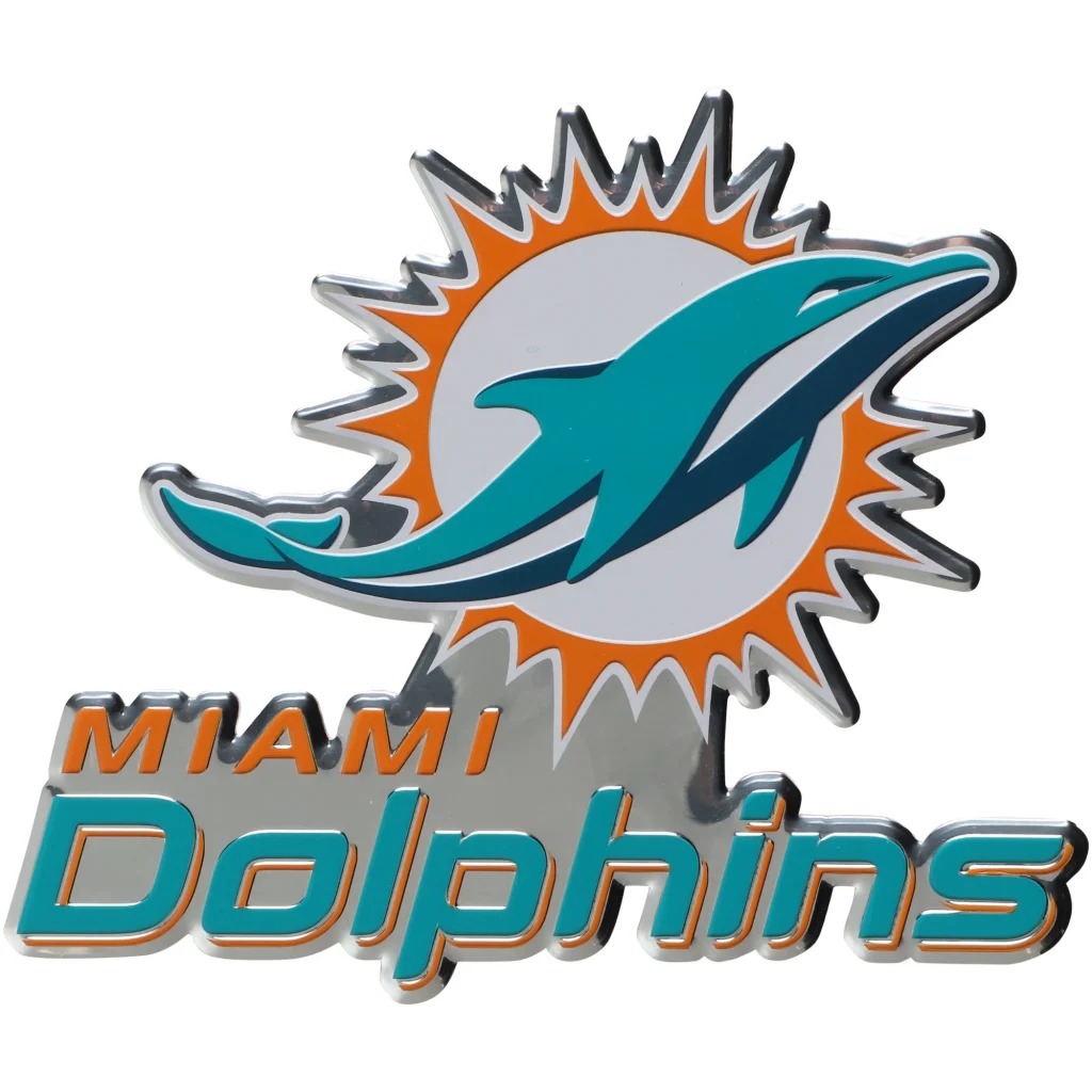
Innovation came in the form of design updates that aligned with the changing aesthetics and marketing strategies of the times. Whether through streamline adjustments in the dolphin’s depiction, incorporating realistic designs, or harmonizing color gradients, each redesign reflects efforts to keep the Dolphins relevant and appealing to new generations of fans. Digitization and branding necessity compelled these changes, indicating the team’s commitment to remain competitive both on and off the field.
This delicate balance speaks to a profound understanding of brand evolution in not only reflecting competitive spirit but also acknowledging the shifting tides of audience expectations. The blend of innovation with tradition in the Dolphins logo offers a microcosmic view into the dynamics of sports branding, where teams must keep pace with technological advancements while preserving the emotional ties inherent in sports fandom.
Ultimately, the Miami Dolphins logo encapsulates a broader dialogue between past and present, serving as a testament to the enduring appeal of visually anchored representations of identity. It illustrates that successful logos do more than brand a team—they encapsulate the collective experiences and aspirations of their communities.
Frequently Asked Questions
What does the Miami Dolphins logo symbolize?
- The Miami Dolphins logo symbolizes agility, intelligence, and the vibrant, spirited cultural essence of Miami. The emblem captures the energy of a coastal city known for its thriving sports culture and the dolphin’s characteristics of teamwork and strategic prowess.
How many times has the Miami Dolphins logo been redesigned?
- The Miami Dolphins logo has undergone several redesigns, most notably in 1974, 1997, and 2013. Each redesign reflects broader artistic trends and branding strategies aimed at keeping the team’s image fresh and relevant.
Can I use ailogocreator.io to create a logo inspired by sports teams?
- Yes, ailogocreator.io offers flexible, user-friendly tools to create sports-themed logos. The platform allows users to customize design elements to capture the essence and energetic flair associated with sports branding.
How does the Miami Dolphins logo represent the city of Miami?
- The Miami Dolphins logo represents the city through its use of oceanic colors and sun motifs, capturing Miami’s coastal charm and vibrant lifestyle. The dolphin as a mascot further embodies the city’s lively, dynamic spirit.
What is the history behind the Miami Dolphins logo?
- Since its introduction in 1966, the Miami Dolphins logo has evolved to reflect changes in society and branding practices. Each iteration retains core elements while embracing new design philosophies to connect with a modern audience.
Why did Miami Dolphins change their logo?
- Logo changes stem from the desire to modernize the brand and appeal to contemporary tastes while still maintaining elements that encapsulate Miami’s rich sporting tradition and symbolic heritage.
What was the original Miami Dolphins logo?
- The original logo introduced in 1966 featured a leaping dolphin wearing a football helmet over a stylized sunburst, embedding the team’s regional and athletic identity into its visual representation.
Why do the Miami Dolphins wear white at home?
- The Miami Dolphins often wear white at home due to Miami’s warm climate. The lighter uniforms are a strategic choice to keep players cool on their home turf and can force the visiting team to wear darker colors.
What NFL team has a dolphin mascot?
- The Miami Dolphins are the only NFL team with a dolphin as their mascot, symbolizing the team’s association with agility and intelligence and aligning with Miami’s coastal culture.


CommentsTake the first comment