Twitter’s logo tells the story of the platform’s journey from experimental side project to global communication powerhouse. Like the company itself, the logo has evolved over time – adapting to shifts in Twitter’s identity and aspirations.
In its 17 years of existence so far, Twitter’s logo has undergone multiple redesigns. With each iteration, the new logo has aimed to capture the ethos of that era in the company’s trajectory.
Let’s trace the evolution of the Twitter logo over the years, and what each rebrand says about the platform at that point in time.
The Early Days: “twttr” and the Birth of the First Logo

Twitter began life in 2005 as an internal side project within the podcasting company Odeo Inc, founded by Evan Williams, Noah Glass, Jack Dorsey and Biz Stone.
At the time, they were experimenting with different ideas for projects to pivot their company towards. The team initially named their new messaging service “twttr” – no vowels – as a reference to the 5 character limit for SMS messages which inspired the short, frantic nature of tweets.
| Year | Logo Version | Key Characteristics |
| 2005-2006 | “twttr” wordmark logo | Elongated green letters, reflective of growth and vitality of a young startup. Quirky spelling referenced SMS character limits. |
The origin of “twttr”: The minimalist and text-based design approach
The initial “twttr” logo design used a clean, sans-serif font rendered in green. The letters were elongated and had a bubble-like shape.
This pared down, minimalist logo was born more from necessity than artistic intent, as the founders were still experimenting with ideas and trying to see if their messaging concept had legs.
Still, the quirky “twttr” wordmark encapsulated some core traits:
- Simplicity – No extra bells and whistles in the logo. Just the essentials required to test their idea.
- Youthful vitality – The bubbly font and bright green hue represented the energy and fresh perspective of a young startup.
- Tongue-in-cheek humor – The intentional misspelling nods to the quirky nature of the platform itself.
So while the logo itself was simple, it did succeed in conveying the playful and irreverent ethos of the early Twitter team.
How the first logo reflected the simplicity and rawness of the early platform
In the early days, Twitter prioritized function over form. The team was still trying to figure out exactly what this new “micro-blogging” service would be.
Their experimental mindset was evident in the initial logo design and minimal website aesthetic.
- No visual icons – just the wordmark typing out the name.
- Black background with simple green and white color scheme. Black backgrounds were common in early 2000s web design.
- Plain layout with Times New Roman type serif font for body text. No extra flourishes.
This pared down design reflected the incomplete nature of the project at this exploratory phase. The logo didn’t try to oversell anything before they had figured out what Twitter even was.
The odd “twttr” spelling did succeed in grabbing attention for its unconventional look. Overall though, this logo highlighted that Twitter was still trying to find its feet in the social media landscape.
The Introduction of the Bird: Shifting to a Visual Icon

As Twitter’s popularity grew, the founders realized they needed a more polished brand identity.
In February 2010, Twitter revealed its new logo – the now iconic blue bird symbol beside the Twitter name. This marked the start of the company solidifying its brand image.
| Year | Logo Version | Key Characteristics |
| 2006-2010 | Text only logo | Plain black wordmark and minimal design |
| 2010-2012 | First bird logo alongside name | Cheerful blue bird introduced as brand’s visual identity |
Why Twitter transitioned from text-based to image-based branding
When Twitter shifted from the “twttr” text logo to an image-based logo with the bird icon, it signified the company was staking its claim in the social networking sphere.
Some key reasons why Twitter upgraded to a logo with visual branding:
- Instant recognition – Having an eye-catching and unique visual icon increased brand memorability.
- Personality – The cute bird mascot gave the brand some added approachability and warmth.
- Adapting to user habits – As more users accessed Twitter on mobile, an image-based logo was important for small app icon visibility.
- Standing out – Distinct visual brand identity differentiated Twitter from text-based competitors.
The bird logo marked Twitter cementing its position as an established, recognizable social brand – no longer just an idea in beta testing.
The creation of Larry the Bird: The story behind the first bird logo
The process of designing Twitter’s first bird icon involved extensive research on bird species, shapes and characteristics by the brand design team.
Their aim was finding an appropriate bird to represent the essence of the Twitter product experience for users.
Twitter’s logo designer Douglas Bowman described how they chose the final bird design:
“We liked the bird because it was universal. It was punchy, global, attention-grabbing, and simple. It worked with the product and had a topside and personality that resonated well. There wasn’t much of a process beyond that.”
The team arrived at a blue lightweight bird, almost chickadee-esque in shape but with more curved edges.
Notably, the bird icon was not even originally a new creation. Twitter purchased rights to use an existing iStock illustration titled “310262 Tweet Bird.”
Fun fact – early Twitter employees fondly referred to their new feathered mascot as “Larry the Bird” – an homage to the legendary basketballer Larry Bird.
Over time though, Larry slimmed down, losing his cartoonish bodily details to become a simple smooth outline.
Evolution of the Bird: From Larry to Simplified Twitter Bird
By 2012, Twitter’s bird icon was universally recognizable, even without the accompanying wordmark logo. The vibrant blue silhouette effectively evoked Twitter’s brand personality.
Twitter’s logo continued to evolve, as Larry the bird grew up in line with the company’s own maturity.
| Year | Logo Version | Key Characteristics |
| 2010-2012 | Cheery cartoonish bird | Friendly mascot “Larry the Bird” with bright colors |
| 2012-2022 | Refined graceful bird | Simplified design with focus on curved head and wings |
The redesign in 2010: Moving toward a more refined and modern bird symbol
The initial cheerful blue bird named Larry was uncommonly detailed for an icon, with visible feet, an expressive beak and three tiny feathers sticking up from his head. This cartoonish aesthetic aligned well with Twitter’s early bubbly presence.
However, as the company grew, the branding needed to mark that shift towards maturity.
In 2012, Twitter refreshed their bird icon in slight ways:
- Slimmed and smoothed edges and silhouette
- Removed extraneous details like toe nails and odd head tuft
- Tilted head up to imply looking to the skies
- Lifted wings subtly to suggest effortless flight
These small changes had significant impact, marking the evolution from juvenile doodle bird to elegant brand symbol.
Simplification in 2012: Streamlining the bird logo to reflect Twitter’s growth and clarity
By 2012, the ubiquity of Twitter’s friendly bird logo allowed the platform to make a game changing move.
Twitter dropped their name wordmark from the logo, going forward with just the standalone bird icon.
Confident in its worldwide recognition, the Twitter bird could now fly solo as the face of the brand. With adoption surging internationally, keeping the logo clean and simple was key.
Graphic designer Douglas Bowman described the thinking behind the bird taking centerstage:
“Because the bird had been the most recognizable part of the logo, we could simplify by removing the text.”
This poignant logo redesign marked Twitter staking its claim as global name in communications – on par with the recognition value of a Coke bottle or Nike Swoosh. From meme fodder to Arab Spring symbol, Twitter had become intrinsic to 21st century dialogue.
Twitter Blue and Visual Branding: Modernization and Updates
Lasting from 2012 to 2022, the iconic lone blue bird logo came to encapsulate Twitter’s brand identity over the decade of its explosive spike in worldwide usage.
Some elements that made the blue bird logo so memorable and effective:
Color
- Vibrant blue – Associated with communication and trust
- Clean white background – Breathing room to stand out
Shape
- Balanced proportions – Equal focus on body and wings
- Positive forward tilt – Energetic upwards motion
- Open wings – Suggesting inclusivity
Simplicity
- Silhouette style – No superficial details
- Easily reproducible – Scales to any dimension
This thoughtful design ensured consistency in a logo befitting one of the most influential social networks.
Branding Evolution Matching Platform Growth
Interestingly, the shifts in Twitter’s logo align well with key developments on the product front:
| Logo Era | Platform Evolution |
| twttr wordmark | Experimenting with messaging ideas |
| Text logo with name | Gaining traction with early adopters |
| Cheery Larry bird | Nationwide growth beyond tech circles |
| Refined blue bird | Established global influence |
| Solo blue bird | Recognizable as ubiquitous communication channel |
| Black and white X | ? |
The logo redesigns reflect Twitter keeping pace with its expanding reach and importance over the past two decades.
The Biggest Rebrand: From Twitter to “X”

In November 2022, Twitter was acquired by billionaire Elon Musk in a $44 billion deal. This ushered in an overhaul of Twitter’s branding under its new owner.
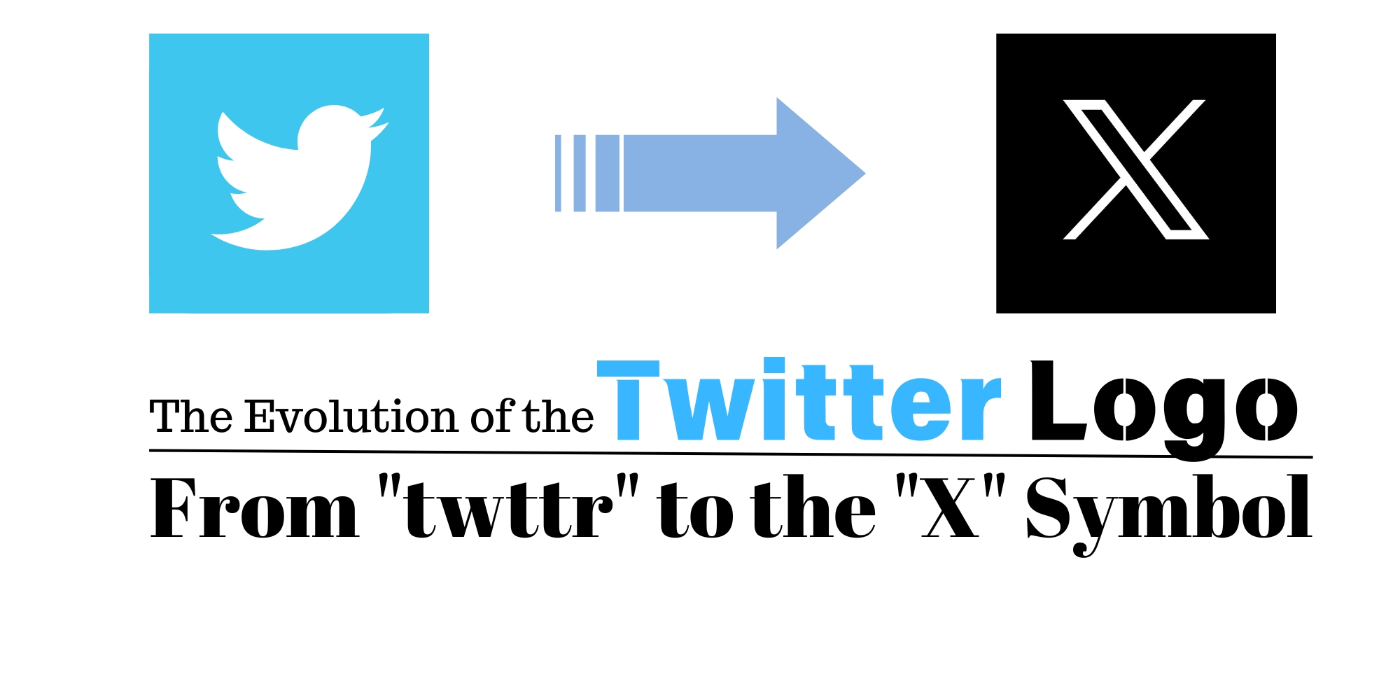
Gone was the iconic blue bird…in its place, a stark black and white “X” logo. This surprise rebrand signified the dawning of a new era.
| Year | Logo Version | Key Characteristics |
| 2022 – Present | Black and white “X” | Minimalist, stripped down, bold typographic logo |
From Bird App to “Everything App”?
Musk has not yet publicly specified the reasons behind the dramatic axing of Twitter’s brand identity mainstay for the past 12+ years.
But the “X” logo likely hints at his grand ambitions to transform Twitter from a niche social app into an all-encompassing “everything app”.
In April 2022, Musk referenced this vision on Twitter, saying:
“Buying Twitter is an accelerant to creating X, the everything app”
The “X” rebrand seems to signify this intended quest to evolve Twitter into something larger in Musk’s mold – an internet Swiss Army knife of sorts.
Deconstructing the “X” Logo Minimalism
The new Twitter logo features an “X” set in bold black and white sans serif type, in stark contrast to the previous friendly blue bird.
Some key characteristics of this stripped down rebrand:
- Starkness – Heightened through bold letterform and lack of colors
- Simplicity – Removed all visual elements except single letter
- Mystery – Cryptic meaning open to speculation
- Severance – Total divorce from old brand identity
This utterly unfamiliar logo renders the app unrecognizable from past versions. The opaque, clinical aesthetic seems to symbolize detachment from all that Twitter represented before.
Whether the “X” will eventually also come to embody Twitter’s next era remains to be seen. But for now, it feels like a definitive closing of the chapter that was.
Design Principles Reflected in Twitter’s Logo Evolution
Stepping back, Twitter’s ever-changing logo over the past 17 years represents a compelling evolution.
The company’s brand identity has walked a fine line – needing to constantly update their image to stay relevant, but without losing core visual heritage that fans had come to cherish.
The balance between simplicity, flexibility, and adaptability
A key factor that has allowed Twitter’s logo to smoothly weather multiple makeovers is simplicity underlying each design.
Whether the minimalist text logo, cute bird cartoon or abstract letter, simplicity creates recognition value that transcends rebrands.
| Logo Version | Simple Yet Distinctive Elements |
| twttr | Precisely cropped wordmark |
| Blue bird | Memorably smooth silhouette |
| Black and white X | Striking typographic form |
This adherence to simple shapes ensures flexibility – logos can be deconstructed and reinvented without losing their core visual essence.
Evolution Matching Growing Influence
Critically, the periodic refreshes to Twitter’s branding align with evolutions in its product-market fit and societal role over the years.
- The clean text logo mirrored the unfinished nature of a fledgling startup
- The friendly bird icon signaled its mainstream adoption
- The mature bird marked Twitter becoming integral to global discourse
- The cryptic “X” hints at unknown future ambitions
Like any enduring company, Twitter’s logo has walked in step with the brand maturing over time.
The Future: AI Powering Data-Driven Logo Design?
The era of Web 3.0 calls for brands to take a data-driven approach even to creative arenas like logo design.
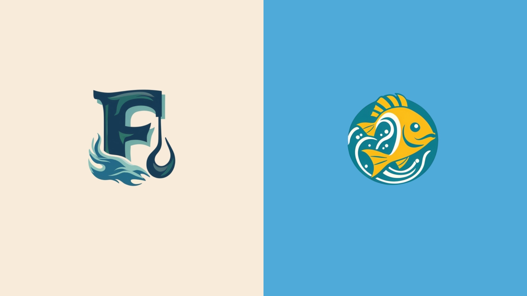
AI logo generators promise to revolutionize the branding process by creating on-trend logo options optimized based on data insights.

AI Logo Creator Benefits
Tools like AI Logo Creator allow users to self-serve unique logo designs within minutes, powered by machine learning technology.
Key advantages over manual logo design services:
Cost
- Self-serve online tool has low access costs
- No graphic designer fees
Efficiency
- AI generates 50+ logo options instantly
- Minimal effort compared to traditional process
Flexibility
- Iterate easily to refine designs
- Export high resolution vectors
For early-stage startups and small brands, AI logo creators promise an agile, affordable rebranding process.

AI + Human Collaboration for Optimal Designs
However, AI has its limitations in replicating human creativity, intuition and aesthetic judgement.
The ideal scenario is using AI logo maker platforms to collaborate with human designers – enjoying the best of both worlds.
A balanced design workflow could entail:
- Human briefs creative needs and brand personality
- AI suggests abundant logo samples
- Human curates best options and provides feedback
- AI iteratively refines selections based on feedback
- Human makes the final call to pick the winning logo!
This human + AI cooperative approach takes advantage of machine learning’s untiring rapid iteration capabilities combined with human contextual input.
Frequently Asked Questions
What impact did introducing the bird symbol have for Twitter’s brand recognition?
The bird logo hugely increased Twitter’s recognizability and discoverability by giving it an identifiable mascot. The logo encapsulated the essence of “tweeting” which users could easily associate with the platform.
What lessons can we learn from the bird logo simplification?
The gradual removal of complex details as Twitter’s brand matured shows that refining logos towards minimalism helps strengthen and clarify brand messaging over time.
What made Twitter’s logo iconic?
Memorable visual symbols, meaningful color associations, consistent branding, and regular evolution to match the maturing platform combined to make Twitter’s logo globally iconic.
How did Twitter Blue impact the brand?
Adopting a signature shade of blue boosted Twitter’s trustworthiness. Maintaining color consistency during logo changes built familiarity. The blue tone also suits Twitter’s ambitions as a relaxed communications medium.
Can AI assist in designing logos balancing simplicity and adaptability?
Yes, AI services like AI Logo Creator can rapidly generate minimalist logo options with color scheme consistency. The cost and speed advantages empower iterative designs to meet simplicity, recognition and flexibility needs.


CommentsTake the first comment