I. Texas A&M University
Texas A&M University, founded in 1876, is a flagship institution known for its rich history and contributions to education and research. As the first public institution of higher learning in Texas, it has grown into a prominent university offering diverse programs that attract students globally. Texas A&M holds a distinct position among American universities due to its commitment to developing leaders in agriculture and technology while fostering a sense of community and tradition known as the Aggie Spirit. This spirit is not only encapsulated in the academic and social life of its students and alumni but also prominently symbolized through its logo.

The logo serves as the university’s visual cornerstone, symbolizing its heritage and values. It is a significant tool for brand recognition, fostering community pride, and establishing a cohesive university identity. Recognized worldwide, the logo embodies Texas A&M’s mission of excellence, integrity, leadership, loyalty, respect, and selfless service, which the university instills in its students. It provides a visual link to the past and bridges the university’s storied history with its aspirations for the future.
This article aims to delve into the evolution of the Texas A&M logo, examining its history, design elements, and significant impact on both the university community and its global recognition. In tracing the journey of the logo from its inception to the present, we will highlight the changes in its design that mirror the university’s growth and adaptation to change over time.
II. Historical Background of the Texas A&M Logo
Founding and Initial Symbolism
Texas A&M University originated as the Agricultural and Mechanical College of Texas, emphasizing practical education in agriculture and the mechanical arts. The first emblem, created upon the university’s founding in 1876, was a straightforward combination of the initials “TAMC,” representing “Texas Agricultural and Mechanical College.” This initial design underscored the institution’s commitment to these disciplines and served as a source of identification for students and faculty at the time.
1876 – 1907
The design was inspired by a utilitarian ethos, reflecting the practical skills the college aimed to impart to its students. The simplicity of the original logo, with its primary focus on conveying the institution’s academic orientation, mirrored the spirit of an age where clear and functional communication was paramount. The logo’s earthy tones and no-nonsense typography were characteristic of the needs and sensibilities of an institution tasked with equipping students with workforce-ready skills during the Industrial Revolution.
As a representation of the university’s foundational values, the original logo resonated deeply with the institution’s purpose, encapsulating its origins in both form and function. While it wasn’t elaborate or ornate, it symbolized a commitment to a practical and applied education system aimed at enhancing students’ skill sets in relevant fields.
Decades of Transformation: Key Milestones in Redesign
With the passing decades, the Texas A&M logo went through numerous transformations, each marking a significant period in the university’s history. Key moments in this evolution often coincided with broader historical events or shifts within higher education itself. As the university expanded its academic offerings and extended its reach globally, it required a visual identity that could encapsulate these developments while preserving the essence of its roots.
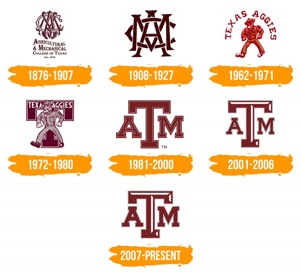
1876-1907: The original logo consisted of the initials of the Texas Agricultural and Mechanical College, using a Gothic English font. The letters were interwoven into a complex design, making it difficult to read.
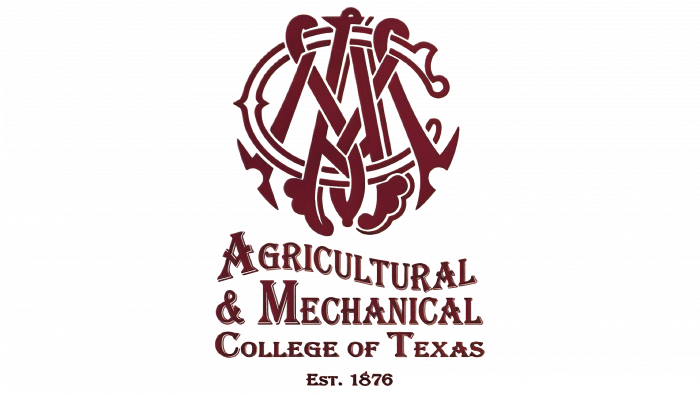
1908-1927: The logo changed to a unique interwoven combination of three letters—“A,” “M,” and “C.” These letters intersected vertically and horizontally, creating an elegant design.
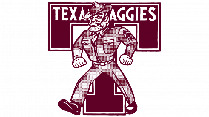
1962-1971: The athletic department introduced its own logo, featuring the inscription “Texas A&M” over a militant male figure. During this period, burgundy became the official color for the university athletes.
1972-1980: The logo incorporated a large “T” with a fully-armed soldier in the background, using maroon details to emphasize the figure and attire.
1981-2000: The logo was simplified to consist of only the letters “A,” “T,” and “M,” with the middle “T” being the largest, while the other letters were positioned to its left and right.
2001-2006: A white stripe was added to the “T,” giving the logo a new visual element.
2007-present: Changes to the logo primarily involved increasing the size of the letters “A” and “M” to enhance visual recognition.
1908 – 1927

1962 1971

1972 1980
1981 2000
2001 2006

Since 2007
Dating back to the early 1900s, as Texas A&M began to grow and diversify its academic programs beyond agriculture and engineering, the logo underwent its first major redesign. This redesign incorporated more stylized typography and additional symbolic elements that reflected the university’s burgeoning academic landscape. The inclusion of new symbols served to communicate a broader institutional identity and mission, showing an adaptation to changing educational paradigms.
In the latter half of the 20th century, during periods such as the post-World War II era and the space race, Texas A&M sought to reaffirm its image as an institution driving innovation. The logo took on a more modern look, with cleaner lines and more prominent features that echoed technological advancement. These updates corresponded with another wave of academic expansion and globalization, as the university established itself as a leader in research and education worldwide.
Throughout the many changes, the logo consistently acknowledged its past by maintaining core elements while incorporating nuanced iterations that reflected current trends. Each redesign was carefully deliberated to stay true to the university’s foundational values while propelling its identity into new realms of vision and potential.
III. Design Elements of the A&M Logo
Core Symbolism and Scholarly Imagery
The Texas A&M logo is rich with symbolic meaning, effectively encapsulating the institution’s ethos and academic heritage. The core elements, represented by the letters “T,” “A,” and “M,” are not mere initials but stand as a timeless commitment to the fields of agriculture and mechanics that the university has maintained since its inception. These letters form the cornerstone of the logo, symbolizing an ongoing dedication to practical and impactful education.
Over the years, different icons and symbols have been integrated into the logo to reflect evolving scholarly themes. For instance, the star—a prominent motif in Texan symbolism—has occasionally appeared in the logo, representing the spirit and strength inherent in both the state and its flagship institution. Additional scholarly imagery, such as books or laurels, has been considered in emblematic updates to signify academic excellence and distinguished knowledge across disciplines.
The design incorporates subtle elements that tell stories of growth, resilience, and excellence, all while visually resonating with the university’s mission of fostering leaders who embody the Aggie Spirit. Each iteration of the logo honors its narrative by weaving historical significance into modern interpretations, making it a versatile and powerful emblem of intellectual pursuit.
Typography Evolution and Tone
The typography of the Texas A&M logo has been through significant evolution, dynamically translating the university’s changing tone and positioning through the years. Initially, the robust serif fonts used in the earliest versions of the logo conveyed formality, tradition, and reliability—qualities integral to a pioneering educational institution in the late 19th century.
As the university navigated the 20th century, the typography saw shifts towards bolder and more contemporary styles, reflecting its modern aspirations while retaining a tangible connection to its historical lineage. Developing clear, legible fonts became crucial as the logo increasingly featured in diverse media from printed materials to digital platforms, ensuring that the university’s brand identity remained both recognizably traditional and innovatively forward-thinking.
Presently, the typography of the Texas A&M logo balances heritage with accessibility, featuring a style that signifies both authority and approachability. This evolution underscores a strategic vision that respects the institution’s legacy while appealing to new generations of students and scholars. The nuanced typography choices serve not just to enhance aesthetic appeal but to cultivate strong emotional and intellectual connections.
Color Scheme and Institutional Identity
Central to the Texas A&M logo is its distinctive maroon color scheme, a primary component of the university’s visual identity. Historically, maroon has been associated with endurance and vigor, symbolically embodying the Aggie Spirit and the university’s enduring resilience and passion for advancement.
The use of maroon as a dominant color in the logo conveys a sense of unity and pride across campus life, becoming synonymous with school spirit and loyalty. This consistency in color choice assists in brand recognition and reinforces the university’s image beyond academic settings, extending to athletic programs, merchandise, and promotional materials.
Additionally, accent colors, often introduced in logo variations or special-edition designs, complement the maroon base and reflect different facets of the university’s dynamic identity. These palettes are carefully selected to harmonize with maroon while maintaining readability and a cohesive visual impression across diverse applications.
The color scheme plays a pivotal role in establishing a strong institutional identity, enabling easy recognition and creating an emotional resonance that connects current students and alumni. By maintaining a consistent yet adaptable color strategy, Texas A&M ensures that its visual branding remains timelessly impactful and vibrantly relevant.
IV. The Impact of the A&M Logo in Academia and Beyond
Cultural Significance and Legacy
The Texas A&M logo is more than a visual identifier; it is a profound reflection of culture and community. As an emblem of shared traditions and values, it serves as a visual rallying point for Aggies worldwide, connecting generations through a consistent representation of collective identity. The logo’s pervasiveness across campus – from academic buildings to athletic fields – demonstrates its role in cultivating a sense of belonging and pride among students, faculty, staff, and alumni.

Throughout its history, the logo has been emblematic of the university’s values: respect, excellence, leadership, loyalty, integrity, and selfless service. These core values are interwoven into everyday life at Texas A&M, with the logo serving as a constant reminder of the university’s mission to produce leaders committed to these principles. The sense of continuity that the logo provides is vital in reinforcing the cultural ethos that defines Texas A&M.
Beyond its cultural implications, the legacy of the Texas A&M logo influences perceptions of the university at both national and international levels. It symbolizes quality, ambition, and tradition-recognized hallmarks across the global academic community. In international collaborations and partnerships, the presence of the logo reassures external stakeholders of Texas A&M’s reputation and commitment to excellence.
Marketing, Recruitment, and Competitive Advantage
The Texas A&M logo is a pivotal asset in marketing and recruitment strategies, presenting a competitive advantage in the dynamic landscape of higher education. As part of an effective branding strategy, the logo helps communicate the university’s strengths, including its comprehensive program offerings, world-class faculty, vibrant campus life, and enduring traditions, to prospective students and global partners.
In marketing campaigns, the logo is strategically deployed to capture the attention of target audiences and convey key messages, whether in promotional materials, website design, social media platforms, or public relations efforts. By doing so, the university leverages its brand identity to attract high-caliber students and faculty, competing effectively with peer institutions.
Recruitment efforts are bolstered by the emotional connection the logo fosters with potential students and families. The visual identity signifies not only a commitment to academic excellence but also the idea of joining a welcoming and supportive community. Additionally, the logo’s prominence in alumni networks and events fosters lifelong affinity, enhancing both fundraising and outreach efforts.
The consistent use of the logo across various channels ensures brand coherence, maintaining a professional and reliable image. This strategic integration enables Texas A&M to stand out in crowded educational markets and amplify its narrative, reinforcing a competitive edge that leverages the university’s storied reputation and vision for future growth.
V. Designing a Contemporary Logo with AILogoCreator
Innovation in Design: AI Tools for the Modern Age
The advent of artificial intelligence has revolutionized design processes, offering opportunities to create logos that blend tradition with modernity efficiently. AILogoCreator is at the forefront of such innovations, providing sophisticated tools that enable institutions like Texas A&M to design logos reflecting contemporary aesthetics while maintaining heritage signifiers.
AILogoCreator utilizes AI algorithms to analyze design trends, suggest color palettes, and provide customizable templates that can be tailored to align with specific branding guidelines. This technology aids designers in generating professional-quality logos at a faster pace than traditional methods, accommodating both in-house teams and external brand agencies who seek efficient yet impactful outcomes.
This platform empowers designers to experiment with new styles, color combinations, and typographies without extensive manual effort, freeing creative professionals to focus on strategic brand messaging. Moreover, its intuitive interface accommodates users with varying levels of design experience, democratizing access to high-quality logo creation.
While AI-driven tools open new design possibilities, they also present challenges in ensuring the logos they generate remain authentic and respond to the cultural and historical contexts of their use. Thus, institutions can benefit from a hybrid approach, combining technological advancements with human insights to achieve balanced and meaningful designs that resonate with stakeholders.
Process of Creating a Logo
Designing a university-themed logo using AILogoCreator involves several key steps to ensure alignment with institutional values and brand identity. The process begins with defining the university’s core message and intended audience, which informs initial design choices. Next, designers input the university name (e.g., “Texas A&M”) into the platform, selecting relevant themes reflecting educational, cultural, and historical aspects.
Based on the input, AILogoCreator provides various templates and style recommendations. Designers choose from these options, refining elements such as shapes, symbols, and typography to correspond with Texas A&M’s distinctive characteristics. At this stage, selecting an appropriate color palette is crucial to maintain visual consistency with existing branding.
Subsequently, designers further customize the logo by adjusting icon sizes, font styles, and orientations to ensure coherence and visibility across different media. Continuing iterations enable designers to achieve a logo that captures both modern design sensibilities and the time-honored spirit of Texas A&M.
Upon finalization, AILogoCreator generates logo files in multiple formats, ready for deployment across academic platforms, promotional materials, and digital communications, thereby facilitating seamless integration into Texas A&M’s existing brand ecosystem.
Balancing Tradition with Modernity in Design Approaches
The integration of AI tools in logo design presents opportunities and challenges that must be carefully navigated to ensure balance between tradition and modernity. While technology can enhance creativity and streamline processes, it is essential for institutions to remember the cultural and historical significance of logos like Texas A&M’s when leveraging AI for design.
Traditional design methods are rooted in a deep understanding of symbolism, cultural nuances, and artistic intuition. Designers employ these insights to produce work that tells a unique story and embodies its user’s identity comprehensively. On the other hand, AI-assisted design prioritizes speed and scalability, optimizing for technical efficiency and adaptability.
The most effective design strategies employ a hybrid approach, capturing the best of both worlds by blending AI’s powerful capacities with human-centered design skills. This ensures the resulting logo is not only aesthetically pleasing but also culturally relevant, symbolically rich, and equipped to carry the university’s legacy forward.
In conclusion, while AI tools greatly aid in modern design, they should be used in conjunction with, not as a substitute for, traditional design methodologies. By embracing innovation with an understanding of history and culture, institutions can craft logo identities that stand the test of time while adapting to the evolving demands of contemporary audiences.
VI. Case Studies and Testimonials
Notable Redesigns: Historical Perspective and Lessons Learned
The history of Texas A&M’s logo showcases the process of redesign within an educational context, illustrating how the institution has adeptly tackled the challenge of embracing change while preserving its legacy. A significant milestone occurred in 2000, when the logo underwent a profound redesign to better meet the demands of the digital age. This redesign aimed not only to enhance the visual impact of the logo but also to ensure its clarity and recognizability in new media environments.
During this update, the design team faced the primary challenge of modernizing the logo while maintaining its historical continuity. The new design retained the classic “A&M” letter combination, symbolizing the traditional roots of Texas A&M University, while introducing a more modern font and streamlined lines to reflect a spirit of ambition and innovation. This change underscored the necessity of incorporating a wide range of perspectives and disciplinary knowledge.
By setting clear design objectives and maintaining an openness to feedback and adaptability, Texas A&M successfully created a logo that is both fresh and true to its historical essence. These redesign experiences emphasize the importance of strategic vision and open discussion in the development of a logo. Through thoughtful consideration and creative collaboration, Texas A&M has infused its visual identity with enduring vitality, respecting its historical origins while supporting a forward-looking vision.
Community Voices: Impact on Identity and Perception
Community feedback from students, staff, and alumni reinforces the profound impact that the Texas A&M logo has on identity and perception. For many Aggies, the logo is more than an emblem; it is a badge of honor signifying membership within a unique, dedicated community that shares common values and traditions. Testimonials reveal that wearing and displaying the logo fosters pride and belonging, reminding individuals of their connections to the broader Aggie family.
Alumni often speak to the role the logo plays in their deep, lasting relationships with Texas A&M, extending beyond academic achievements to embody shared experiences and cherished memories. Whether at reunions or professional networking events, recognition of the logo forms an immediate bond, facilitating camaraderie and mutual respect among fellow Aggies. It frequently serves as a tangible bridge between past and present, maintaining the timeless unity across campus generations.
Furthermore, Texas A&M faculty note the emblem’s significance in conveying educational excellence and intellectual rigor. In academic publications, conferences, and collaborations, the logo functions as a respected seal that enhances credibility and prestige. As a brand ambassador, the logo influences perceptions of Texas A&M’s contributions to research, civic engagement, and global impact, highlighting its stature among leading educational institutions.
Together, these personal narratives and professional insights demonstrate the logo’s diverse resonance across the community. They affirm its vital role not only in establishing a cohesive visual identity but in strengthening collective identity, amplifying Aggie Spirit, and expanding Texas A&M’s influence and reputation worldwide.
VII. Logo Evolution in Similar Institutions
Comparative Analysis of Peer Institutions
Examining logo evolution at institutions similar to Texas A&M provides valuable insights into effective branding strategies and shared challenges that academic institutions face in preserving legacy while pursuing innovation. Peer institutions such as the Massachusetts Institute of Technology (MIT) and Stanford University also have longstanding traditions of updating their logos to reflect changing educational missions and cultural influences.

MIT’s logo evolution, for instance, has embraced minimalist and modern visual elements since its founding, striving for a clean and innovative image that reflects its technological leadership. Despite occasional updates, key elements remain consistent, such as its iconic shield and the inclusion of Latin inscriptions symbolizing knowledge and enlightenment. This continuity reinforces MIT’s brand identity by maintaining recognizability and aligning with its intellectual commitments.
Stanford’s brand journey underscores how institutions reinvent logos to convey progressive values while retaining ties to heritage. Its logo history integrates evolving typography and color usage to project an image that is vibrant, forward-thinking, and reflective of Stanford’s Californian setting. Recent adaptations have focused on optimizing digital aesthetics without compromising brand clarity and tradition.
Through comparative analysis, Texas A&M can draw lessons on the importance of reconciling aesthetic innovation with an institution’s historical character. Effective strategies include the thoughtful selection of enduring symbols, communicating values authentically, and considering contemporary visual trends. These best practices articulate how education institutions can evolve their logos in ways that enhance brand strength and competitive positioning.
VIII. Future Directions in Logo Design
Anticipating Change: Trends and Innovations
Looking forward, several trends and technological innovations are poised to shape the future of university logo design, impacting how institutions like Texas A&M craft and disseminate visual identities. Key among these trends are digital-first design approaches, experiential branding, and incorporating cultural elements that resonate with increasingly diverse audiences.
Digital animations and interactive logos are becoming popular, mirroring advances in augmented and virtual reality technologies that enrich brand storytelling and audience engagement. By fostering interactive experiences, such as animating elements of the logo across digital platforms, universities can provide dynamic modes for potential students and stakeholders to connect with their identity.
Furthermore, the emphasis on integrating cultural and community-driven elements will continue to gain significance in logo design, focusing on symbols and motifs that resonate genuinely with diverse audiences. This not only strengthens emotional bonds but also enhances relatability and inclusivity, underscoring an institution’s commitment to represent its community accurately.
Building on Legacy while Embracing Innovation
Texas A&M is uniquely positioned to build on its legacy while embracing impactful innovations in logo design. To succeed in the future, the university can maintain its tradition and proud identity, while adopting new technologies to reinforce its narrative across various media and formats. By cultivating an open approach to experimentation, Texas A&M will be better equipped to meet the evolving needs of its global community and engage effectively with broader audiences.
Collaboration with designers, brand experts, and community stakeholders remains integral to this effort, ensuring that the university continually produces logos that represent its defining values and reflect its accomplishments. As Texas A&M charts its path forward, its visual identity will ultimately serve not only as a testament to its history but as an emblem of its forward-thinking pursuit of excellence in the ever-evolving landscape of higher education.
Frequently Asked Questions
What does the Texas A&M logo stand for?
The Texas A&M University logo symbolizes the institution’s history, academic traditions, and core values. The initials “TAMU” stand for “Texas Agricultural and Mechanical University,” reflecting the school’s original focus on agricultural and mechanical disciplines. The logo conveys values such as excellence, integrity, leadership, loyalty, respect, and selfless service, which are central to Texas A&M’s mission.
What is the animal on the Texas A&M logo?
The Texas A&M logo does not feature any animals. The school’s mascot is Reveille, a Shetland Sheepdog, but she does not appear on the official logo. The mascot and the logo serve different purposes, with the former representing school spirit and vitality.
Is the A&M logo trademarked?
Yes, the Texas A&M logo is a registered trademark and is legally protected. The usage of this logo is subject to strict guidelines to ensure its lawful application in commercial activities and to protect the integrity of the brand. Unauthorized use may result in legal consequences.
What does A&M mean?
A&M stands for “Agricultural and Mechanical,” highlighting the university’s original emphasis on these two fields of study. Although modern Texas A&M offers a wide array of disciplines, this name is retained to honor its historical roots.
Can I use the Texas A&M logo?
To use the Texas A&M logo, one must obtain formal permission, especially for commercial purposes or promotional use. Applicants need to go through the university’s trademark office to ensure compliant usage.
How has the A&M logo influenced branding in academia?
The Texas A&M logo is a cornerstone of the university’s branding strategy and has significant influence on how academic institutions engage in market-oriented branding. The logo is more than just an identifier; it has become a symbol of the university’s traditions, achievements, and academic excellence.
Can AI compete with traditional design methods in logo creation?
AI technology has made strides in design precision, creativity, and time efficiency, making it a viable tool that can compete with traditional handcrafting methods. AI excels at handling repetitive tasks and generating multiple design iterations, though creativity and cultural depth are still reliant on human designers’ input.
What are the benefits of using AILogoCreator for designing educational logos?
Using tools like AILogoCreator offers the advantages of quickly meeting design needs and providing convenience. Its strength lies in rapidly generating diverse design options that can be tailored to specific needs.
What future trends might influence university logo designs?
Future logo designs may be influenced by advances in digital technology, such as interactive and adaptive designs. Additionally, globalization and multicultural exchanges could impact the symbolic diversity and inclusivity of logo designs.


CommentsTake the first comment