Hermès’ iconic logo is one of the most instantly recognizable symbols in the luxury fashion industry. With its elegant typography and visual references to the brand’s origins, the logo encapsulates Hermès’ heritage of fine craftsmanship and tradition.
The Concept and Story Behind the Hermès Logo Design
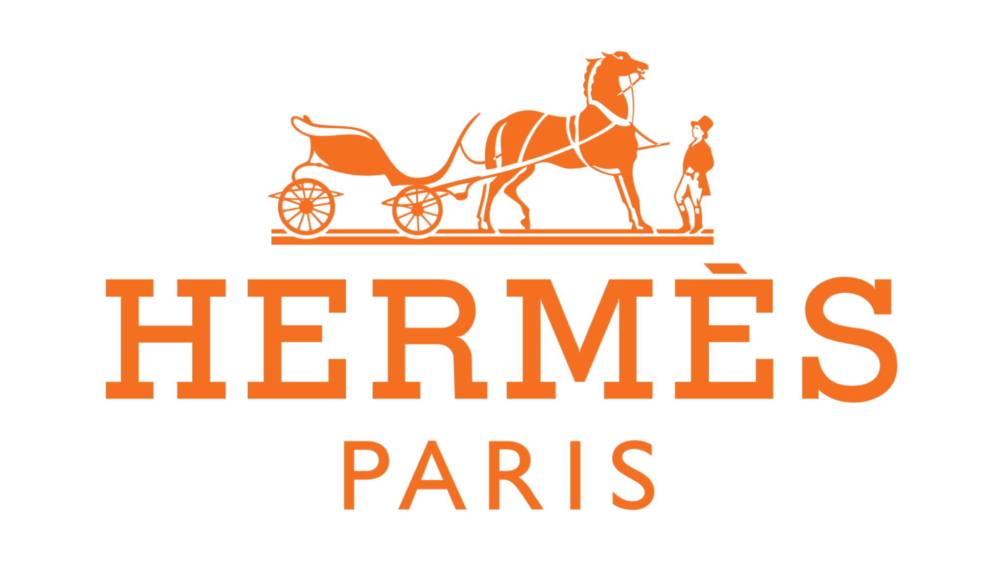
The current Hermès logo features a set of two ‘H’s, drawn from the family name, as well as a carriage with horses and a groom. This design pays homage to Émile Hermès, who founded Hermès as a harness workshop in Paris in 1837.

Design Origins: Equestrian Heritage and Its Influence on the Logo
As Hermès started out crafting harnesses and saddles for noblemen and their horses in the 19th century, it’s only fitting that the brand’s logo reflects these equestrian origins.
The central element of the logo is inspired by French artist Alfred de Dreux’s 1861 painting “Le Duc Attelé” (“The Hitched Duke”), which depicts a horse-drawn carriage awaiting its groom. Hermès’ creative director in the 1950s chose this image as it connected perfectly with the brand’s heritage.
By including visual references to its beginnings focused on equine equipment, Hermès gives a subtle nod to its history of outstanding leatherwork and dedication to the equestrian lifestyle.
:
| Year | Milestone |
| 1837 | Founded as a harness workshop |
| 1880 | Transitioned to luxury saddlery and bridles |
| 1900s | Branched into leather luggage and accessories |
This early company history laid the foundations for Hermès’ logo design, which gives a subtle nod to the brand’s origins while conveying luxury and refinement.
The Designer’s Vision: How the Logo Embodies Hermès’ Values
The current Hermès logo is largely credited to designer Ledoux, who envisioned the mark in the 1950s. He sought to encapsulate the Hermès spirit in a visual form.
This resulted in a logo that seamlessly blended tradition and modern simplicity through:
- Equestrian motif conveying luxurious heritage
- Sleek, capitalized typography implying contemporaneity
- Well-balanced composition communicating high quality
According to Ledoux, the logo aimed to reflect Hermès as:
“A house where everything was possible, where fantasy and whimsy could happily coexist with functionality and trust.”
Through this harmonious blending of fantasy and function, Ledoux brought Hermès’ values of creativity, craftsmanship and timelessness into the logo design itself.
The result is an iconic, memorable symbol where no element is arbitrary or meaningless. Even the slightest detail echoes Hermès’ commitment to outstanding luxury products.
Key Elements of the Hermès Logo: What Makes It Iconic
Several specific features of the Hermès logo contribute to its instantly recognizable visual identity. These strategic design choices give the logo its prestigious vibe.
The Carriage and Horse Symbol: A Tribute to the Brand’s Roots

The central image of a horse-drawn carriage in the Hermès logo pays homage to brand’s equestrian beginnings in the 1800s. This motif connects directly to Hermès’ origins in leather harnesses and saddles.
By retaining these initial product offerings in symbolic form, Hermès gives a subtle nod to its early company history. Simultaneously, the carriage implies refinement and tradition—values still associated with Hermès today.
This effortless blend gives the logo an elevated, sophisticated mood suited to a luxury maison. The equestrian reference and visual balance convey Hermès’ commitment to the horse and rider: its first and second priority since the company’s inception.
| Aspect | Contribution to Brand Identity |
| Carriage Shape | References early product focus and craftsmanship |
| Horse Image | Reinforces tradition and sophistication |
| Groom Figure | Connotes exclusivity and privilege |
Through these symbolic associations, Hermès packs heritage, quality and luxury into a compact, fuss-free logo.
Serif Typography: Why the Font Reinforces Tradition
The Hermès logo utilizes serif font styling with its capitalized rendition of the “H” from the family name.
This classic typographic look aligns perfectly with the brand’s tradition of outstanding leather pieces and commitment to doing things the right—if old-fashioned—way.
Unlike sleek, modern sans-serif fonts, serif styling has an elevated, historical mood suiting the nearly two-century-old brand.
Much like the logo’s equestrian vignette, the typography choice quietly signals that Hermès still holds the core values of its origins. Luxury consumers recognize and appreciate this dedication.
Symmetry and Balance: The Visual Harmony in the Logo
A sense of symmetry pervades the Hermès logo, with both sides mirroring each other precisely. This considered symmetry results in a balanced, aesthetically pleasing mark.
The two “H” letters have the same proportions, while the carriage vignette is a Palace Vis-à-Vis, indicating equal distribution. This harmony reflects Hermès’ holistic approach across all its products and functions.
Much like Hermès strives for excellence across all aspects of a product, the logo pursues aesthetic perfection through planned symmetry. This mirrors the meticulousness ingrained in the Hermès ethos.
Every aspect of the logo aligns cleanly, from the typography to the spacing around motifs. This coherence and consistency result in an instantly familiar symbol.
The Role of Color in the Hermès Logo Design
Color plays a crucial role in cementing the Hermès logo’s recognizability and connection to luxury. Specifically, Hermès’ distinctive burnt orange hue sets the logo apart.
The Hermès Orange: Why This Bold Color Choice Is Key
While initially a pragmatic choice during wartime material shortages, Hermès’ burnt “orange” hue has become an icon.
According to company lore, this distinct color entered Hermès’ repertoire in the early 20th century when supplies of other leathers ran short. As tan military cape leather was abundant, Hermès used this robust material instead.
The rich orange tone became an unintended but serendipitous design feature, giving Hermès leathergoods a signature colorful flair.
Fast-forward to today, and this vibrant orange shade permeates across Hermès’ branding and products. The leather logo plaque on a Birkin bag or the packaging ribbon around an Hermès perfume both utilize this tone conveying luxury and originality.
This bold color separates Hermès from competitors with more expected black, brown or tan palettes. By applying orange liberally, Hermès makes a confident statement aligned with contemporary tastes for braver hues.
Minimalist Use of Color: Contributing to Timelessness
While orange provides crucial branding, Hermès utilizes color judiciously in the logo itself. No overbearing palettes or gradients appear.
Instead, black and white dominate to ensure longevity no matter the trends. This reduction to basics, enhanced by a single tone, keeps the logo timelessly elegant.
Just as an Hermès Constance bag resists dating due to excellent materials, the pared-back logo cannot be pinned to any era or aesthetic.
This restraint with color also mirrors Hermès’ general avoidance of logos plastered across products. Understated and discreet, just like the Hermès ethos.
The Evolution of the Hermès Logo Design: Consistency in Branding
While fashion trends fluctuate dramatically, luxury heritage brands like Hermès focus on consistency in identity. This reliance on logo recognition cements the air of heritage and tradition.
However subtle, Hermès has evolved its logo over time while retaining its core symbolic associations.
How Hermès Has Kept Its Logo Consistent While Evolving Branding
Across nearly two centuries in business, Hermès has nurtured brand consistency through a near-unaltered logo. This breeds familiarity and reliability for the target ultra-high net worth audience seeking security.
Comparing early versions to today’s logo shows how changes merely enhance, rather than overhaul, the design:
| Early Logo | Current Logo | Brand Consistency Elements |
 |  | Carriage visual and serif “H” retained |
| Single color | Mainly black and white | Minimalist color scheme |
| Simplified line art visuals | Depth through detail | Equestrian motif remains |
Through stylistic upgrades enhancing gravitas, Hermès retains instant recognition while communicating heritage.
This balance helps sales: the logo plaque on a Birkin bag both cements exclusivity through legacy and appeals through elevated design.
Adaptation in Digital Platforms: Maintaining Recognition
In today’s digital age, brand consistency across mediums is a challenge. However, Hermès has adapted its logo successfully online by:
- Strategic animation: For digital channels like Instagram, the logo plaque subtly animates to mimic texture while retaining key identity elements
- Context sensitivity: On the Hermès website, the logo changes depending on page content through smart coding
- Link to e-commerce: Occasional seasonal animations connect digital presence to sales funnels
This agile adaptation keeps the Hermès essence at the fore while communicating digitally integrated omnichannel sophistication.
By leveraging the flexibility of online platforms cautiously, Hermès enjoys logo visibility with Millennial and Gen Z audiences on social media and webpages. This will spur continued sales via channels like the brand’s industry-leading e-commerce platform.
Designing for Luxury: Lessons from the Hermès Logo
The Hermès logo offers inspirational lessons for designers tackling any luxury branding project:
Simplicity with Meaning: Conveying Luxury Without Over-Complicating
The pared-back Hermès logo proves that conveying sophistication relies on meaningful symbols, not just flashy effects. Every visual element roots back to Hermès’ origins and ethos.
By focusing on simple but evocative details—like the carriage shape or groom figure—the logo gains an elevated mood. This allows luxury clients to appreciate the heritage and craftsmanship the brand embodies.
The Balance Between Heritage and Modernity: Ensuring Timelessness
Hermès strikes an enviable balance between heritage and contemporary aesthetics for enduring appeal. The logo features classic elements like serif typography and line art motifs while feeling current through abstracted minimalism.
This ability to blend eras gives the logo a timeless quality, enjoyed by traditional luxury consumers and newer audiences alike.
Any luxury brand can employ this technique of reworking signature historical brand assets within an abstracted or elevated setting suited to today. This exponentially boosts relevance and recognition.
Conclusion: An Iconic Emblem of Luxury Craftsmanship
Hermès’ logo beautifully telegraphs the brand’s values of peerless creativity and technique. With roots in Hermès’ origins, the logo builds desire and significance through smart design choices and consistency in branding application.
This commitment to an instantly recognizable logo serves Hermès’ clientele and commercial goals, cementing status and boosting sales.
For new brands seeking similar wins, Hermès’ logo evolution provides inspiration on cornerstones of iconic branding. Aspiring luxury purveyors can similarly employ timeless symbolic elements and consistent implementation to drive brand perception and buyer loyalty over centuries rather than seasons.
While fashions fluctuate, quality and considered design remain beloved. By learning from logos like Hermès’ and taking an iconic branding approach from the outset, modern brands set themselves up for success—no matter their size or scale.
Frequently Asked Questions
Q: What makes a logo iconic in the fashion industry?
A: Key elements for iconic fashion logos include simplicity, meaningful symbolism, clever use of negative space, bold color choices, and extreme consistency across years and mediums. By combining several of these strategic design aspects, brands like Chanel and Versace create memorable visual identities conveying their essence.
Q: How does digital transformation affect logo design for luxury brands?
A: Luxury brands must strike a balance between showcasing brand heritage and adapting their visual identity for digital-first modern buyers. Most retain core logo elements while elevating the design through subtle animation or digital enhancements. Hermès allows its logo plaque to shift textures on Instagram while linking to e-commerce funnels through the logo on its website.
Q: Can AI logo creators provide scalable designs for businesses of all sizes, from startups to luxury brands?
A: Yes, AI tools like ailogocreator offer an accessible way for companies to quickly ideate strong logo options tailored to their brand identity and goals. An AI logo creator can assess brand values and industry context to generate relevant, creative logo designs incorporating symbolic elements and aesthetics aligned to the brand essence. Theirseteq for rapid iteration saves costs and time.

Q: How can logos maintain consistency across different media platforms?
A: Strategic brand guidelines are crucial for consistency. These outline exact specifications for logo sizing, placement, color tones, typography and more across all offline and online touchpoints. Adherence to pre-set guidelines lets consumers instantly recognize the logo on platforms from e-commerce sites to social media, building familiarity.
Q: What are the benefits of using AI tools to experiment with multiple logo designs before finalizing one?
A: AI logo creators like ailogocreator facilitate rapid design iteration, allowing brands to see hundreds of unique logo options in various styles. This visibility empowers data-driven decision making to determine the best design direction before investing in full logo development and branding guidelines. The tech does the time-intensive design work, while humans direct the creative strategy.


CommentsTake the first comment