Peanut Butter and Jelly: This seemingly unexpected pairing of two unrelated foods is a recent innovation from the 1900s. It is now part of most household breakfasts. The art of mastering odd combinations extends to the use of colors. Going against the rules, like “Red & Green Should Never Be Seen,” can yield unique and eye-catching results. Moreover, finding the delicate balance between creativity and training gives character to logo designs.
Floral designers break the “Red & Green Should Never Be Seen” together rule. Their use of various color combinations, including red and green, to create a heartwarming bouquet is another example of how rules are easy to break as long as designers execute them with finesse. Using green and red in logo design can create striking and memorable visuals. Designers can use guidelines in this blog to salvage creative ways to induce harmony between red and green for logo design.
The Challenge of Using Red and Green Together
We must understand the challenges of creating a logo using a red and green color combination. Some are global, while others may be local. Only then can we fully grasp the essence of strategies to overcome these hurdles in logo design.
● Clashing Tones
Red and green are complementary colors. They lie on the opposite ends of the color wheel. For observers, it may seem that both are fighting over each other to grab your attention. Color experts refer to the phenomenon as visual tension. Placing them one over the other can cause observers to lose focus on the shape and details of the logo.

● Hues Are Too Close
Overcoming the challenge of how people perceive things in web design is vital for an attention-grabbing logo. The proximity of the hues of green and red can disorient users. Some observers might even look away due to the strain they cause the eyes. That is why fiddling with shades is vital to reduce visual tension.
● Cultural Associations
Whether it is Christmas or Valentine’s Day, red and green in these holiday events sets a context in the observer’s mind. It’s hard to perceive their use in other settings. A logo with a strictly red and green color combination is a challenge for designers as it’s possible to subconsciously invoke holiday imagery in the observer’s mind.

● Accessibility Concerns
Deuteranopia is a common color blindness that affects up to 1 in 12 males (8%) and 1 in 200 females (0.5%). It is also called congenital red-green color blindness. Considering these numbers, you are highly likely to encounter consumers who cannot distinguish between red and green in your logo when they are bright (hues have high saturation and low value). Design your logo while considering these factors to ensure your design looks appealing and accessible.
Strategy 1: Emphasizing One Color Over the Other
Mastering the art of combining two opposite colors, red, which symbolizes “Stop,” and green, which signifies “Go,” can go a long way in logo design. You can create a logo that will stand out from the sea of logos that use the traditional color palette. One way to do it is to emphasize one color over the other.
How Dominance Reduces Visual Clashing
Dominating one color over the other is a great way to reduce the visual tension that comes with red and green bright colors. However, the color dominance needs to take into account some factors to make them relevant to the brand:
- Brand Image: Dominate using the color that best represents your brand image. Red represents high energy, while consumers perceive green as calm and close to nature. Find the right balance that speaks for your brand.
- Connect with Consumers: Look into the cultural perception of colors within the target market. Check how locals embrace red or green in their daily lives. Ensure the color that connects most with them dominates the logo.
- Accents and Background: Red’s overwhelming intensity can appear too aggressive and loud. Using green as a subtle background or accent can create a duality that softens the logo design and makes it more approachable.
Case Study: 7-Eleven Logo – Dominance of Green with Red Accents
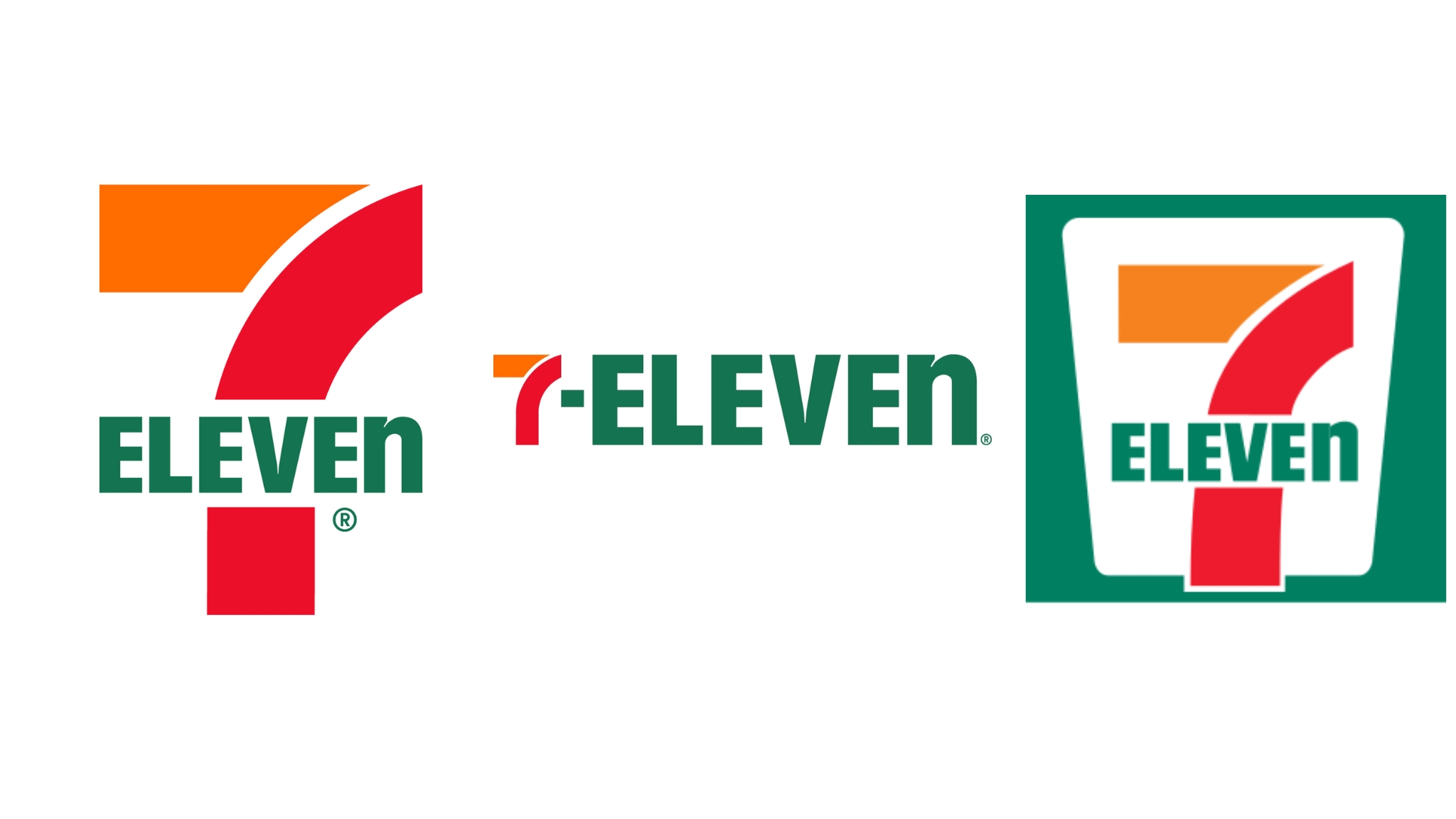
It’s hard to miss a 7-Eleven pilon sign while driving, and it’s not just because of a catchy name but an equally catchy logo. The intelligent use of the minimalist color scheme of red and green colors draws on-goers’ attention. The red catches your attention immediately, and then the subtle green uppercase text combines a welcoming tone with confidence.
7-Eleven’s latest logo design also sheds some weight by embracing the massive landslide of debranding campaigns. The initial design of 7-Eleven was predominantly green, which it uses as its background. They occasionally use the green background or complement it with green accents in their pilon sign board. Nonetheless, the 7-Eleven logo’s visually striking color combination, memorability, and minimalist design have captivated consumers over the decades. It’s a success story that uses intense red and green colors effectively to maintain brand identity and legibility.

Strategy 2: Incorporating Shades and Gradients
Another great way to include green and red in your logo is to use different shades and gradients. It will add depth to the logo design and cause them to complement each other. A darker green can induce emotions in the viewer, while red can bring attention to what matters.

Softening the Contrast with Subtle Variations
Red and green in their pure form are opposite of each other. However, logo designers can soften their appeal by using shades of red and green. Here are some ways to use these two colors:
- Gradients: Blend the two colors with a smooth transition to soften the edges.
- Pastels: Using pastels is an excellent way to muffle very forthcoming colors. It can make the logo look more cohesive and less jarring.
- Darker Shades: Add darker shades of red and green for elegance and sophistication. Crimson red and lime green are very disorienting. Meanwhile, burgundy and olive green can provide a modern aesthetic.
Here are some of the shades of red and green with hex code for reference:
| Shade of Red | Color (Hex Code) | Shade of Green | Color (Hex Code) |
| Crimson | #DC143C | Lime Green | #00FF00 |
| Scarlet | #FF2400 | Forest Green | #228B22 |
| Ruby | #D00000 | Olive Green | #6B8E23 |
| Maroon | #800000 | Chartreuse | #7FFF00 |
| Burgundy | #800020 | Emerald Green | #008000 |
| Bordeaux | #872E32 | Teal | #008080 |
| Rust | #B76E43 | Jade | #00A550 |
| Brick | #B22222 | Avocado | #008000 |
| Coral | #FF7F50 | Kelly Green | #4CBB17 |
| Salmon | #FA8072 | Grass Green | #7CFC00 |
| Tomato | #FF6347 | ||
| Cerise | #DE3163 | ||
| Magenta | #FF00FF | ||
| Cardinal | #D50000 |
Understanding the nuances of color combination is essential to creating a logo that speaks volumes. AI logo creators understand these details as trained on a large data set. Logo designers prompt AI with keywords and cultural information to achieve desirable results. Be sure to provide AI with the nuances to produce relatable results.
Case Study: Heineken – Dark Green with Subtle Red Accents
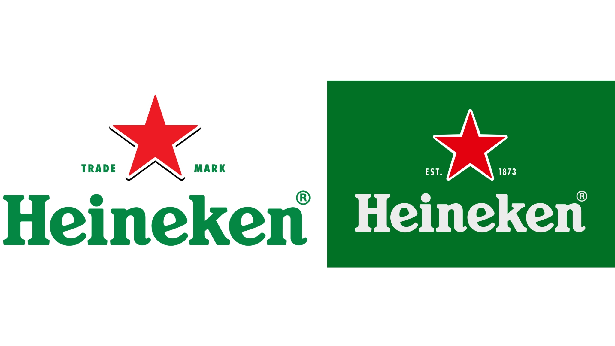
The Heineken symbol is also a great example of using color shades to create harmony amongst opposite colors. The bright red star sits on top of a deep green that softens the bright red. However, the striking nature of a bright red star still doesn’t mellow down. It captures the sign of anyone looking at the fridge for a drink.
Using colors adds depth and richness to the brand’s iconic look. As smartphone screens dominate how we consume content, Heineken has shifted towards the logo load-shedding approach to using more text than color. They have added depth to the start by adding a shadow and turning towards using a shade of green for their text. The change makes it more visually appealing for the audience on phones. You can never go wrong with using white as background.

Strategy 3: Utilizing Symbolism and Cultural Context
Designers are familiar with using red and green in flags and events. All you need is red and white stripes with a touch of blue for onlookers to see the national US flag. Similarly, green and red, separated by white, immediately remind us of the Mexican flag. There are tons of ways to evoke emotions in observers.
When Red and Green Represent More Than Just Colors
Logo designers can connect with the audience more profoundly by understanding the masses and their orientations. Designers can also use these colors associated with holiday events to add versatility to their logo design. Flexibility is essential in logo design, and some brands use flexibility by adding elements of the US flag on national days. However, there are more things to consider when using colors. Here are some examples:
- Christmas: Red represents the holy berry, and green symbolizes life and renewal.
- China: Red symbolizes good fortune and joy, while green represents growth and prosperity. Together, they often embody wealth and happiness. On New Year’s Eve, people share money-filled ornate red packets to ward off evil.
- Islamic Culture: Green symbolizes paradise, while red shows bravery. Their combination can convey deep spiritual meaning to the culture.
Case Study: The Italian Flag and Its Influence on Brands
Italian brands signify quality and engineering, which the Italians hold dear to their hearts. The use of their national flag colors in car logos is significant. They carry their national colors with pride and consider them their identity. Adding gradients and shades to green and red in a sophisticated, subtle way leads to a bold yet beautiful look. Their automotive brands, such as Ferrari, Fiat, Abarth, and Alfa Romeo, use these color combinations to invoke nationalism.
Key-Takeaways: Beyond the Obvious by Combining Red and Green
Combining the seemingly unrepairable colors can create a unique and memorable impression in the sight of observers. Designers can use AI logo creators to command them to use red and green with finesse. To eloquently and elegantly add red and green to your logo design using AI, consider the following:
- Understand Challenges: To find the right balance, consider the cultural, disorienting, harsh, opposite, and aggressive nature of red and green hues.
- Contrasting Colors: Dominate one color over the other to find a connection with the consumers.
- Shades and Gradients: Add shades and use gradients of color palettes to offset the various facts that make red and green an awkward combo.
- Harness Cultural Associations: Consider the target audience and use their cultural associations, such as holiday events, country flags, and religious or spiritual beliefs, to form a deeper connection.
- Accessibility Concerns: Considering that 8% of males and 0.5% of females may have color blindness, adjusting the colors to make green and red differentiable and still look amazing is a designer’s achievement.
Websites such as AILOGOCREATOR can add depth to your current logo or rough design. You can also prompt it with the correct use of red and green to generate logo designs that are highly customized, unique, and connect to your audience. AILOGOCREATOR is free to use, so feel free to experiment with designs. It is the ideal method to achieve desirable results.

FAQ:
- Why is the “Red & Green Should Never Be Seen” rule commonly followed in design?
The red & green should never be seen rule indicates the disorienting nature of bright red and green when placed together. Moreover, cultural associations, accessibility issues, and design complexity also contribute to the rule. While it’s a standard guideline, modern AI generators like AILOGOCREATOR can effectively utilize these seemingly opposite colors with careful consideration.
- What cultural or symbolic meanings are associated with red and green in branding?
Red and green colors carry rich cultural symbolism. In Western cultures, they link to Christmas. In China, they represent fortune and prosperity. In Islam, they symbolize paradise and bravery. Italian brands often use them to evoke nationalism. AI generators, such as AILOGENERATOR, can be valuable tools that can take prompts to understand these associations, helping brands connect with their target audience and create meaningful logos.
- Are there industries or sectors where using red and green in logos is more common or effective?
Red and green are commonly used in industries like food and beverage, health and wellness, and environmental sectors. Their vibrant and energetic natures align well with these themes. However, the effectiveness of red and green in a logo depends on the specific brand image and target audience. It’s essential to consider these factors when choosing colors for your brand.
- What are the psychological effects of red and green on consumers in logo design?
Red grabs attention and evokes excitement, urgency, and passion for sales or action. Green symbolizes growth, calm, and health, often linked to eco-friendliness. Together, they balance energy with tranquility, creating a compelling and harmonious feel that can attract a diverse audience while reinforcing brand positivity.
- How does colorblindness impact the perception of red and green logos, and how can designers address this?
Colorblindness, particularly red-green blindness, can make these hues indistinguishable, reducing logo clarity. Designers can address this by incorporating strong contrasts, distinct shapes, and textures, ensuring the logo is still recognizable. Using colorblind-friendly palettes and testing designs with colorblind tools helps maintain visual accessibility.


CommentsTake the first comment