Can you imagine an app with 430 million monthly active users suddenly deciding to change its logo? Instagram did precisely that and successfully pulled it off. It wasn’t a one-time event, as the platform has continually evolved its branding to stay relevant. They made drastic changes to their memorable Polaroid camera in the past, eventually ending up with a flat icon.
As a brand owner, you may observe most brands shedding graphic load off their logos and shifting to minimalist designs with meaningful depth. Brands may opt to change their logo design to overturn a negative reputation, change their vision, appeal to a larger audience, or ensure logo scalability. Instagram’s logo change also has a story and important lessons for brands. Let’s discuss it in this blog post.

The Journey of an Iconic Logo
Instagram’s Impact on Digital Landscape
The impact of Instagram on the digital world is worth discussing. A mobile check-in app that Kevin Systrom and Mike Krieger developed in 2010 now has 1.3 billion image uploads daily. Celebrities, politicians, media publications, and brands leverage the image-sharing platform to connect with people through visual and auditory experiences. Instagram’s interactive experience makes it iconic.
Logo Change Indicating Growth and Adaptability
While users may resist change, courageous brands can envision prospects and take risks to yield results. Instagram’s bold logo evolution reflects its growth and ability to adapt to the changing dynamics of social media platforms and technology. The main driving forces for the change were display technologies, user perception, and competing brands. Instagram remained true to its core identity while being open to change.

Logo’s and Brand Identity in Social Media
Social media platforms have a global outreach, and Instagram is no different. It has the most users, approx 385.4 million in India, followed by the United States, Brazil, Indonesia, and Turkey. Finding relevance and establishing a brand identity that connects with such a large and diverse audience is vital. In a sea of content, instant logo recognition from users means you have established your foothold.
In one Medium post, “We also asked people at the company to draw the Instagram icon from memory in 5 seconds. Almost all of them drew the rainbow, lens, and viewfinder.”
Key Takeaway: With such an impactful logo, Instagram still made the switch to stay relevant.
The Origin: Instagram’s First Camera Logo
Retro Camera Logo and Challenges
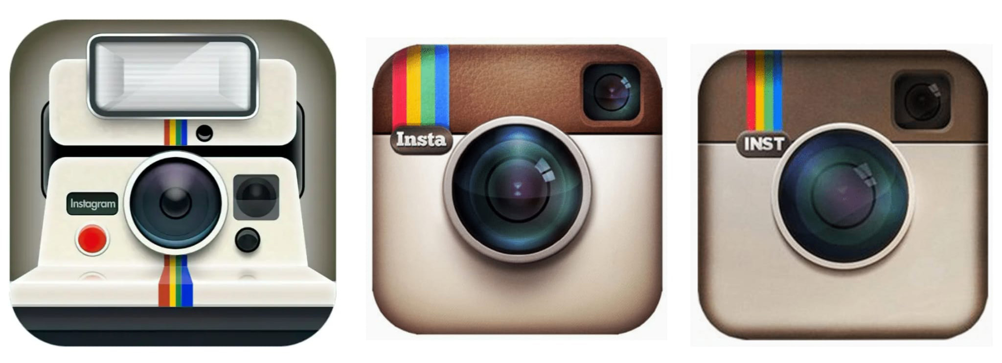
The retro “Polaroid Land Camera 1000” inspired Instagram’s first-ever logo. However, they switched to a newer-looking Polaroid camera that kept the rainbow stripes, viewfinder, and lens from the classic version. The first switch was mainly to avoid any potential trademark issues. The purpose was to generate a logo reflecting Instagram’s photography focus while ensuring legal protection. Another reason was to connect better with the evolving world. “Less is more” was a driving force in combination with the legality issues that hastened the process.

Simple and Nostalgic
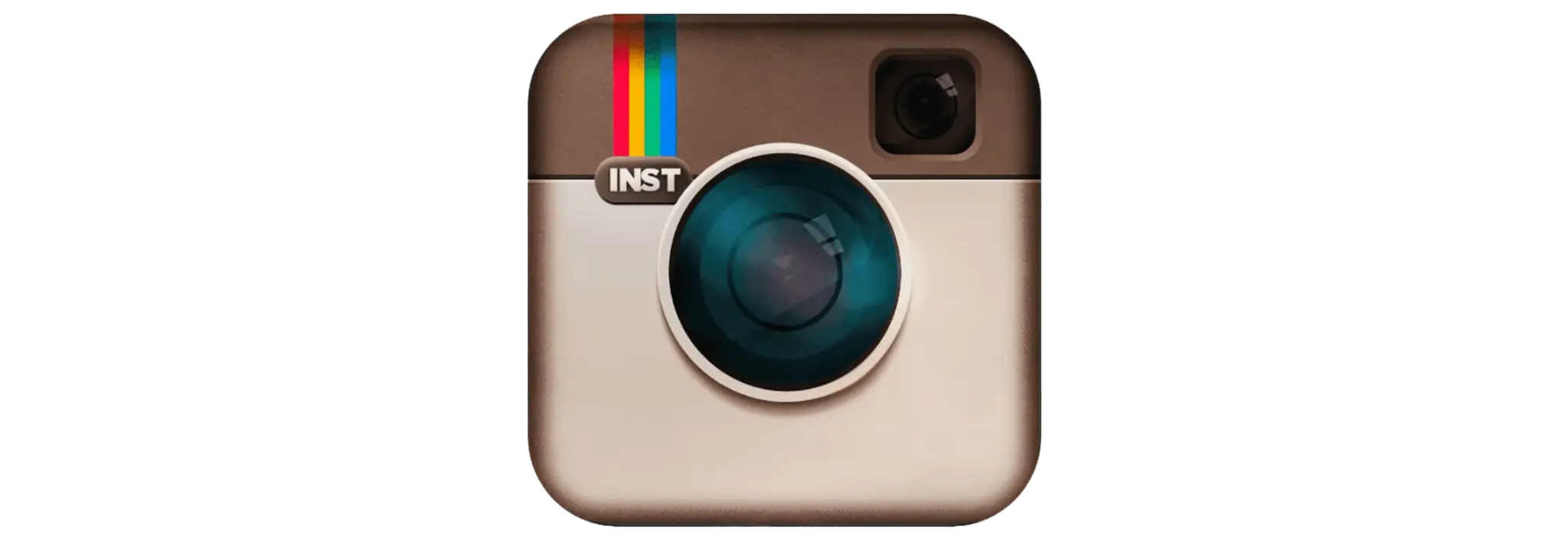
Cole Rise, their logo designer, chose a simple, vintage Bell & Howell camera-inspired logo. The purpose was to bring back nostalgia for the adults and connect with the younger generation. The beige and brown logo stood out in all screen sizes. It retained the rainbow strip on the top-left corner and switched to the more straightforward “INST” in sans-serif.

However, the third switch was just the addition of details, like adding leather texture to the brown and adding more depth and clarity for the remaining objects. The lens looks more vibrant, and using “Insta” felt more relatable to the audience. The rainbow stripes were more comprehensive, and the lens stood out more. The purpose was to improve the visuals and impact of the icon within the multitude of app icons on one’s smartphone.

The Transition to Flat Design: A Bold Move in 2016
Why the Switch to Modernized Logo
Meta, formerly known as Facebook, acquired Instagram in 2012 to ensure Facebook’s dominance in image-sharing applications across platforms. With a bigger team and resources at Meta, shifting to flat aesthetics from the skeuomorphic design was strategic and aligned with the industry’s trends.
Microsoft, Apple, and Google were the driving forces behind the switch to flat logos. They played a significant role in popularizing flat design. Their adaptation of flat aesthetics in their logos, applications, and banners led others to follow. Their driving force was to reduce the visual clutter, which led to memorability, easier recognition, and cleaner aesthetics. Users were starting to perceive skeuomorphic designs as old and outdated. Instagram had to move towards a modern approach to logo design before it became irrelevant.
Vibrant Color Gradient
The vibrant switch to the color-rich flat Instagram icon was made in 2016. Marcos Vinícius de Souza Vieira’s design brought a fresh look to the platform, catering to viewers’ changing visual canvas like smartphone, tablet, and laptop displays. The change eliminated any typography and resemblance to real-world objects. The aim was to attract a global audience with their new approach.
The brand’s colors speak a lot. The gradient blends pink, purple, and orange hues and represents creativity, energy, and a dynamic user experience. The colors stand out on any mobile device, and the contemporary look resonates with Instagram’s diverse and global user base. In 2022, Instagram again made a subtle change to its logo. The blue was reduced while the pink and yellow shades were brightened.
Initial Backlash
Resisting change is human nature. An initial backlash to the change in the skeuomorphic design was expected. The first sentence in everyone’s mind is, “Why Did They Have to Do This? ” Humans perceive change as a loss of control. Most users are comfortable with the previous design, as navigating and spotting on their devices is more accessible. It takes time to adjust to the new logo, maybe just a few more seconds than usual, but it’s an irritating change for some.
Emotional attachment to things is another factor that resulted in the backlash. People can feel like they are losing the connection with the app that evokes memories and feelings. The change can make people feel like it’s a loss. Brands should consider the following factors that could potentially cause a backlash and form a strategy to launch their new design:
- Fear of Unknown
- Status Quo
- Loss of Control
- Familiarity
- Cognitive Effort
- Trust and Credibility
- Perceived Value of Visuals
Instagram Confidence in Change
The Instagram team knew that the backlash was bound to happen. They understood that their brand fanbase would still hold, and they could connect better with the newer audience. The newer generation is more inclined towards change and being different. There is also a significant shift towards minimalism and contemporary aesthetics. As the tide was just turning, Instagram found the perfect time to switch, and they had a loyal fan base to execute the maneuver.
Key Features of Instagram’s Current Logo Design
The new Instagram logo looks simple but has a lot of depth and versatility. It allows creators much freedom to use the logo in unique situations. The Instagram logo will always stand out, regardless of the background color.
Simplicity and Versatility
The logo is a simple Glyph of the camera over a colorful gradient. Instagram had to ensure its logo was simple yet unique to stand out from Camera applications on smartphones or computers. Using a simple camera icon resembling the modern era’s DSLR camera could easily be mixed up with the Android or iOS default icons. Instagram chose to stick to the roots with its classic camera look, which has a square shape with the camera right at the center.

The new design approach helped Instagram develop a Glyph that could overlay videos for branding and ensured that the app logo worked across platforms.
The Role of Gradients in Branding
The Instagram icon has tons of psychological effects. Its gradient color palette plays a crucial role in emotional appeal and branding. Here are the top reasons why Instagram went for the Pink, Purple and Orange:
- Creativity and Inspiration: You can observe perseverance by setting any other icon beside the Instagram icon. The Instagram icon gives off a creative vibe and a fun app aspect, while the other icons look more like tools.
- Energy and Excitement: The older Instagram icon with the retro camera had an exciting or intriguing look rather than the energy-filled look of the new logo. The use of colors induces an exhilarating feeling of exploration and experimentation.
- Modern and Trendy: The younger audience is interested in the bold and new. The use of colors in application logos is increasing, making it easier for logos to stand out if it’s catchy and modern.
- Color Impact: Pink is often associated with love, nurturing, and compassion. Purple represents imagination, wisdom, and spirituality. Orange signifies enthusiasm, adventure, and sociability. Together, these three colors portray sophistication, engagement, and calmness.
Scalability and Digital Optimization
Shedding a load of logos or logo debranding affects all fields. The purpose is to ensure scalability. 35.21% of the world’s 5.68 billion active mobile phone users access Instagram regularly, which means the logo should be relevant to small screens. However, it should also be able to expand on large screens and remain familiar. The current flat Instagram logo excels in small-screen usability and iconography.
Lessons from Instagram’s Logo Evolution for Designers
The Importance of Staying Relevant
As logo designers, sticking to one logo can sometimes make you irrelevant. The competition is ever-growing, and adapting to users’ fresh perspectives is critical to a successful business. The modern generation wants to be unique and have an outstanding identity. Instagram has users from Gen Z and Millennials alike. Striking a balance between functionality and modernity while adapting to change will help brands stay relevant.
User Feedback as a Guide
Instagram’s logo evolution story started in 2010 and is an excellent example for brands. Instagram is good at redesigning a logo and still successfully maintaining relevance. Many users resisted their design evolution. Acknowledging the user feedback in Instagram’s design change process can help other brands avoid potential pitfalls. It’s essential to find the right conditions to launch a change.
Balancing Heritage and Innovation
Instagram never let go of its Polaroid camera look. Despite the ever-changing camera perspectives, Instagram maintained its brand logo. They skillfully added colors that spark curiosity, excitement, engagement, and playfulness to a logo that still contained the heritage element. Brands should never let go of their core values as a compromise to innovation. Find innovation with heritage!
How AI Tools Like AILOGOCREATOR Can Simplify Logo Redesign
Redesigning can be hectic. There are many factors to consider, and hiring a designer to make multiple logo designs can be expensive. Meta is a big brand, and they have the resources to pull off a logo change by hiring designers. However, small businesses can use modern AI tools like the AILOGOCREATOR to hasten the logo design process.
AI’s Role in Predicting Design Trends
AI is a program that learns patterns and trains itself. Its ability to learn through training is exceptional. Users can use the Instagram logo design philosophy to generate their logo design. Simply prompting the AI with keywords that inspire modern logo redesigns is enough to provide many examples for reference.
Quick Prototyping for Logo Updates
The key advantage of AI is its ability to generate multiple logos with simple commands. It can form relations and observe patterns in seconds to generate prototypes that designers can draw inspiration from. For businesses planning to create a logo with AI, further refinement through prompts can lead to an impressive final design.
Example Prompt:
Here is an example of a prompt that can generate possible outcomes for Instagram logo design iterations:
“Design a sleek, modern logo inspired by Instagram’s evolution. Use vibrant gradients minimalistic shapes, and ensure scalability for digital platforms.”

Conclusion: Instagram’s Logo as a Case Study for Future Branding
Instagram has a significant impact on the digital landscape. Users spend an average of 33.9 minutes daily on Instagram and Influencers to engage audiences for a lucrative career. Instagram, launched in 2010, has gone through iterations of design to its modern form. It shows brands’ growth and adaption to the tech trends. They have kept their logo recognizable while switching from skeuomorphic to flat icons.
The world is shifting to flat icons and minimalist design owing to the driving force of popular brands like Apple, Google, and Microsoft. Instagram’s switch to the modern flat icon with vibrant gradient in 2016 was a bold move, but it was done with finesse and timing. Brands can use these examples to create logos that stick.
We recommend using AI tools like the AILOGOCREATOR to find their new adaptive and innovative logo design. Design your logo with AILOGOCREATOR to explore endless creative possibilities.
FAQ
- What was the primary inspiration behind Instagram’s original camera logo?
It was to connect with the audience at a nostalgic level. The retro Polaroid Land Camera 1000 was a recognizable object. Instagram thought to provoke the idea of accessing a real Polaroid camera through the application. However, there was a complication that could lead to trademark issues. Brands can use AI logo creators like the AILOGOCREATOR to avoid such instances, as they provide unique and versatile logos for inspiring ideas and creativity.
- How did the public react to Instagram’s 2016 logo redesign initially?
The public initially reacted with significant backlash to Instagram’s 2016 logo redesign. Many users were upset, feeling a loss of familiarity. The new flat design and vibrant gradient departed from the skeuomorphic, nostalgic original. Emotional attachment and the sudden change led to discomfort and resistance, highlighting the challenges brands face when updating iconic visuals. AI logo creators like the AILOGOCREATOR can help soften the transition by adding elements that reduce backlash.
- Why are gradients so commonly used in modern logo designs?
Using gradients makes logos eye-catching. It’s rare for someone to set their background in high contrast and bright colors. Instagram is a great example. Their logo stands out on any screen as users typically have darker backgrounds, and having multiple colors helps icons pop up. AI logo designers like the AILOGOCREATOR can help create these logos by simply adding popping gradient colors.
- What tools can brands use to prototype logo designs quickly?
Prototyping is expensive and time-consuming. Logo designers need feedback from brand management to finalize a design. An AI logo maker like the AILOGOCREATOR is an excellent prototyping tool. Users can prompt iteratively to produce multiple logo designs for quick selection or inspiration.


CommentsTake the first comment