Logos are more than just symbols; they are the essence of a brand’s identity, carrying values, mission, and credibility. In a world saturated with countless brands, an iconic logo serves as a beacon, distinguishing a company from its competitors and creating a lasting impression in the minds of consumers.
Google’s logo stands as a testament to the power of effective brand identity. As one of the most recognized logos globally, it represents not just a tech giant but also a cultural phenomenon that influences our daily interactions with technology. Understanding its journey offers invaluable insights into the branding strategies that can elevate a company’s market position.
II. The Birth of Google and Its Initial Logo
A. Early Years and Initial Designs
1. The Humble Beginnings
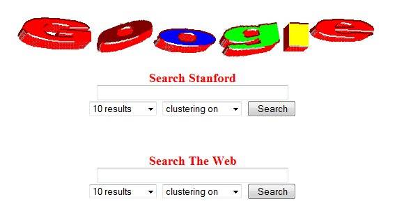
The original Google logo, conceptualized in 1998 by co-founders Larry Page and Sergey Brin, was developed with minimal resources using the free graphic design tool GIMP. The then-primary focus was on functionality over formality, with the logo incorporating a playful color scheme that hinted at the creative, boundary-breaking path Google intended to carve in the digital world.

2. The Ruth Kedar Influence
By 1999, Google approached graphic designer Ruth Kedar to refine its logo. Her design introduced the now-familiar multicolor scheme, representing a departure from conventional primary color usage. The use of non-primary colors in specific letters signified the company’s intent to innovate beyond traditional bounds. The font used during this phase had a Catull typeface, giving the logo a sophisticated yet approachable aesthetic.
1997 year:
III. Evolution of Google’s Logo: Milestones and Redesigns
A. The Gradual Evolution of Google’s Logo
1. Subtle Tweaks for a Modern Era
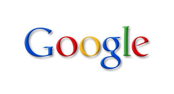
From 1999 to 2010, the Google logo retained its core characteristics but underwent subtle shading and dimension additions. These changes included a shadow effect introduced in 2010, which aimed to give the logo a more three-dimensional appearance. While these modifications were minor, they indicated Google’s sensitivity to design trends and versatility in changing digital landscapes.
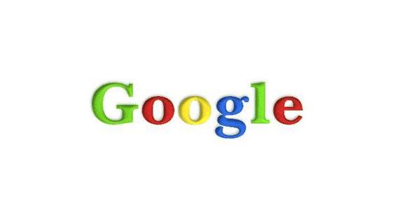
1998 year:
1999 year:
The logo has been upgraded again. The new logo re-coloured the letters, followed by an exclamation mark, apparently inspired by the Yahoo logo of the time.

1999year-2010year:
2. The 2010 Update: Flattening for Simplicity
In 2010, Google introduced a significant update, eliminating the drop shadow. This made the logo flatter and more in line with contemporary design simplicity. This shift was a response to the growing move towards minimalism in digital spaces, reflecting the company’s commitment to streamlined user experiences.
2010year-2013year:

3. The 2013 Iteration: Preparing for Change
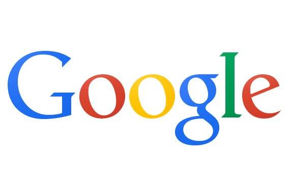
In 2013, another subtle change brought tighter kerning and a slightly modified color palette. This version aimed at modernizing the logo, preparing it for the more substantial changes on the horizon. These subtle tweaks were indicative of Google’s strategic planning, allowing users to slowly adjust to evolving branding while maintaining a sense of familiarity.
2013:-2015year:
Both the shadows and the 3D effects have been removed in this version, leaving only a minimal look. This is also in line with the most popular flat UI design style at the moment.
B. The Major Redesign in 2015
1. A New Era with a Sans-Serif Typeface
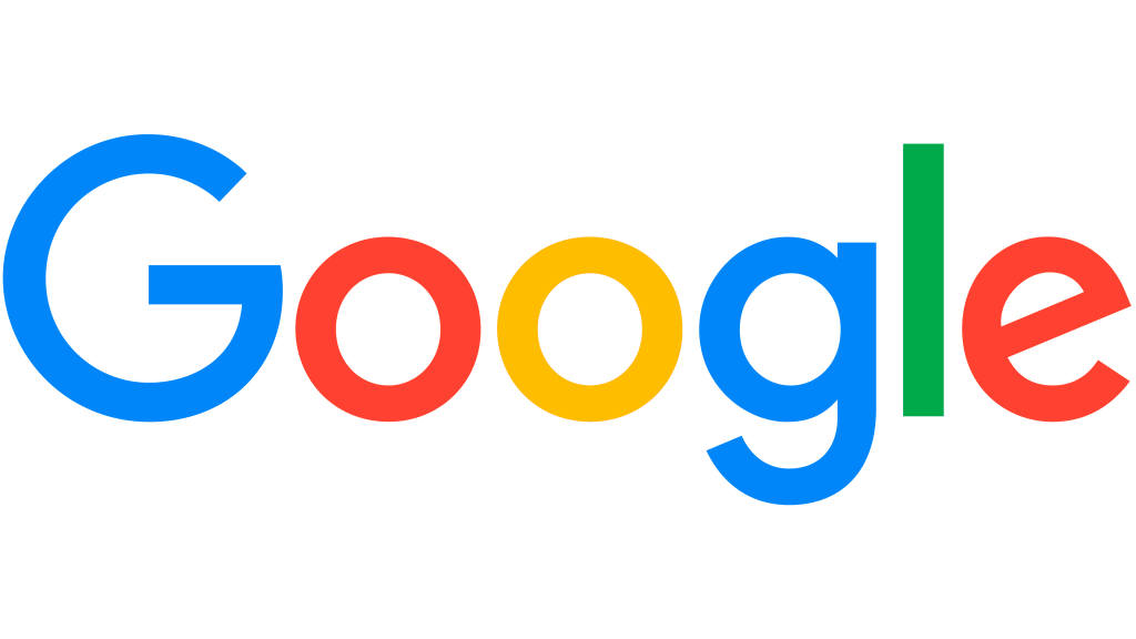
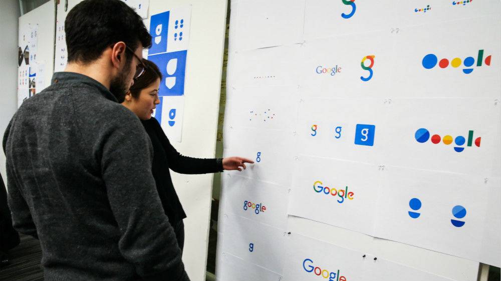
The most substantial logo update occurred in 2015, marking a pivotal moment in Google’s identity evolution. This redesign introduced a sans-serif typeface known as Product Sans, offering a clean and modern look. This change was not just aesthetic; it symbolized Google’s adaptability in a shifting technological landscape, with a renewed emphasis on readability across diverse screen types, from watches to widescreen monitors.
2015-Present:
2. A Symbol of a Unified Ecosystem
Alongside typography changes, this redesign also included a shift in structural representation. The redesign represented not just a visual update but a strategic alignment with Google’s broader mission—reorganizing its ever-expanding suite of services under the parent company, Alphabet. The simplified and more geometric look of the logo signified unification and fluidity, qualities that reflected Google’s evolution from a search engine to a multifaceted technology leader.
C. The Role of Design in Google’s Brand Strategy
1. Reflecting Corporate Values
Throughout its various redesigns, the Google logo has been a reflection of its underlying corporate values: innovation, simplicity, accessibility, and adaptability. Each iteration has reinforced Google’s focus on functionality while advancing aesthetic appeal and technology integration. The logo acts as a visual narrative of Google’s journey from a search engine startup to a giant in the tech industry.
2. Adapting to User-Centric Trends
Google’s logo changes align closely with shifts in user expectations and digital technology trends. The updates are a testament to Google’s commitment to user-centric design, ensuring that branding elements do not hinder but enhance interaction. Whether on a desktop or a mobile interface, Google’s logo remains a consistent yet flexible symbol of the company’s ethos and ambition.

IV. Design Philosophy of Google: Simplicity and Functionality
A. Embracing Simplicity: Less is More
Google’s commitment to minimalism underscores its design philosophy. By eliminating unnecessary complexity, Google ensures that its interfaces, including its logo, are straightforward and user-friendly, enhancing user experience without distraction.
B. Functional Excellence: Beyond Aesthetics
The functionality embedded within Google’s design principles ensures that beauty never compromises usability. The logo’s simplicity facilitates seamless integration across various applications and devices, maintaining visual integrity regardless of size or medium.

V. Elements of the Google Logo: Color, Font, and Layout
A. Psychological Impact of the Color Palette
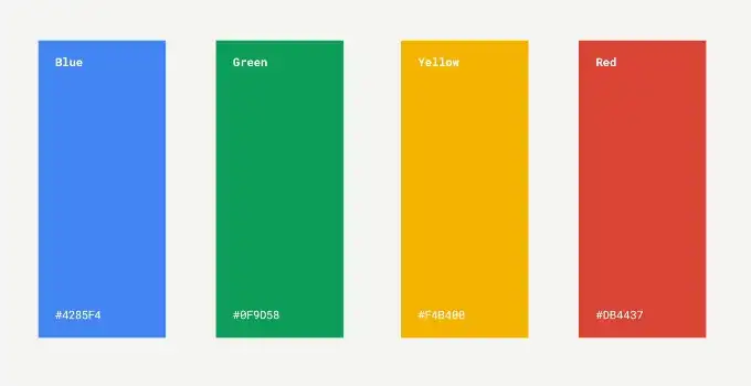
The Google logo’s color scheme—blue, red, yellow, and green—plays a crucial role in its identity. These colors invoke trust, warmth, innovation, and growth, resonating with Google’s vision and engaging users on a psychological level.
B. Typography and Its Reflection of Identity
The transition to a sans-serif typeface in the 2015 redesign marked a significant shift towards modernity and clarity. This choice of typography aligns with the digital age, reflecting efficiency and forward-thinking ethos that defines Google.

VI. Google Logo’s Adaptability Across Platforms and Media
A. Consistency in a Multichannel World
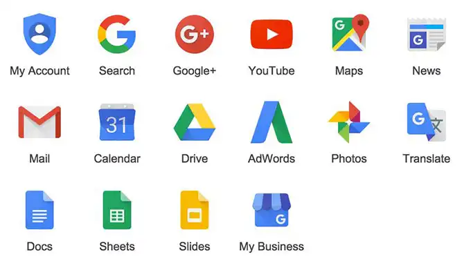
The logo’s adaptability is crucial for maintaining brand consistency across a myriad of digital touchpoints, from mobile applications to wearable technology. This cross-platform uniformity ensures that the Google brand remains instantly recognizable anywhere.
B. Innovations and Adaptations in Media Presentation
Google’s innovative approach includes interactive elements such as Google Doodles, showcasing the logo’s flexibility and ability to engage audiences creatively while maintaining core brand integrity.
VII. Market Influence and Global Recognition
A. Establishing Global Brand Consistency
The consistency of the Google logo across international markets underscores its role in fostering a cohesive brand experience. Its visual familiarity transcends languages and cultures, contributing significantly to Google’s universal appeal and trustworthiness.
B. Strategies for Sustaining Market Influence
Google employs strategic updates to its logo as part of a broader effort to refresh its brand image periodically, ensuring relevance in evolving market dynamics while reinforcing customer loyalty and brand equity.
VIII. Lessons from Google’s Logo Design for Other Brands
A. Insights Into Effective Logo Design
Google’s logo offers vital lessons in achieving simplicity without sacrificing identity. The balance of aesthetics and functionality serves as a blueprint for brands striving to create memorable and effective logos.

B. Leveraging Technology in Logo Creation
For brands seeking to emulate Google’s success, tools like AILogocreator.io enable the creation of professional logos, drawing on Google’s principles of functionality and simplicity through AI-driven design capabilities.
IX. The challenge is to design a logo that is “great” like Google
A. Design tools:AILogocreator.io
AILogocreator.io demonstrates how artificial intelligence can streamline the design process, offering businesses intuitive tools to develop compelling brand identities even without specialized design skills.


B. Step-by-Step Guide to Using AILogocreator.io
- Text to Logo: Input business details to generate tailored logo suggestions.
- Style and Color: Choose from a variety of styles and color schemes aligned with brand identity.
- Customization: Fine-tune fonts and design elements for a personalized touch.
- Preview and Adjust: Make real-time adjustments with instant feedback.
- Download: Secure high-resolution logo files ready for any application.
Design case:

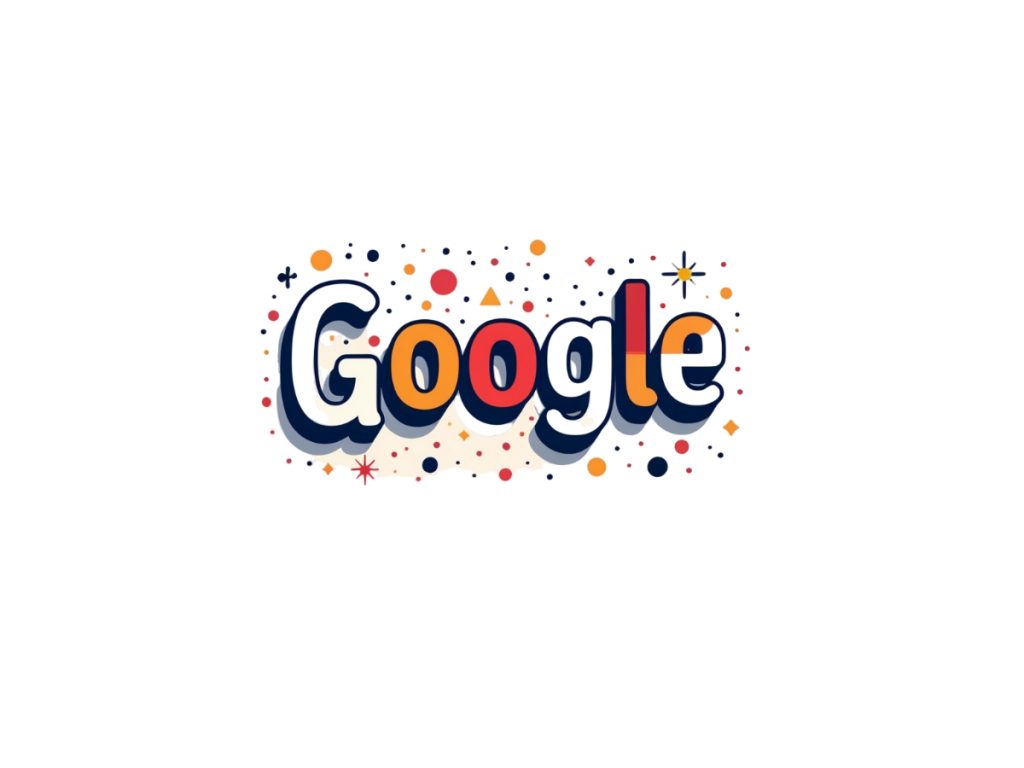
X. Unveiling Google’s Logo: More Than Just a Design
A. Beyond Aesthetics: The Emotional Connection
The Google logo encapsulates more than visual appeal; it builds an emotional connection with users, evoking memories and trust that transcend the online search experience.
B. Alignment with Brand Values
Google’s logo is an embodiment of the brand’s core values: innovation, accessibility, and simplicity. Its enduring relevance reflects Google’s ability to adapt while remaining true to its founding principles.
Q&A
What are the key elements of the Google logo?
It features a harmonious blend of a vibrant color palette, modern sans-serif typography, and a minimalist design—all embodying accessibility and innovation.
Why did Google change its logo?
The changes reflect technological evolution and the need to stay relevant, ensuring that the logo is functional, aesthetically pleasing, and consistently aligned with the brand’s mission.
How does color psychology affect logo design?
Colors play a pivotal role in shaping perceptions, conveying emotions, and building connections, making them essential in establishing a strong brand identity.
What is the significance of minimalism in logo design?
Minimalism fosters memorability and flexibility, allowing logos to be impactful and versatile across diverse platforms and media.
How do you create a professional logo without design skills?
With platforms like AILogocreator.io, users can craft professional-grade logos by leveraging AI-driven insights and design features, simplifying the creative process.
A collection of Naxue logos used by Google
From Google Doodles
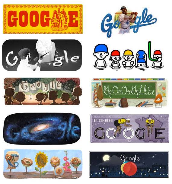
Google’s first logo doodle

Graffiti on French National Day 2000

Google’s first dynamic doodle

Austrian National Day 2018 October 26, 2018

Teacher’s Day (Australia) 26 October 2018

–
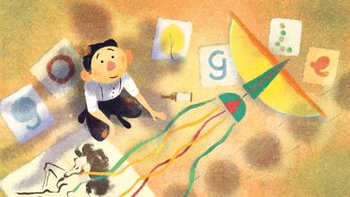
The 108th anniversary of Wong’s birth, October 25, 2018

In memory of Zinaida Ermolyeva, October 24, 2018

Children’s Day 2018 (Australia) 24 October 2018

沙姆苏尔·拉赫曼诞辰 89 周年2018年10月23日
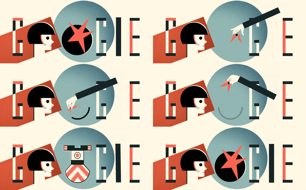
The 124th anniversary of Stepanova’s birth October 22, 2018

Mother’s Day 2018 (Argentina) October 21, 2018

Laura Esther Rodríguez Dulanto’s 146th Birthday 2018年10月18日

93rd Anniversary of the Birth of Prof. Dr. Rawee Pawila 18 October 2018

Chiquinha Gonzaga’s 171st Birthday 2018年10月17日

Lachhu Maharaj’s 74th Birthday 2018年10月16日

2018 Luxembourg General Election October 14, 2018

In memory of Roberto Clement October 12, 2018
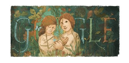
Lucy Tejada celebrated the 98th anniversary of her birth on October 9, 2018

Thanksgiving Day 2018 (Canada) October 8, 2018

Croatian Independence Day 2018 October 8, 2018
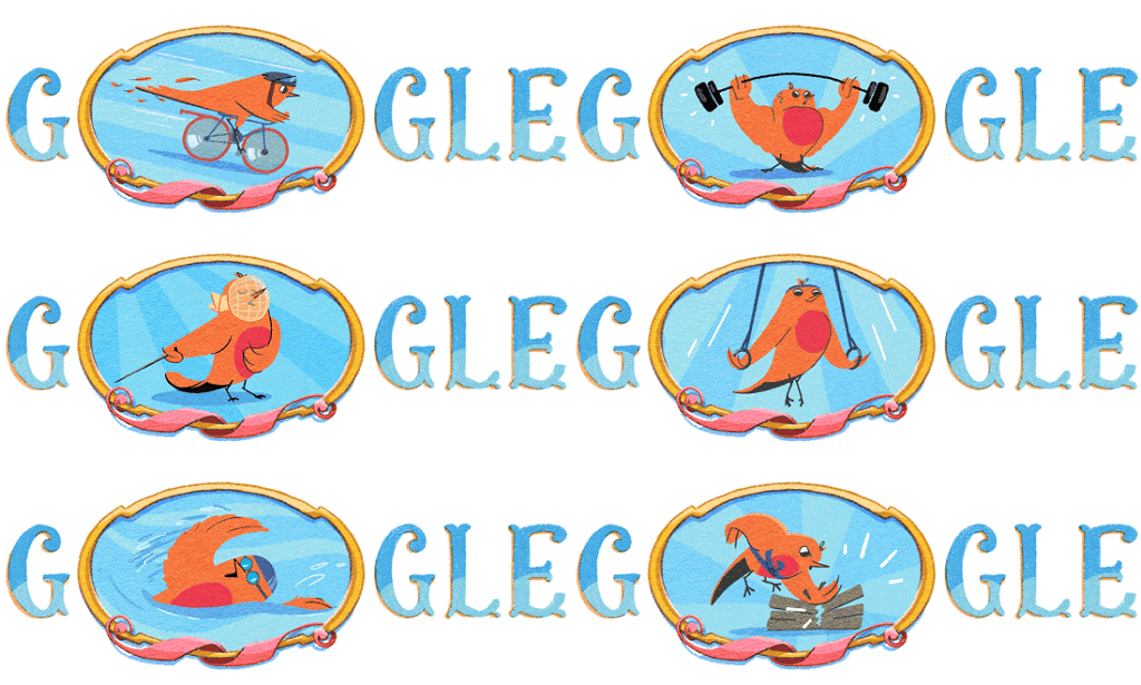
2018 Summer Youth Olympic Games October 6, 2018

German Unity Day 2018 3 October 2018

Grandparents’ Day 2018 (Italy) October 2, 2018
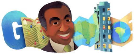
In memory of Milton Santos October 1, 2018

Nigerian Independence Day 2018 October 1, 2018

100th Anniversary of the Birth of Dr. Govinda Heyu Wangkataswamy on 1 October 2018

Helia Bravo Hollis celebrates the 117th anniversary of her birth on September 30, 2018

2018 U.S. Voter Registration Day, September 25, 2018

Monument to Altamira Cave September 24, 2018


CommentsTake the first comment