Logos serve as the cornerstone of brand identity, acting as the visual representation of a company’s mission, vision, and values. In this landscape, Taco Bell stands out not only as a fast-food giant but as a brand whose logo has made significant contributions to its global recognition and success. Founded in the 1960s, Taco Bell has grown into a worldwide phenomenon, partly due to its effective branding strategies. By reviewing the evolution and impact of the Taco Bell logo, we can better understand its essential role in branding and consumer perception within the fast-food industry. The Taco Bell logo has continuously adapted to reflect contemporary design trends and cultural nuances, making it more than just a symbol but a link between consumers and Taco Bell’s vibrant, innovative spirit.
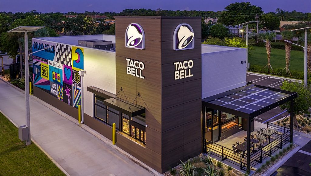
In today’s competitive market, logos do more than just differentiate one brand from another. They need to tell a story, inspire trust, and create an emotional connection with consumers. Taco Bell’s logo has succeeded on all these fronts, evolving from its humble beginnings into a global icon. The intricate design details and cultural symbolism embedded within the Taco Bell logo reveal much about the brand’s journey, successes, and aspirations.
The Birth of Taco Bell
The story of Taco Bell begins in 1962, with its founding by Glen Bell in Downey, California. What started as a single taco stand has grown into a global powerhouse synonymous with Mexican-inspired American fast food. Glen Bell was no stranger to the food industry; before launching Taco Bell, he owned and operated Bell’s Drive-In and Taco Tia. His fascination with Mexican culture and cuisine drove him to create a dining experience that was both exotic and accessible to the American public.

The original branding and logo for Taco Bell were consistent with its goal of blending Mexican and American cultures. The early logos featured traditional Mexican elements, such as a mission-style bell and sombrero. These designs aimed to capture the essence of Mexican cuisine while making it approachable for an American audience. The bell became central to the company’s identity—a nod both to its founder’s name and to a common icon in Mexican architecture.

The journey of Taco Bell’s branding was not merely about creating a logo and a catchy slogan; it was about crafting an identity that resonated with consumers. From the outset, Glen Bell sought to create a brand that wasn’t just about serving food but about offering an experience. The original logo captured this vision succinctly, encapsulating the spirit of Mexican hospitality in a form that appealed to a diverse audience.
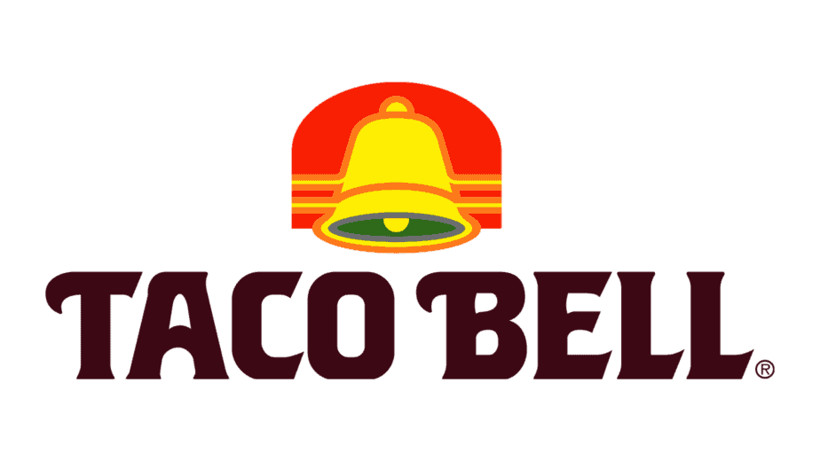
In examining the early phases of Taco Bell’s logo and brand strategy, we see the foundational principles that would guide the brand’s future iterations. The emphasis on capturing cultural authenticity while delivering a modern dining experience was seminal in creating a logo that would become recognized worldwide. These early branding efforts laid the groundwork for a logo that would go on to embody the spirit of youthful exuberance and cross-cultural fusion, key elements that characterize Taco Bell today.
Evolution of the Taco Bell Logo
Over the past several decades, the Taco Bell logo has undergone numerous redesigns, each iteration aligning with broader cultural and brand-specific evolution. From the 1960s onward, the logo witnessed various design shifts tailored to meet changing consumer preferences and market dynamics.
The 1980s and 1990s were crucial eras for Taco Bell’s logo transformation. As fast food chains became more competitive, Taco Bell recognized the need to keep pace with rapidly evolving design trends. The logo from this time removed some of the more traditional elements in favor of a modern, streamlined look. Its revamped design was less about explicit cultural references and more about capturing an energetic and vibrant spirit. Bright colors and bold fonts took center stage as the brand transitioned into a contemporary icon that appealed to younger audiences.

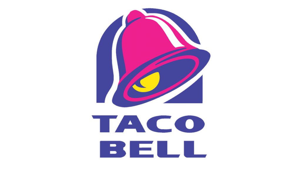
In 1995, the brand embarked on another significant redesign by introducing a logo characterized by purple, yellow, and red hues—a palette that reflected boldness and flair, setting it apart in the fast food industry. This version of the logo distilled the brand’s essence down to its most recognizable element: the bell. Emphasizing the bell allowed the brand to maintain a connection to its roots while offering flexibility across various marketing platforms, from television ads to packaging.
The 2016 update marked a pivotal moment, adapting to digital-first brand strategies. This redesign embraced minimalism, positioning itself to thrive in an increasingly digital ecosystem. The simplified logo was crafted to resonate across various digital and physical mediums, making it adaptable to modern branding needs.
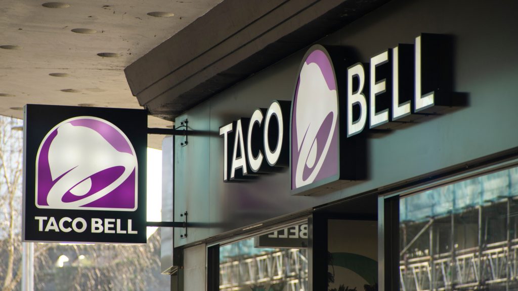
Through these iterations, several key design elements have remained consistent: the bell, the use of vibrant colors, and playful yet modern typography. These elements collectively serve as an implicit promise of the lively and adventurous dining experience Taco Bell aims to provide. By understanding the types of shifts made over the years, we gain an appreciation for how specific design choices can embody a brand’s ongoing evolution, ensuring continued relevance and appeal.
The Symbolism Behind the Taco Bell Logo
The Taco Bell logo is rich in symbolism, and understanding the imagery it conveys offers deeper insights into the brand’s identity and cultural positioning. At the heart of the logo is the bell, a central icon that carries both literal and figurative significance.
The bell in the Taco Bell logo serves as a metaphor for merriment and celebration, evoking the idea of bringing people together for a shared experience. Additionally, it’s a direct reference to the brand’s founder, Glen Bell, seamlessly integrating personal legacy with the brand identity. The sound of a bell is universally understood, acting as a beacon that invites customers to partake in what Taco Bell offers—a vibrant fusion of flavors and experiences.
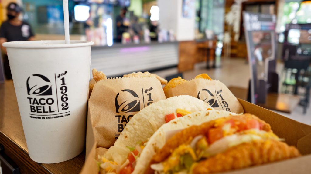
Further symbolism is derived from the use of colors in the logo. The vibrant palette—predominantly featuring shades of purple, pink, and yellow—suggests energy, fun, and creativity. Purple, often associated with luxury and ambition, communicates Taco Bell’s intention to offer a rich, satisfying culinary escape. The playfulness of pink and yellow complements this, suggesting warmth and approachability, characteristics that have become hallmarks of the brand.
Beyond the individual icon and colors, the logo embodies a fusion of Mexican culture and American sensibilities, celebrating the cross-cultural origins of the Taco Bell menu. The logo communicates a narrative where traditional dining melds with modern expectations, creating a connection between diverse cultural landscapes. By bridging these elements, the Taco Bell logo becomes a visual metaphor for the brand’s overall mission: to deliver a dining experience that is as novel as it is familiar.
Brand symbols such as the Taco Bell logo serve powerful roles in articulating the ethos of a company. For Taco Bell, the logo expresses a commitment to offering affordable, joyful dining experiences while respecting the cultural influences that inspired its creation. As the world grows increasingly multicultural, the logo’s symbolism reflects a willingness to embrace and celebrate this diversity, making it a potent cultural marker in modern fast-food branding.
Designing Impact Using ailogocreator.io
The process of designing a memorable logo involves careful attention to detail, creativity, and technical skill—all elements supported by platforms like ailogocreator.io. To illustrate the capabilities of this powerful design tool, consider crafting a Taco Bell-inspired logo. This process highlights both the intuitive interface of ailogocreator.io and the creative opportunities it offers.

Step 1: Input Inspiration
Begin by identifying the core elements that make Taco Bell’s logo iconic—namely, the bell shape and the vibrant color scheme. Using ailogocreator.io, designers can input these elements as foundational ideas, ensuring that the new logo aligns with Taco Bell’s vibrant and recognizable aesthetic.
Step 2: Style and Color Selection
Ailogocreator.io allows for diverse style and color options. Designers can explore various palettes, focusing on hues that mirror Taco Bell’s energetic vibe. The selection process within the platform encourages experimentation, enabling users to visualize how different styles and colors contribute to the logo’s overall impact.

Step 3: Customization
With ailogocreator.io’s customization features, unique fonts, and shapes can be incorporated to give the design its individuality. This is a vital step in distinguishing the logo while maintaining coherence with Taco Bell’s spirited brand image. Tools within the platform include adjustments for icon size, shape, as well as options for adding text in playful, modern fonts.
Step 4: Preview and Finalization
The preview function in ailogocreator.io provides an immediate look at how the logo appears across various formats, from website icons to print material. Designers can make final adjustments, ensuring the logo meets all visual criteria before confirmation. This iterative process ensures that the final design achieves the desired balance of originality and brand consistency.
Step 5: Download
After finalizing the design, the completed logo can be downloaded in a variety of formats, making it ready for diverse applications, including digital platforms, marketing materials, and corporate stationery. The flexibility offered by ailogocreator.io simplifies conversion into all necessary formats, ensuring seamless integration across media.
Using ailogocreator.io to design a Taco Bell-inspired logo underscores the potential of AI-driven creative platforms in modern branding. These tools bring together the practicality of technology with the limitless possibilities of artistic expression, enabling brands to craft logos that are both impactful and true to their identities.
Taco Bell Logo’s Influence on Business and Fast Food Culture
As a cornerstone of Taco Bell’s branding efforts, the logo has played a pivotal role in the company’s success and influence in the fast-food industry. It has become a powerful tool for expansion, establishing brand recognition across diverse markets and consumer demographics.
The strategic design of the Taco Bell logo has contributed significantly to the company’s marketing and advertising campaigns. A recognizable logo is essential in a crowded marketplace where brands vie for consumer attention. Taco Bell’s logo, with its vibrant colors and distinctive bell icon, has consistently stood out, facilitating memorable advertising efforts and successful promotional launches.
Beyond marketing, the logo represents a broader impact on business operations. As Taco Bell has expanded internationally, the logo has acted as a unifying symbol, ensuring consistency across different regions while allowing for localized adaptations to meet specific cultural needs. This adaptability is crucial for maintaining brand integrity while embracing the unique characteristics of each market.
Moreover, the logo has set trends and standards within the fast-food industry, influencing how companies approach branding. The blend of cultural symbolism and modern design embodied in the Taco Bell logo serves as a model for successfully marrying traditional elements with contemporary consumer expectations. This strategy has been vital in shaping Taco Bell’s consumer perceptions and contributing to its reputation as an industry innovator.
In reflecting on the logo’s contributions to business and fast-food culture, it is clear that successful branding extends beyond visual appeal. It encompasses strategic thinking, adaptability, and an understanding of how logos function as living elements within a company’s identity. For Taco Bell, its logo is not merely a visual marker; it is an integral part of its ongoing narrative within the fast-food sector.
The logo’s alignment with Taco Bell’s broader business objectives has helped in customer retention and brand advocacy, creating a cycle of consumer engagement that feeds back into the company’s growth. As the fast-food industry continues to evolve, Taco Bell’s logo remains a case study in effective branding strategies and their far-reaching business implications.
Challenges and Adaptations
Maintaining relevance in an ever-evolving market presents challenges to any brand, and Taco Bell is no exception. As consumer preferences shift and new competitors enter the fast-food industry, Taco Bell has faced the necessity of adapting its logo to stay pertinent and appealing to modern audiences.
One of the primary challenges has been balancing the brand’s heritage with contemporary trends. While some consumers are drawn to the nostalgia and cultural elements embedded in the original logo, younger demographics often favor modern, sleek designs. This dichotomy has required Taco Bell to adapt its brand imagery thoughtfully, ensuring it honors its past while resonating with new generations.
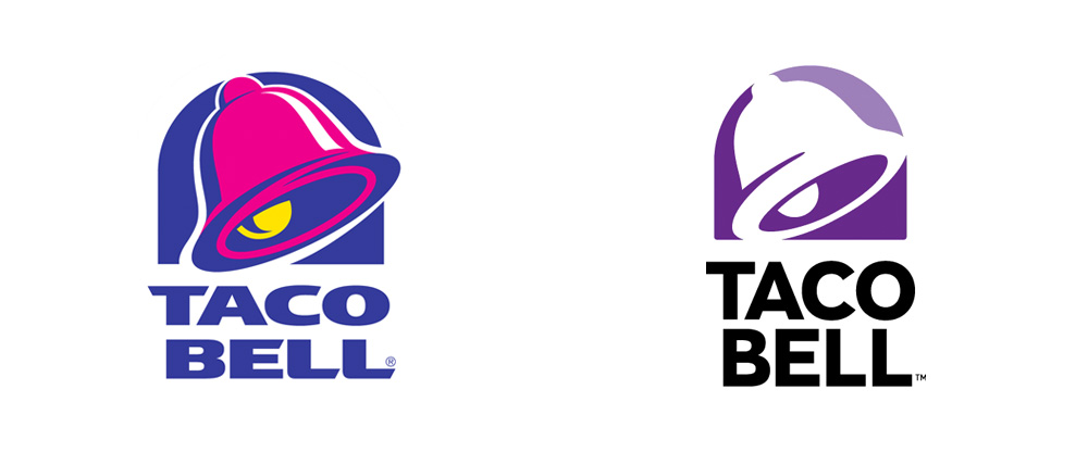
Additionally, the digital transformation has prompted Taco Bell to reassess its branding strategies. Logos must now perform across various digital platforms, from mobile applications to social media channels. This shift demands high adaptability and clarity, both criteria met by the 2016 iteration of the Taco Bell logo—a simplified design that enables clear recognition across devices and screen sizes.
Moreover, Taco Bell must continuously navigate global markets where cultural symbols and consumer expectations widely vary. The challenge lies in translating the brand’s core values into formats that appeal to international audiences without losing the essence of what makes Taco Bell unique. The adaptability of the Taco Bell logo, with its minimalist yet culturally resonant design, plays a critical role in addressing this challenge.
Adaptive rebranding strategies have included campaigns and collaborations that leverage cultural nuances and explore new facets of the brand’s identity—for example, incorporating limited-time themes and products that align with current consumer interests. These initiatives reflect an understanding that successful branding is dynamic and multifaceted, capable of evolving with time while staying true to its foundational principles.
As the industry and global market dynamics continue to shift, Taco Bell’s logo stands as a testimony to the brand’s versatility and resilience. Continuously revisiting and refining its branding approach enables Taco Bell to remain competitive, customer-centric, and culturally relevant, setting a benchmark for how brand adaptations can be strategically executed.
From Logo to Icon: Cultural Significance
Over the years, the Taco Bell logo has transcended its original purpose to become a cultural icon within the fast-food world and beyond. Its journey from a simple bell design to a recognized symbol of American fast food culture illustrates the significant cultural impact a well-executed brand identity can have.
At its core, the Taco Bell logo represents the convergence of tradition and modernity, mirroring the evolving tastes and values of its consumer base. As fast-food culture has shifted from serving merely as a sustenance provider to becoming a lifestyle and social experience, Taco Bell, through its logo, captures this cultural sentiment. The logo aligns the brand’s identity with the lively and communal aspects of dining, where food serves as a bridge between different cultures and communities.
As a pop culture icon, the Taco Bell logo has found its way into various media forms, from television appearances to digital memes. Its versatile depiction in popular culture is indicative of its widespread appeal and recognition. Whether featured in music videos, social media posts, or collaborations with fashion brands, the logo acts as both a statement of brand identity and a marker of cultural relevance.
The cultural significance of the Taco Bell logo is further highlighted by its ability to spark conversations about the globalization and hybridization of cuisine. By embracing diversity through its menu offerings and brand imagery, Taco Bell stimulates dialogue about the acceptance and celebration of multicultural experiences, an ethos reflected visually through its evolving logo.
In understanding the transformational journey from logo to icon, we see the power of branding as a cultural force. Taco Bell’s logo encapsulates a narrative that goes beyond commercial success to encompass broader societal themes, from cultural fusion to innovation in the fast-food industry. This transition underscores the potential of logos to effect lasting cultural impressions, situating them as symbols that capture and convey the spirit of entire generations.
Taco Bell’s ability to maintain its iconic status lies in its commitment to reflecting the changing tides of culture and consumer behavior. The logo will likely continue to adapt, serving not only as a mark of quality and enjoyment but as an enduring emblem of the evolving fast-food landscape and its place within global cultural conversations.
Concluding Thoughts on Brand Identity
The story of the Taco Bell logo underscores the critical nature of branding in creating and sustaining a successful business. Throughout its existence, the logo has effectively communicated the brand’s identity, navigating the complexities of cultural symbolism and contemporary design trends to maintain its relevance and appeal.
The ongoing power of the Taco Bell logo lies in its ability to balance tradition with innovation. As consumer tastes and market conditions change, Taco Bell has adeptly adapted its branding strategies to fit new paradigms, ensuring the logo remains a focal point of its brand narrative. This adaptability highlights an understanding that logos are not static; they are living entities that must evolve alongside the brands they represent.
Moving forward, the future prospects for the Taco Bell logo in an evolving market landscape are both challenging and exciting. Emerging technologies, such as augmented reality and digital interactivity, present opportunities for the brand to further enhance its consumer engagement through innovative logo applications.
As Taco Bell continues its journey, maintaining the core values represented by its logo—celebration, cultural fusion, and modernity—will be essential. The logo remains a testament to the power of thoughtful design in building a lasting, impactful brand. By continuing to embrace change while honoring its roots, Taco Bell’s logo will likely remain a beloved and influential symbol, capturing the essence of a brand that is as dynamic as the market it serves.
In exploring the history and evolution of the Taco Bell logo, one uncovers valuable insights into the processes, challenges, and triumphs that define successful brand identity strategies. These insights offer lessons not only for those in the design and culinary industries but for any entity seeking to make a meaningful mark in their respective fields.
Frequently Asked Questions
What does the Taco Bell logo symbolize?
- The Taco Bell logo symbolizes modernity, fun, and a fusion of Mexican and American dining culture. It encapsulates the brand’s ethos of providing an adventurous and eclectic dining experience.
How many times has the Taco Bell logo been redesigned?
- The Taco Bell logo has undergone several notable redesigns, particularly in the 1980s, 1990s, and 2016, aligning with shifts in consumer preference and design trends.
Can the Taco Bell logo be recreated using ailogocreator.io?
- Yes, ailogocreator.io offers the flexibility and tools necessary to design logos inspired by Taco Bell’s aesthetic, enabling users to experiment with colors, fonts, and icons reminiscent of the brand.
Why is the bell an important design element in Taco Bell’s logo?
- The bell serves as a direct reference to the brand’s name and founder, Glen Bell, while also acting as a cultural symbol that invites consumers to partake in the brand’s vibrant dining experience.
How has the Taco Bell logo influenced fast food branding trends?
- The logo’s blend of contemporary design and cultural symbolism has set industry benchmarks for balancing traditional elements with modern innovation, influencing how other brands approach their branding strategies.
What inspired the original design of the Taco Bell logo?
- The original design was inspired by Mexican cultural symbols, particularly the mission-style bell and sombrero, which aimed to convey the brand’s Mexican roots in an approachable way.
How has the Taco Bell logo changed over the years to reflect the brand’s evolution?
- The logo has shifted from traditional elements to more modern, streamlined designs to resonate with contemporary digital media, representing the brand’s ambitious and youthful spirit.
What is the significance of the colors used in the Taco Bell logo?
- The vibrant colors used in the logo communicate energy, creativity, and the inviting nature of the brand, reinforcing its dynamic position in the fast-food sector.
How does the Taco Bell logo stand out in the competitive fast-food industry?
- Through its unique blend of recognizable elements, vibrant palette, and adaptable design, the Taco Bell logo creates a strong and memorable brand presence that differentiates it from competitors.
What are the key elements that make the Taco Bell logo memorable?
- The bell icon, bold color palette, and the seamless integration of cultural motifs with modern design elements all contribute to its memorability and longstanding brand resonance.


CommentsTake the first comment