Banks in the US are very powerful. Big banks like JPMorgan Chase, Bank of America, Wells Fargo, and Citigroup lead. They control big parts of the market. These banks are important for the economy. Bank logos help people know them. Logos show what a bank stands for. They make people trust the bank. The history of logos mixes old and new styles. Good logos are simple and easy to remember. A great logo shows a bank’s identity fast. To pick the top 10 logos, we looked at design, history, and brand impact.
1. Bank of America

Design Parts
Colors Used
Bank of America’s logo uses colors from the U.S. flag. The blue, red, and white colors make people think of America. Blue means safety and being good at something. Red shows energy and the American way. These colors show the bank is important in the country and can be trusted.
Meaning
The logo looks like an American flag with squares. It looks like roads crossing each other, showing choices and moving forward. This means the bank is open and friendly. The logo is simple with big blue letters for the name, making it easy to read. Even though it’s simple, it works well everywhere and still looks modern.
History Importance
Logo Changes
Bank of America changed its logo to stay trendy over time. At first, it had blue letters and stripes in blue and red. This showed how important it was nationally. Now, the logo works well online, showing the bank keeps up with changes.
Brand Image
The logo is key to Bank of America’s brand image. It shows they are modern, love their country, and are professional. The design shows they care about customers and can change when needed. By using parts that show American values, the logo helps people trust them more as a top bank in the U.S.
2. JPMorgan Chase
Design Parts
Colors Used
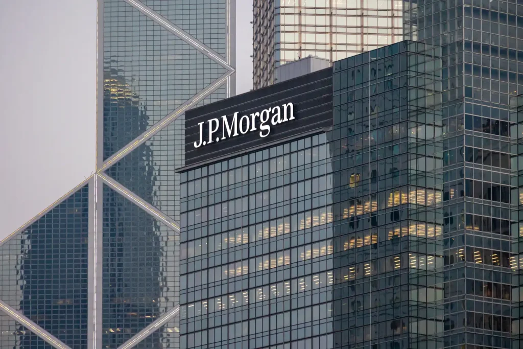
JPMorgan Chase’s logo is a bold blue octagon. Blue means tradition and loyalty, which are key to the bank. The letters are black, adding elegance and professionalism. These colors show protection, skill, and confidence. The blue and white symbol also shows the bank cares about safety and trust.
Meaning
The octagon in the logo is not just a shape. It stands for movement and growth, showing the bank’s active nature worldwide. Chermayeff and Geismar Associates made this famous symbol in 1959 for Chase Manhattan Bank. The octagon has four parts, meaning four corners of the earth and old sun symbols. This design shows the bank’s big goals as a reliable partner in finance.
History Importance
Logo Changes
JPMorgan Chase’s logo has changed over time to stay modern. First used in 1959, it changed to fit the bank’s growing global reach. In 2004, they chose a solid blue octagon to show leadership in finance. This change shows how the bank adapts while keeping its core values.
Brand Image
The logo helps shape JPMorgan Chase’s brand image. It shows tradition, safety, and trust, making it easy to recognize among other banks’ logos. The design says the bank is honest and reliable for customers. By keeping an iconic logo, JPMorgan Chase builds its brand image and gains clients’ trust.
3. Wells Fargo
Design Parts
Colors Used
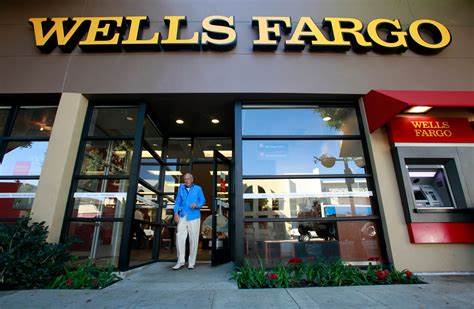
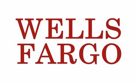
Wells Fargo’s logo is red with white letters. Red shows energy and strength. It grabs attention and feels important. White letters make the name clear to see. This mix shows the bank is strong in money matters.
Meaning
The stagecoach in the logo is special. It links to the Gold Rush days. The six-horse coach means trust and speed. It reminds us of safe travel long ago. This picture ties old times to now, showing how Wells Fargo grew into a big bank today.
History Importance
Logo Changes
Wells Fargo’s logo changed as it grew. At first, it showed a stagecoach for history. Later, it added a modern wordmark on red to show growth in tech times. This change shows they like new ideas but remember their past.
Brand Image
The Wells Fargo logo shapes how people see the bank. It stands for being steady and trustworthy since it began. The stagecoach reminds us of good service and trust over time. By mixing old with new design, the logo keeps Wells Fargo looking ahead while staying true to its roots.
4. Citibank
Design Elements
Color Scheme
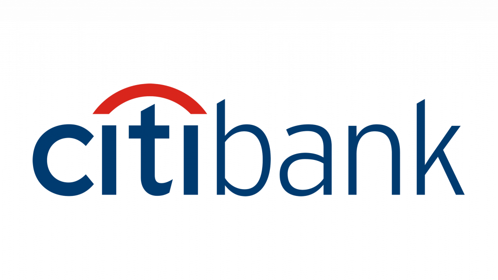
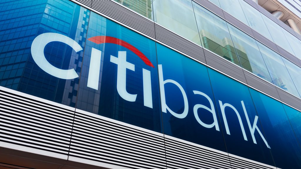
Citibank‘s logo uses blue and red colors. These are like the American flag. The colors make people feel proud of their country. Blue means trust and being reliable. Red adds energy and a modern look. Together, these colors make the logo stand out.
Symbolism
The Citibank logo has a special red arc. It connects the two “I’s” in “Citi.” This arc looks like an umbrella, showing safety and protection. The “t” is like the handle of the umbrella, meaning the bank keeps money safe for clients. The letter “c” stands for the world, showing Citibank is everywhere.
Historical Significance
Evolution of the Logo
Citibank’s logo changed many times over years. In 1999, after joining with Travelers Inc., they made a new logo fast on a napkin by Paula Scher from Pentagram. It was simple but strong. In March 2023, they updated it again for places like Singapore and America to stay current.
Brand Identity
Citibank’s logo helps show its brand image. Using “Citi,” it looks modern and open to all kinds of people. The plain font makes it easy to see and know right away. Mixing old style with new ideas shows Citibank is both innovative and respects its past.
5. Goldman Sachs
Design Parts
Colors Used
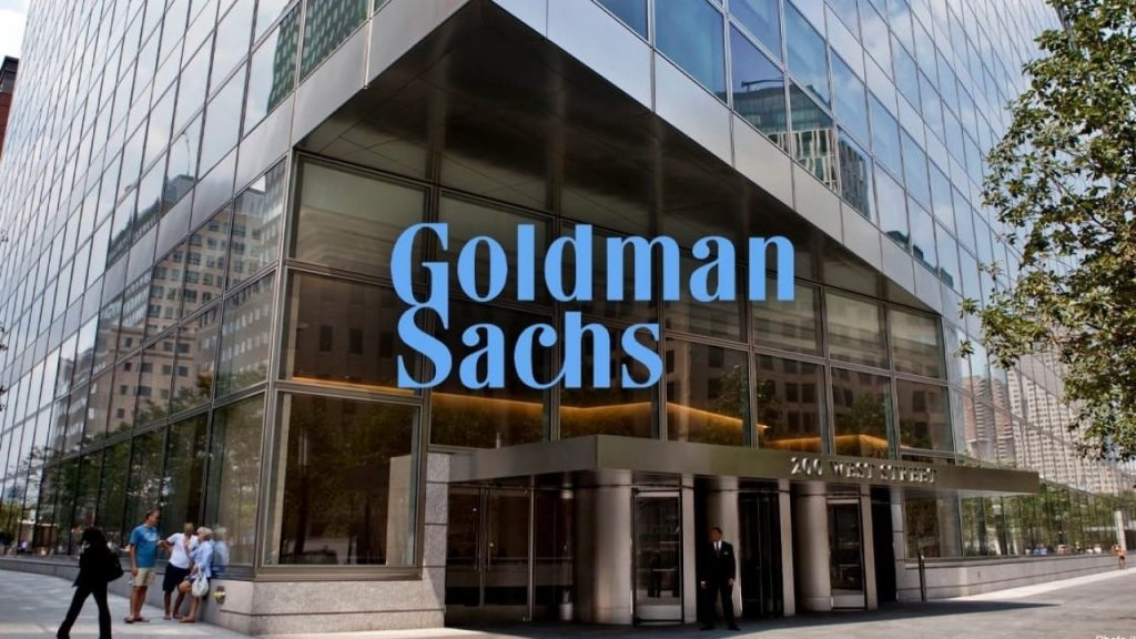
Goldman Sachs uses simple colors. The logo is a blue box with white letters saying “Goldman Sachs.” These colors make people feel calm and trustful. The blue shows honesty and being practical, which are important to the company. The white letters are easy to see on the blue background.

Meaning
The Goldman Sachs logo has special meaning. The square looks like a safe box, showing safety and trust. The fancy letters add style and show they are professional. How the “G” and “S” connect makes it unique. This design shows they want to be strong and trusted.
History Importance
Logo Changes
Goldman Sachs kept their logo mostly the same over time, with two big designs. First, it had their name in white inside a blue box made in 1970 by Lippincott when they grew as a finance leader. In 2020, they changed it a bit by removing some letter links but kept the blue box. This change shows they can update but keep who they are.
Brand Image
The Goldman Sachs logo helps shape how people see them. It shows stability, being professional, and trustworthy. By keeping it simple, it shows clarity and focus on doing things well. Using the same blue box and white letters keeps their image as honest bankers clear for everyone.
6. Morgan Stanley
Design Parts
Colors Used
Morgan Stanley‘s logo uses deep blue. This color means trust and stability. Blue is often used by banks because it feels safe and reliable. It helps show Morgan Stanley cares about doing a good job for clients.

Meaning
The logo says “Morgan Stanley” in clear letters. This style looks modern and easy to read. Big letters make it look serious and strong. The simple design makes the logo easy to remember, showing Morgan Stanley is a top bank.
History Importance
Logo Changes
Morgan Stanley’s logo changed as the bank grew. At first, it had fancy parts but now it’s simple. This change shows how the bank has adapted over time, like when it joined with Dean Witter in 1997 before going back to just “Morgan Stanley” in 2001. The changes show the bank stays strong and true to its values.

Brand Image
The logo helps people see what Morgan Stanley stands for. It’s clean and professional, showing they care about growing well and helping clients. As a big investment bank, they focus on smart investing. The simple design shows they are dedicated to being great and flexible in tough times. Keeping this logo helps them stay trusted worldwide.
7. U.S. Bank
Design Parts
Colors Used
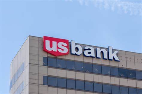
U.S. Bank‘s logo uses red, white, and blue colors. The red shape with “us” in white shows love for the USA. These colors show working together and being patriotic. Blue in “bank” means trust and being reliable. This mix makes the logo stand out and shows the bank wants to help people clearly.
Meaning
The U.S. Bank logo is simple but has meaning. The “U” and “S” are linked, showing teamwork with clients. This clean style shows the bank is serious and professional. The neat design reflects a good image and ties to U.S. Bancorp. By keeping it simple, it shows the bank’s promise to be trustworthy.
History Importance
Logo Changes
U.S. Bank’s logo changed many times because of its history of joining other banks and new names. It started in 1863 with a different name and had many logos since then. But now, this logo truly shows what the bank is today. Even if we don’t know exactly when it started, it proves the bank can change but keep its main values.
Brand Image
The U.S. Bank logo helps shape how people see them as a brand. Its simple look and patriotic colors make it easy to remember right away. By focusing on being clear, the logo shows they want to give reliable services people can trust.
8. PNC Financial Services
Design Parts
Colors Used
PNC’s logo uses bright colors. It has deep blue and bright orange. Blue means trust, which is key for banks. The orange circle shows new ideas and energy. These colors make the logo look lively and cool to customers.

Meaning
The PNC logo has a special shape called a Mobius strip. This shape shows money moving all the time, like how banks work with money nonstop. It shows PNC helps people with easy banking services. The shapes in the logo show how the bank connects people and helps them grow.
History Importance
Logo Changes
PNC changed its logo as it grew bigger. At first, it looked old-fashioned to show safety. As it got more modern, the logo added new parts to look up-to-date. Now, it mixes old style with new looks, showing PNC can change but still be itself.

Brand Image
PNC’s logo helps people know its brand well. Big “PNC” letters show strength and trust, proving it’s been around a long time. The fancy font adds style, showing they are skilled at what they do. By mixing old ways with new ideas, the logo shows PNC gives many smart money solutions.
9. Capital One
Design Parts
Colors Used
Capital One‘s logo uses bright colors like the U.S. flag. The blue and red show American pride. Blue means trust, while red shows energy and new ideas. Together, they make the logo look modern and cool.
Meaning
The logo has a special red shape called a swoosh. It goes with the blue name of the bank. This shape means moving forward and being confident. It shows Capital One wants to grow and try new things. The swoosh points up, meaning progress.
History Importance
Logo Changes
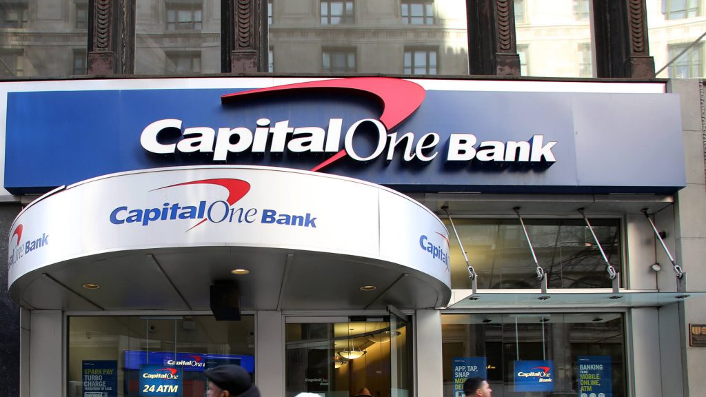
Capital One’s logo changed as it grew bigger in banking. At first, it was simple but later got bolder with a red swoosh. This change showed they like being creative and fast.
Brand Image
The logo helps people know Capital One’s brand well. It shows they think differently and are smart with money ideas. The bold design makes them stand out among banks.
10. TD Bank
Design Parts
Colors Used
TD Bank‘s logo is a bright green box with white ‘TD’ letters. It has two greens and white colors. Green means growing and doing well with money. This shows the bank cares about being eco-friendly and new ideas. The white letters pop out on green, making it easy to see.
Meaning
The logo shows trust and loyalty. The green box stands for being steady and honest, while the white ‘TD’ letters mean clear and open. These parts show TD Bank wants to give good money help. Its simple look works well everywhere, showing it’s a smart bank.
History Importance
Logo Changes
In 2009, TD Bank changed a lot. It used to be Commerce Bancorp but got a new name and logo. This change showed TD Bank was growing in the U.S. The new logo shows how the bank keeps up in tough times by looking modern.

Brand Image
TD Bank’s logo helps people know its brand well. Green and white colors show growth, new ideas, and trustworthiness. The simple design makes it easy to spot, helping customers trust them more. As a top bank locally, this logo keeps TD Bank known as reliable.
New Trends in Bank Logos
Future Changes for Bank Logos
Bank logos are changing fast. Designers use bright colors and simple shapes now. These make logos look new and cool. Banks want their logos to show they think ahead.
In the future, logos will be more digital-friendly. As banking goes online, logos must look good on all screens. They need to be simple but easy to remember. This helps them stand out online.
How Logos Help Build a Brand
Logos are important for a bank’s brand. They show what the bank is like to people. A good logo mixes pictures and words to show safety and being serious.
Big banks use their logos to show they are simple, serious, and full of life. They often add national symbols to gain trust and identity. This makes people feel close to the bank.
“A logo is not just a symbol; it’s the face of the brand,” says an expert in branding. This shows why a good logo is key for a bank’s name.

Why Bank Logos Matter
To sum up, bank logos are crucial for knowing a brand. They show what the bank stands for and help its name grow strong. A well-made logo can make a bank seem trustworthy and smart.
Modern logos use bright colors and easy designs to show they think forwardly. They play an important role in building brands by showing what the bank is about to customers. As banking changes, logos will stay vital in connecting with clients.
How to make a bank logo?
Making a bank logo can be easy with the right tools. Let’s see how you can design a great logo using ailogocreator.io.
Use ailogocreator.io
What is ailogocreator.io?
ailogocreator.io is a smart design logo tool that helps you make logos. It uses many professional logos to suggest designs for your brand. You don’t need any design skills to use it. Just enter your company name and choices, and the AI creates custom logo options for you.

How to use ailogocreator.io
Using ailogocreator.io is simple:
- Enter Your Info: Start by typing your company name and any colors or styles you like.
- See AI Ideas: In about 60 seconds, the AI shows you different logo designs that match your brand.
- Change Your Logo: Pick a design you like and change it if needed. You can adjust fonts, colors, icons, and layouts.
- Get Your Logo: When happy, download your logo in formats like PNG, JPG, PDF, or SVG for different uses.
- Own Your Logo: After downloading, it’s yours to use anywhere without limits.
Design example
RongTai Bank
Wisdom Wealth Bank


Questions & Answers
What is a bank symbol?
Bank logos use symbols to show ideas quickly. A square with strong lines can mean strength and stability. Banks use these symbols to show their main values and make customers trust them. Symbols help people remember the bank’s brand and what it stands for.
What does the HSBC logo mean?
HSBC’s logo has a red shape with white triangles. It looks like an hourglass or flag. This shows the bank is big worldwide and has history. Red means passion, and the shape shows precision. The logo tells people HSBC is reliable everywhere.
What font do banks use in logos?
Banks today often use sans-serif fonts in logos. These fonts are simple and modern, without extra lines on letters. Some banks choose serif fonts, which have small lines at letter ends. Serif fonts show tradition and stability, good for banks wanting to seem reliable.
What makes a good bank logo?
Making a great bank logo needs important parts that show trust, strength, and new ideas. Let’s see what makes a bank logo special:
- Simple and Clear
A good bank logo should be easy to spot. Simple logos are easy to remember and work well everywhere. They show the bank’s main values without too many details. - Symbols
Symbols in logos tell meanings fast. For example, a square with strong lines can mean strength and stability. This helps people quickly know what the bank believes in. Bank Logo Design Expert: “Symbols tell meanings fast. A square with strong lines can mean strength and stability.” - Colors Used
Colors in a logo are very important for showing messages. Blue often means trust, green shows growth, and red can mean energy. The right colors make people feel certain ways about the bank. - Fonts Used
Fonts are also key parts of logos. Modern banks like simple fonts without extra lines because they look clean and new. Some banks use fancy fonts to show they have old traditions. Bank Logo Design Expert: “Modern banks like simple fonts without extra lines for their clean look.” - Smart Design
A bank’s logo is like its face that shows who it is, its name, and what it stands for. Good design tells important values, builds trust, and stays in people’s minds. Bank Logo Design Expert: “In banking, a logo is like the face of an institution’s brand identity.” - Lasting Style
A good bank logo should stay nice over time even if it changes a bit later on; it should still be known by everyone after years go by so customers keep trusting them.
By using these parts well, banks can make logos that show their brand clearly while connecting with people to build trust in the busy money world.
Bank logos are very important for banks. They show trust and being professional. Each logo has a story with pictures and letters. These logos help banks be known and liked by people.
In today’s busy world, a good logo helps people remember the bank. Making a logo needs creativity and knowing about money stuff. As banks change, their logos need to show what they believe in and how good they are.


CommentsTake the first comment