YouTube, established in 2005, is a platform that has significantly transformed the landscape of digital media by allowing users to upload, view, and share video content. As a pioneer in the video-sharing industry, it has not only provided a podium for creative expression but has also redefined how we consume media. It’s staggering to consider how a single platform could serve as a conduit for user-generated content, all while shaping cultural trends and influencing entertainment standards globally. A significant part of YouTube’s identity, apart from its revolutionary approach to media, is encapsulated in its logo—a symbol now synonymous with video content worldwide.
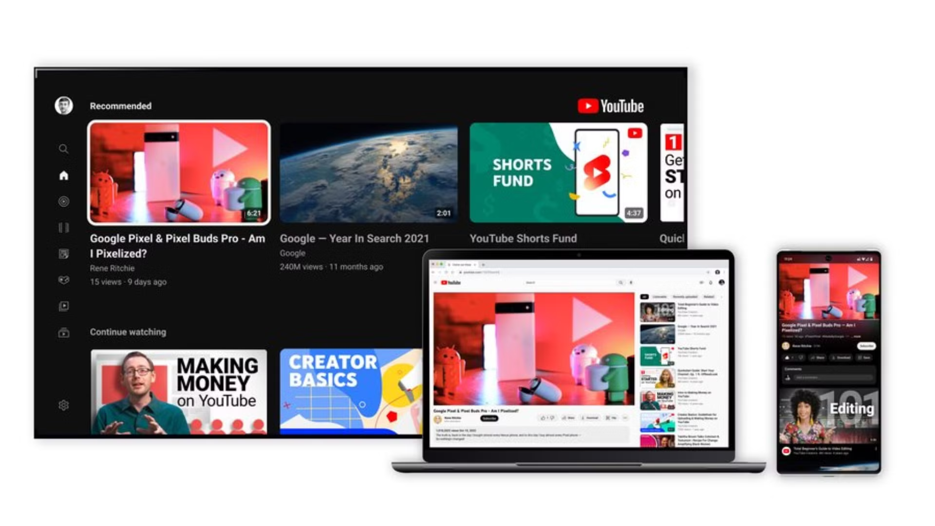
The YouTube logo is more than just a visual mark; it is a critical component of the brand’s identity. In today’s digital age, logos are indispensable elements of branding, serving as immediate identifiers that encapsulate a brand’s essence, mission, and vision. A well-designed logo not only aids in brand recognition but also builds trust and credibility among its user base. For YouTube, its logo projects its core functionalities and cultural impact, having developed into an iconic representation over the years.
The Origins of YouTube
The inception of YouTube is intertwined with the needs of its users and the technological advancements of the early 21st century. Founded by three former PayPal employees—Chad Hurley, Steve Chen, and Jawed Karim—YouTube was developed as a solution to the complicated and cumbersome process of sharing videos over the internet at that time. Officially launched in 2005, it quickly became a vital tool for users seeking to effortlessly upload and broadcast video content to a global audience.
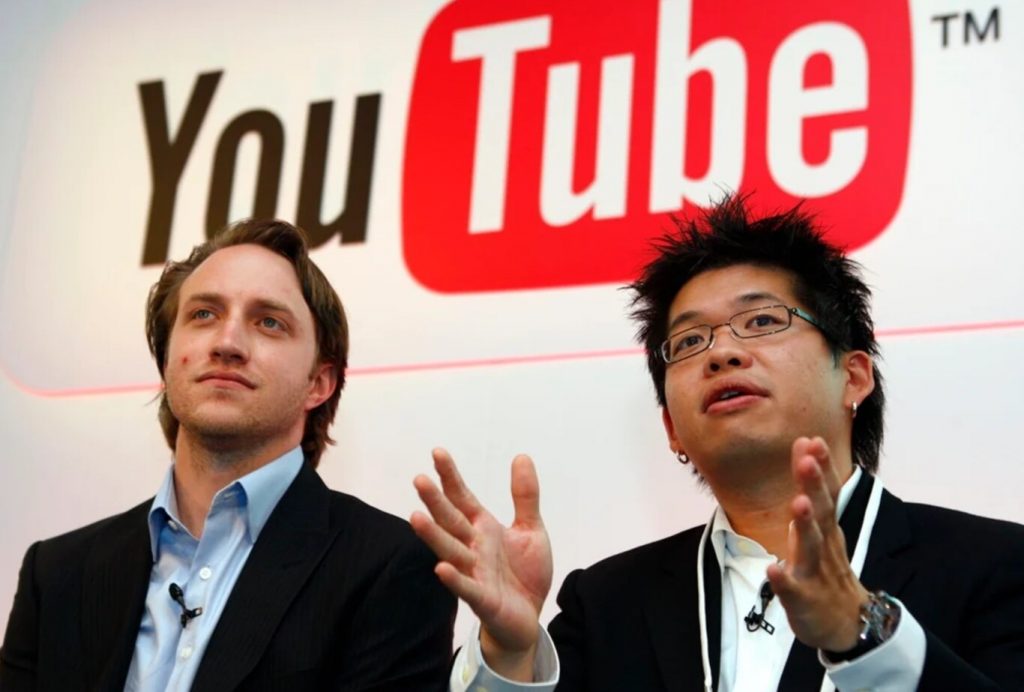
From the outset, YouTube set itself apart with a user-centric approach, prioritizing simplicity and accessibility in video sharing. The original YouTube logo conveyed these qualities with a distinctive wordmark: a combination of the words “You” in black and “Tube” enclosed within a red rectangle, mirroring the shape of a television screen. This design choice was intentional, playing on the convergence of online media and traditional television, while also suggesting a personalized (“You”) broadcasting experience (“Tube” referring to cathode ray tube TVs).
However, building a groundbreaking platform was not without its challenges. Early on, YouTube faced hurdles ranging from technical limitations and bandwidth expenses to copyright issues and the need for effective content moderation. Despite these obstacles, YouTube’s founders remained steadfast in their mission to create an accessible global video-sharing community. By addressing these challenges head-on, YouTube developed a robust platform, paving the way for its later successes and establishing a solid foundation for its survival and growth in a rapidly evolving digital marketplace.
Evolution of the YouTube Logo
The evolution of the YouTube logo provides a visual narrative of the platform’s growth and transformation over time. From its initial introduction to its modern iterations, each redesign reflects YouTube’s endeavor to maintain relevance while aligning with contemporary design trends and improving user engagement.
The Initial Logo Design was a straightforward and effective starting point. With “You” in black and “Tube” in bold white letters set against a red rectangle, it communicated YouTube’s intent of offering a personal broadcast channel through simple yet powerful imagery. This design was emblematic of the platform’s early attempts to draw parallels with traditional television while highlighting its user-generated content focus.
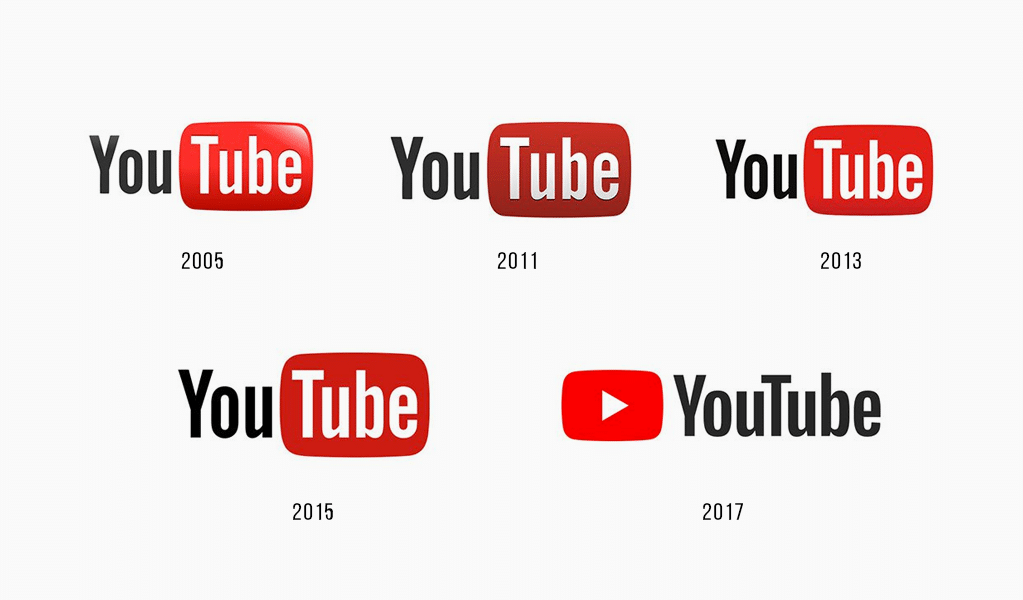
The 2011 Redesign marked a significant milestone in YouTube’s branding story. The introduction of the red play button as a central element was a pivotal change, symbolizing the core functionality of the platform: video playback. This move to include a play button significantly heightened the intuitive appeal of the logo, offering immediate recognition and visually reinforcing YouTube’s identity as a video platform. Moreover, the play button became an icon not only for YouTube but for digital video content on a global scale.
Modern Updates have steered the logo towards a minimalist design approach, reflecting broad trends in digital branding. This involves refining elements to ensure functionality across various platforms—be it desktop, mobile, or TV screens—while maintaining the visual integrity of the brand. Key updates have included font simplification and an enriched color palette, which have together crafted a sleek and versatile visual identity for the brand.
The rationale behind each redesign has been driven by the need to adapt to an ever-changing digital landscape, to improve brand visibility, and to resonate with a diverse and global audience. Through these changes, YouTube’s logo has remained an enduring symbol of innovation, managing to stay current while reminding users of the platform’s core mission and values.
Key Design Elements of the YouTube Logo
The YouTube logo’s effectiveness is underscored by its distinct design elements, each one meticulously chosen to contribute to the platform’s branding narrative. At the heart of these elements is the Play Button, an unmistakable symbol that has transcended digital interfaces to become synonymous with video consumption worldwide. This simple triangular icon suggests action and engagement, encouraging users to press play, interact, and explore. Its centrality in YouTube’s branding underscores the platform’s core function as a video-sharing site, serving not only as a functional element but also as a visual shorthand for the platform itself.
The Color Scheme, predominantly red and white, plays a critical role in the logo’s impact and recognition. Red, a color associated with energy, urgency, and attention, is effective in capturing user focus and encourages interaction. This vibrant hue against a contrasting white background ensures clarity and legibility, making the logo pop across various media. Together, these colors convey a sense of immediacy and engagement, aligning with YouTube’s dynamic content delivery model.
Typography is yet another crucial component in any logo, and YouTube is no exception. The logo employs a customized sans-serif typeface that is clean and modern, resonating with contemporary design aesthetics. Its bold simplicity ensures readability across the platform’s numerous interfaces, from small app icons to larger display screens. By using a straightforward font, the logo maintains a timeless appeal, which helps reinforce YouTube’s identity as a leader in digital media.
Overall, these design elements work harmoniously to create a logo that is not only visually compelling but also rich in meaning and functionality. Each element reflects YouTube’s approach to accessibility, user engagement, and brand recognition, contributing to a cohesive identity that supports the platform’s mission and vision.
Symbolism and Brand Identity
The YouTube logo is emblematic of the platform’s overarching mission and brand identity, encapsulating core values and facilitating a sense of community among its users. Primarily, the logo reflects YouTube’s mission of making video sharing accessible to everyone, regardless of geographical boundaries or technological expertise. This is achieved through its minimalist design and intuitive symbols, which are easily recognizable and universally understood.
Accessibility plays a vital role in all facets of YouTube’s branding, with the logo embodying this by being straightforward and user-friendly. The design empowers creators of all kinds—from budding filmmakers to educators and entertainers—to leverage YouTube’s platform to broadcast their content to a diverse global audience. The use of familiar visual elements like the play button taps into universal media consumption behaviors, making the platform approachable for users across demographics.
Furthermore, the logo conveys a sense of entertainment. The vibrant color scheme and dynamic play button signify a lively and engaging experience, drawing users into the vast array of content available. This aligns with YouTube’s goal of promoting creativity and innovation through diverse content offerings, ranging from music videos and vlogs to educational clips and news reports.
As a reflection of brand evolution, the YouTube logo also illustrates how the platform has matured and adapted to changing times. The logo’s ability to evolve while retaining core elements underscores YouTube’s capacity to innovate. It captures the platform’s journey from its humble beginnings to becoming a leading force in modern digital media. By adapting its logo to meet contemporary trends, YouTube reassures users of its relevance and commitment to providing a cutting-edge user experience.
In sum, the symbolism inherent in the YouTube logo supports the brand identity by reinforcing the qualities of accessibility, entertainment, and empowerment. It stands as a testament to YouTube’s enduring vision and dynamic presence in the digital landscape.
Designing a YouTube-inspired Logo with ailogocreator.io
Creating a YouTube-inspired logo can be an exciting endeavor with the aid of innovative design tools like ailogocreator.io, a platform that simplifies the process through its advanced AI-powered capabilities. This process not only aids in generating unique logo designs but also illustrates how modern design tools can enhance creativity and efficiency.
To design a YouTube-inspired logo using ailogocreator.io, begin by considering key elements that define YouTube’s distinctive branding. Start by inputting keywords such as “play button,” “red and white color scheme,” and “video icon” into the platform to generate relevant design templates. These components are crucial in capturing the essence of the YouTube brand while tailoring the logo to your specific needs.
Next, engage in Style and Color Selection. Ailogocreator.io offers a wide range of design styles that allow you to choose themes that reflect YouTube’s aesthetics. Selecting a color palette that matches YouTube’s iconic red and white scheme will ensure the design resonates with the platform’s recognizable features.
The Customization phase invites users to modify typography, icon layout, and other graphical elements. This flexibility is one of the strengths of ailogocreator.io, given its intuitive editing tools that do not require advanced design skills. You can experiment with different fonts to achieve a personalized touch while maintaining the core essence of a YouTube-inspired logo.
Preview and Adjustments are crucial steps before finalizing your design. Ailogocreator.io provides real-time previews, enabling you to make necessary adjustments easily. This step ensures the logo maintains balance, clarity, and resonates with the intended audience.
Finally, the Download and Application process involves exporting the created logo in various formats suitable for diverse uses. Whether you plan to use the logo on a website, social media, or print materials, ailogocreator.io ensures the logo is available in the required quality and file types, such as vector formats.
Through platforms like ailogocreator.io, designing a YouTube-inspired logo becomes an accessible endeavor, encouraging creativity while ensuring professional quality standards.
Impact of the YouTube Logo on Digital Media
The YouTube logo has had a profound influence on the realm of digital media, setting benchmarks for branding strategies and visual identity within the digital landscape. Since its inception, the logo has been instrumental in helping YouTube affirm its position as a dominant player in the online video-sharing arena, while also impacting broader trends across the industry.
Primarily, the Influence on Branding Trends can be seen in the way other digital platforms have incorporated simplistic, easily recognizable symbols into their branding. The use of the play button, in particular, has become a ubiquitous element across video websites and apps, signifying content that is interactive and media-focused. This has further influenced the way in which platforms embrace minimalist design approaches, sharpening visual communication for better user engagement.
Another significant impact of the YouTube logo lies in its role in Brand Positioning. By cultivating a unique visual identity that encapsulates video consumption, YouTube has short-circuited the typical brand recognition process. The logo, familiar to billions worldwide, has become synonymous with sharing video content, effectively positioning YouTube as the de facto platform for watching and sharing videos online.
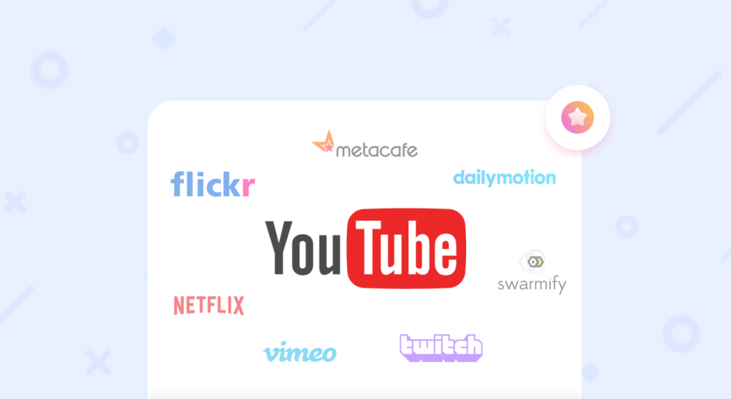
Through a Comparative Analysis with other video-sharing platforms, it becomes apparent how the YouTube logo has set itself apart. While competitors may opt for logos that emphasize text or complex graphics, YouTube’s concise and focused design enables quick recognition and accessibility. This has spurred others in the industry to reevaluate their branding strategies, fostering a trend toward simplified visual identities that facilitate rapid user identification and engagement.
The influence of the YouTube logo on the digital media landscape extends beyond its direct utility, acting as a cultural marker of the internet’s shift towards a video-centric mode of content consumption. As such, the logo’s impact is not only felt in branding contexts but resonates with the broader narrative of how digital media has evolved to prioritize interactive, visually engaging, and user-driven content.
Challenges and Future Prospects
Navigating the challenges of maintaining a dynamic logo that resonates across various cultures and media channels is an ongoing endeavor for YouTube. As with any prominent digital entity, ensuring global brand uniformity and logo visibility pose significant trials, particularly within the multifaceted nature of internet consumption in diverse geographical regions.
Some of the current challenges include adapting the logo for different languages and cultural contexts without losing its core identity. Branding consistency must be maintained across YouTube’s numerous regional versions and mobile formats, all of which require a logo that remains instantly recognizable despite changes in format and usage context. This challenge is compounded by the rapidly evolving technological landscape, which constantly demands adaptability in how logos are displayed and perceived.
Adapting to Change also involves embracing shifts in technology and user expectations. With new devices, screen sizes, and media platforms emerging, YouTube’s logo must navigate these environments seamlessly. Ensuring that the logo scales appropriately and retains its functionality across both traditional and modern mediums, including augmented reality and virtual platforms, is crucial.
Looking ahead, the Future Prospects for Innovation in digital logo design are both exciting and necessary. Future iterations of the YouTube logo must balance retaining the brand’s powerful legacy while integrating current design trends that align with new user behaviors and technological advancements. Innovations may involve more interactive features, such as animated logos, that enhance user engagement and brand interaction.
Ultimately, the challenges that YouTube faces in maintaining its iconic logo are a testament to its ambition to stay ahead in a rapidly evolving digital space. By embracing new technologies, maintaining cultural relevance, and responding aptively to user demands, YouTube sets a course for sustained brand impact and recognition.
Vision for the Future
Reflecting on the Enduring Impact on Branding that the YouTube logo has achieved, it’s remarkable how a simple design can encapsulate the essence of a digital revolution. Its influence extends beyond branding into cultural spheres, embodying the democratization of media access and the empowerment of voices that YouTube facilitates.
Evolving with Trends in digital design is crucial for maintaining relevance. YouTube sets an example in balancing tradition with innovation, a principle that will guide its future decisions in updating its branding. By anticipating the next big shifts in media consumption—such as the growing influence of AI, the rise of immersive media experiences, or the evolution of content delivery methods—YouTube positions itself to remain a central node in the ever-evolving digital ecosystem.
YouTube’s vision for the future involves perpetually aligning its brand image with user needs and the technological landscape. Moreover, the logo’s evolution will likely continue to emphasize simplicity and engagement, transcending cultural boundaries and facilitating enhanced interactions with its global audience.
In conclusion, the YouTube logo stands as a symbol of continuity and change, embodying the dynamic nature of digital media and its users. By anticipating shifts in design and functionality, YouTube will continue forging paths in the digital era, reinforcing its place at the forefront of video-sharing innovation.
Frequently Asked Questions
What does the play button in the YouTube logo symbolize?
- The play button symbolizes action and immediacy, representing the platform’s core function of facilitating video playback and interactive content engagement.
How has the YouTube logo evolved over time?
- Initially a simple text-based design, the YouTube logo introduced the now-iconic play button in 2011 and later adopted a more minimalist aesthetic to maintain modern relevance.
Can the YouTube logo be recreated using ailogocreator.io?
- Yes, the AI Logo Creator platform can be used to design logos incorporating elements like the play button and red and white color scheme reminiscent of YouTube.
Why are red and white the primary colors of the YouTube logo?
- Red conveys energy, creativity, and urgency, while white offers contrast and clarity, collectively aligning with YouTube’s brand emphasis on dynamic content and accessibility.
How does the YouTube logo stand out among other social media platform logos?
- The distinctive play button and the engaging color scheme make the YouTube logo instantly recognizable, differentiating it from competitors and reinforcing its identity as a video content hub.
What is the significance of the play button in the YouTube logo?
- The play button in the YouTube logo symbolizes the availability and engagement invited by the platform, reinforcing its commitment to accessible, interactive video experiences.
How does the YouTube logo influence the digital media landscape?
- As a cultural icon, the YouTube logo signifies the shift towards digital media consumption and user-generated content, marking YouTube’s role in transforming traditional media paradigms.

CommentsTake the first comment