In the competitive world of retail, a supermarket’s brand logo is the face of its identity, embodying its values, mission, and culture. This graphic symbol serves as an instant reminder of a brand’s ethos and promises. In the United States, several supermarket chains have mastered the art of logo design, transforming them into recognizable emblems of trust and quality over decades.
This article explores the establishment and evolution of five iconic supermarket brands — Walmart, Kroger, Costco, Albertsons, and Publix — focusing on their market influence, achievements, and the conceptual journey of their logos.

1. Walmart: A Giant in Retail
Establishment and Expansion
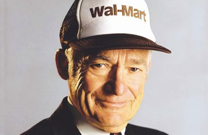
Walmart’s inception dates back to 1962, when Sam Walton opened the first store in Rogers, Arkansas. His vision was uncomplicated yet ambitious: to provide goods at the lowest prices to improve people’s living standards. This philosophy propelled Walmart’s extensive and rapid expansion, marking it as a cornerstone in retail history. By focusing on streamlined operations and customer service, Walmart managed not only to capture a significant market share domestically but also stretched its reach globally.
Influence and Achievements
Throughout the 1990s, Walmart emerged as the largest retailer in the U.S., championing innovations in supply chain management and technological integration. Its influence redefined shopping habits, introducing a culture of one-stop, budget-friendly shopping. The store’s achievements, such as sustainable business practices and e-commerce integration, have reinforced its standing as a retail leader.
Logo Design Journey
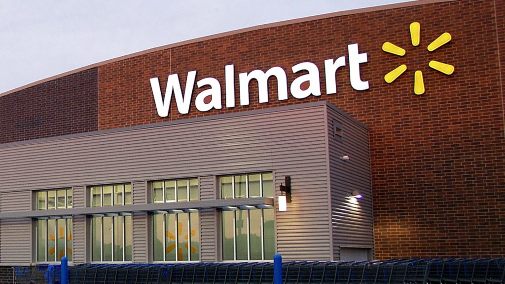
Walmart’s logos have evolved uniquely over the years, reflective of its growth and innovation. Initially, the logo featured a stern, serif typeface that underscored authority and trust — key tenets in the early stages of brand establishment. This traditional approach paved the way for a more dynamic emblem: the ‘Spark.’ Introduced in 2008, it symbolizes Walmart’s renewed commitment to innovation and community.

The Symbolism and Change
The modern ‘Spark’ logo, a sunburst symbol colored in bright yellow, signifies hope, innovation, and a fresh perspective. Paired with a bold blue font, it establishes a balance of optimism and trust. The straightforward design carries market impact by creating a welcoming, familiar symbol, reinforcing Walmart’s position as a market favorite.
2. Kroger: A Legacy of Innovation
Historical Context and Development
Founded by Bernard Kroger in 1883 in Cincinnati, Ohio, Kroger has grown by emphasizing quality and utilizing pioneering strategies. It introduced the concept of self-service shopping, revolutionizing consumer habits. Throughout the 20th century, Kroger expanded by acquiring other chains and developing new retail innovations, like in-store bakeries and meat departments.

Cultural and Market Influence
Kroger’s business model, emphasizing fresh produce and customer satisfaction, influenced consumer expectations nationwide. Ranking among America’s top retailers, Kroger extended its footprint by continually investing in sustainability initiatives and technology. This forward-thinking approach enhanced its prestigious market position, resonating with American families through generations.
Logo Conceptualization
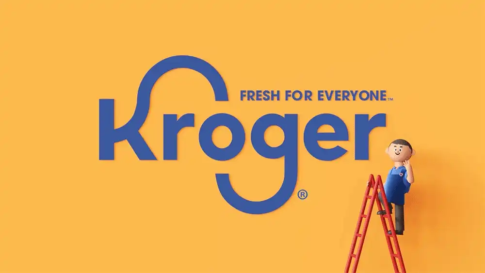
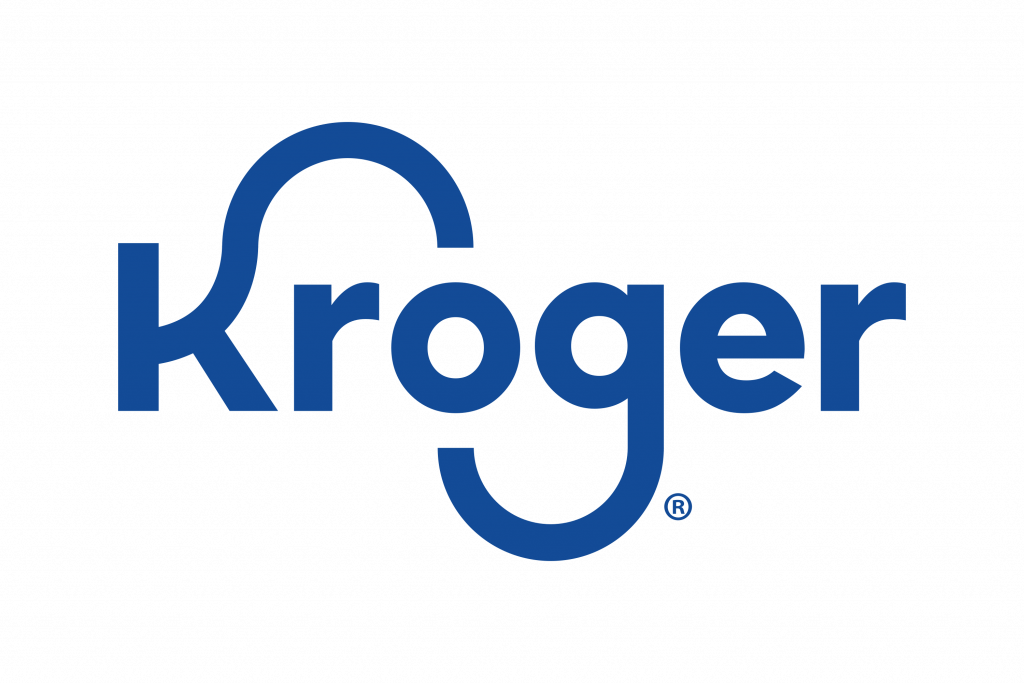
Kroger’s logo has experienced a thoughtful evolution, marking a transition from complex insignias to a streamlined, modern design. The recent logo features a clean, cohesive typeface that conveys modernity while still being rooted in its historical image of community and wholesomeness.
Design Symbols and Market Presence
The contemporary design employs simplicity, with blue tones signifying reliability and security. These design elements not only depict Kroger’s stability and cohesiveness but also echo its longstanding connection to consumer life, merging tradition with digital innovation.
3. Costco: Pioneers of Bulk Retailing
Founding and Strategic Growth
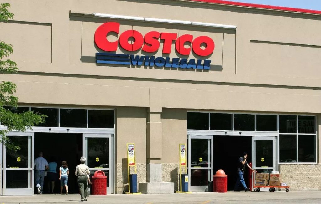
Costco emerged as a revolutionary force in retail after its founding in 1976 as Price Club, and the subsequent merger forming Costco Wholesale in 1993. This fusion brought with it the innovative warehouse club concept — offering bulk goods at discounted prices to members, reshaping how consumers bought goods in large quantities.
Cultural Appeal and Business Model
Costco’s appeal lies in its pioneering bulk retailing model, setting new industry standards. Its business strategy, focused on a straightforward membership model, low markup on price, and a high loyalty customer base, has secured its place as a leader in cost-effective, high-volume sales.
Logo Interpretation over Time
Costco’s logo remains a beacon of consistency. Its deliberate simplicity conveys directness and authority through a no-nonsense visual identity, representing the efficiency that Costco stands for. Despite subtle stylistic improvements, the essence of the logo remains unchanged,
aligning with the brand’s adherence to core business values.
Design Elements and Consumer Perception
The logo’s unmistakable red and blue palette embodies Costco’s core principles of strength and reliability. This design choice aligns with its market offering — an authoritative, efficient warehouse that consumers can trust, impacting both domestic and international markets significantly.
4. Albertsons: Adapting Through Decades
Origins and Market Establishment
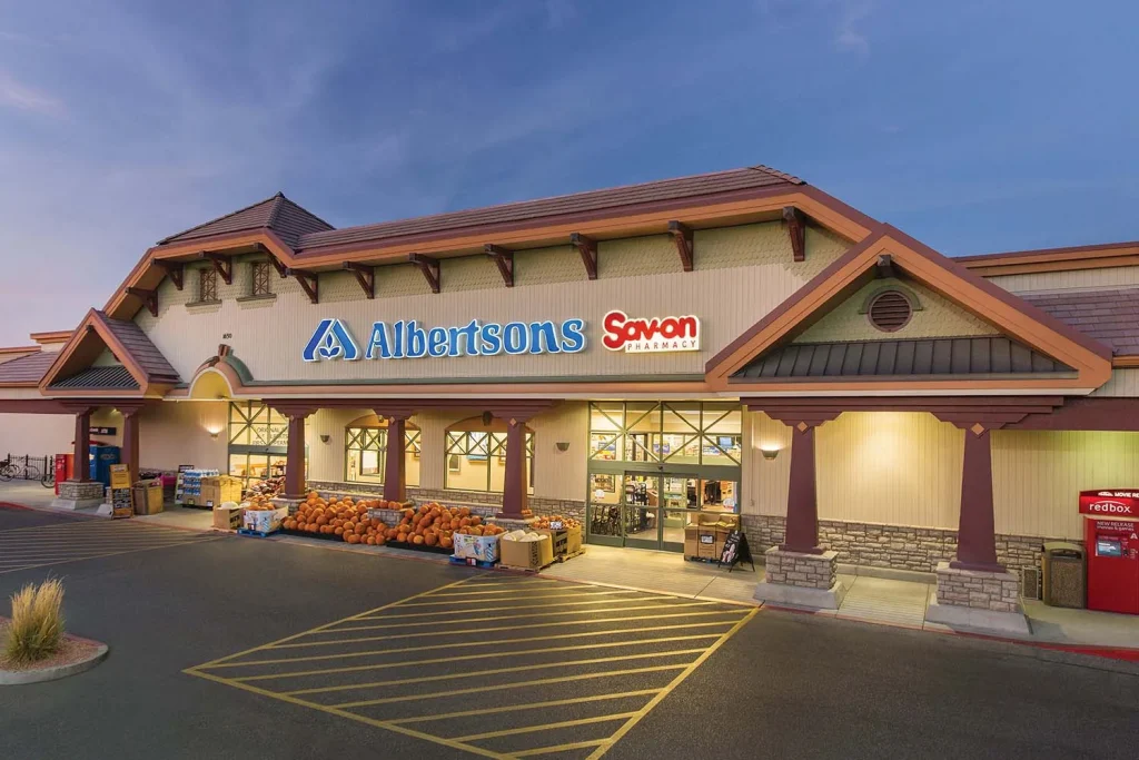
Albertsons was founded by Joe Albertson in 1939 in Boise, Idaho. From its inception, the brand sought to offer high-quality products at fair pricing within an inviting shopping environment. As the company expanded, it acquired and integrated other stores, morphing into a substantial chain that served a wide array of customer needs.
Influence and Adaptability
The adaptability of Albertsons is evident in its ability to maintain prominence in the grocery market through an ever-evolving brand image and product line. It stands as a testament to tactical business practices and cultural relevance, meeting diverse consumer preferences while leaning on its robust foundational values.
Logo Design Historical Perspectives
Albertsons’ logo underwent transformations reflecting its growth and modernization while preserving the essence of its founding. The classic ‘A’ symbol has been a consistent element, embodying an intricate balance between traditional values and modern appeal, vital for projecting longevity and adaptability.
Meaningful Design Elements
The current typography and visual style reflect stability and continuity. The redesigned logo, with its balanced and modern aesthetic, symbolizes Albertsons’ commitment to being a trusted name in the grocery sector. It remains a discernible symbol, maintaining its competitive edge in brand recognition.
5. Publix: Rooted in Service and Community
Foundation and Commitment to Service
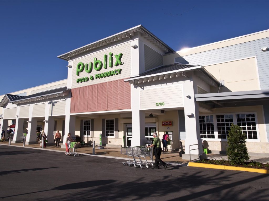
Publix was established by George W. Jenkins in 1930 in Winter Haven, Florida. The brand quickly distinguished itself by focusing on high-quality customer service and deep community involvement. Publix’s growth in the southeastern U.S. reflects its profound commitment to an employee-owned business model that prioritizes customer and worker welfare.
Cultural and Market Contributions
Publix’s market influence is a blend of its strong service ethos and dynamic community initiatives, which resonate deeply with its customer base. Acknowledged for strategic environmental efforts and extensive customer loyalty programs, Publix positions itself as a community-first leader in the supermarket industry.
Logo Design Philosophy and Evolution
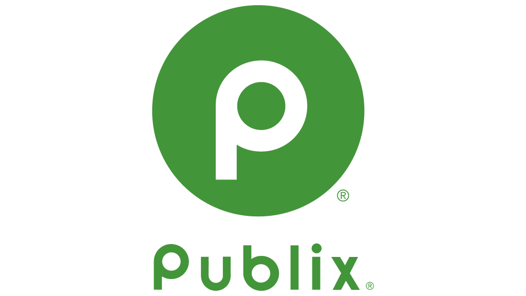
The evolution of Publix’s visual identity has transitioned from traditional designs to embracing modern minimalist aesthetics. The current use of a green-centric minimal design represents growth, sustainability, and approachability — characteristics inherent in its brand philosophy.
Symbolic Representations and Effects
Publix’s minimalistic logo, with a circular emblem embodying the ‘P’, underscores unity and forward motion. This subtle yet powerful design conveys a message of completeness and environmental stewardship, which holds significant resonance in today’s market focused on sustainability and community engagement.
6. Designing a Supermarket Logo with AILogoCreator.io
Integrating AI in Branding
In a rapidly digitizing world, AILogoCreator.io integrates artificial intelligence with creativity, offering an efficient pathway to develop unique branding symbols. By leveraging AI, supermarkets can design logos that not only reflect brand values but are also adaptable in an evolving digital landscape, easily modifying components to meet changing market demands.

Designing Steps for a New Logo
By using AILogoCreator.io, companies can experience a seamless design process composed of critical steps:
Step 1: Text to Logo
Start by entering the essential business details such as the name and slogan. Select industry-specific categories to align the logo design with market expectations.

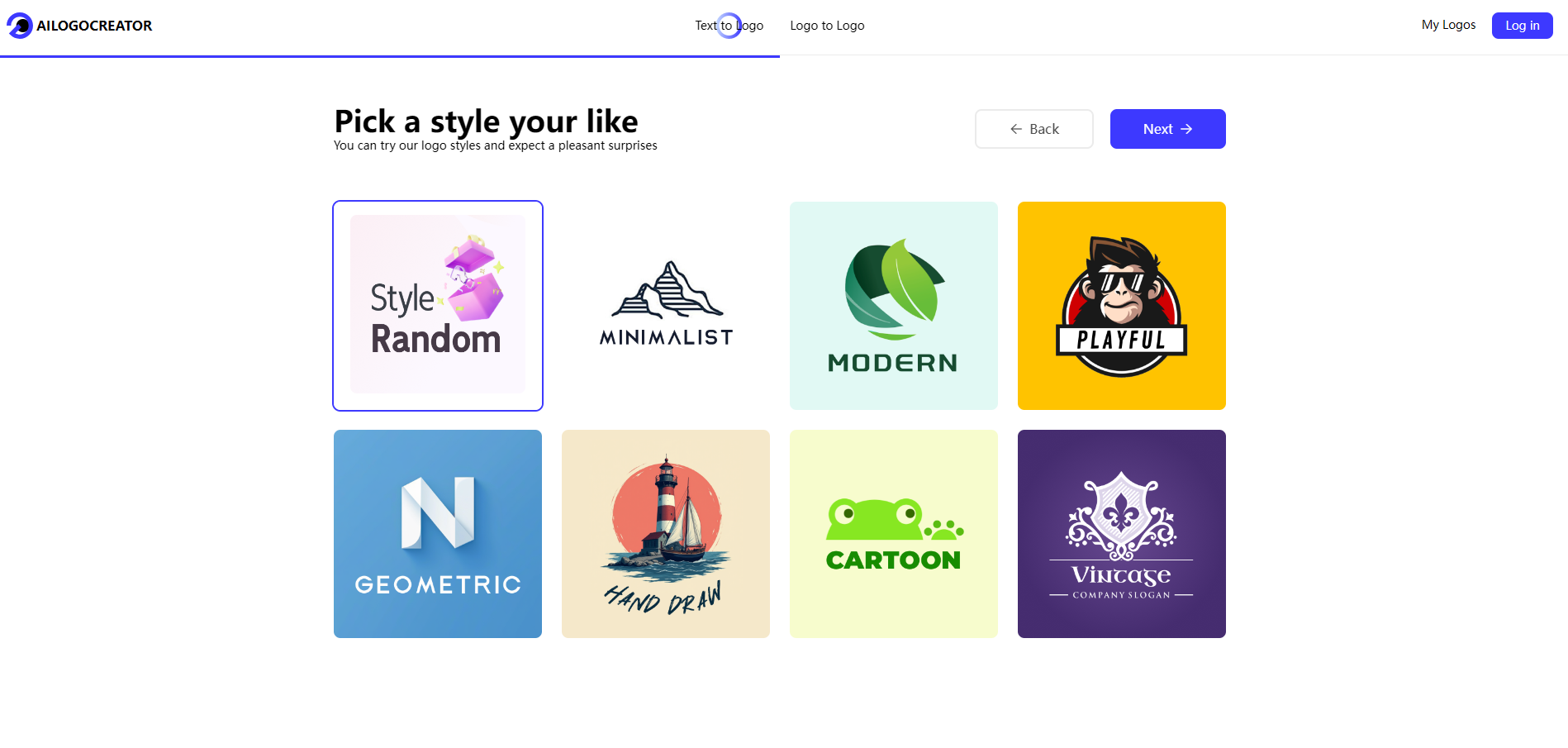
Step 2: Style and Color Selection
Choose from an extensive range of styles and colors that encapsulate the intended brand message and appeal to target demographics.
Step 3: Customization
Utilize powerful customization tools to adjust typography, icons, and other relevant design features, ensuring that the logo is both visually appealing and true to the business identity.
Step 4: Preview and Fine-Tune
Preview the draft design, making necessary refinements to ensure it aligns with the strategic vision. This step involves detailed tweaks to achieve aesthetic and functional perfection.
Step 5: Download
Once perfected, download the finished logo in various formats compatible with multiple media forms — ensuring ample flexibility for brand promotion.

Reflecting on Supermarket Logos
From Walmart to Publix, the logos of these monumental brands play a quintessential role in shaping consumer perceptions and fostering loyalty. The synthesis of brand history and design strategy offers a blueprint for newcomers aiming to establish a lasting visual identity. With technological tools like AILogoCreator.io, crafting resonant and adaptive logos has become more accessible, allowing brands to maintain relevance in an ever-evolving digital and consumer landscape.
Q&A
What makes a supermarket logo successful?
A successful supermarket logo is easily recognizable, reflects the company’s core values, and effectively connects with the target audience.
What is the top 5 biggest supermarket in the world?
- Walmart – With over 11,000 stores worldwide, Walmart is the largest retailer globally. It operates in various formats including hypermarkets, supermarkets, and discount stores.
- Carrefour – A French multinational retail corporation with more than 12,000 stores across 30 countries, Carrefour is known for its hypermarkets and supermarkets.
- Costco Wholesale – Known for its membership-based warehouse clubs, Costco operates over 800 warehouses globally, primarily in North America.
- Kroger – One of the largest supermarket chains in the United States, Kroger operates over 2,800 stores under various banners.
- Tesco – A British multinational that operates in several countries, Tesco is one of the world’s largest retailers with over 6,000 stores.
What is the most common grocery store in the US?
Walmart is often considered the most common grocery store in the United States due to its widespread presence and the number of stores.
Who are the big 6 supermarkets?
The “Big 6” supermarkets typically refer to the largest grocery retailers in the United States:
- Walmart
- Kroger
- The Albertsons Companies
- Ahold Delhaize (includes Stop & Shop, Giant, and Food Lion)
- SuperValu
- Safeway (part of Albertsons Companies)
How a supermarket brand logo should be?
A supermarket brand logo should:
- Be Memorable: Easy to recognize and recall.
- Reflect Values: Convey the brand’s mission, values, and culture.
- Be Versatile: Suitable for various media and applications.
- Be Timeless: Not overly trendy to maintain relevance over time.
- Use Appropriate Colors: Colors that evoke the right emotions and are associated with the brand.
- Be Simple: Simple designs are more likely to be effective and easily understood.
How do I create a supermarket branded logo?
Creating a supermarket branded logo can be done through the following steps:
- Define Your Brand Identity: Understand your brand’s values, mission, and target audience.
- Research: Look at existing logos for inspiration and to understand what works in your industry.
- Sketch Ideas: Start with rough sketches to explore different concepts.
- Choose Colors and Fonts: Select colors and fonts that align with your brand identity.
- Create a Draft: Use design software to create a digital draft of your logo.
- Get Feedback: Show your logo to others and gather feedback.
- Refine: Make adjustments based on feedback to improve the design.
- Finalize: Once you are satisfied, finalize the logo and prepare it for various uses.
- Professional Help: Consider hiring a professional designer if you need expert assistance.
For a more streamlined process, you can use tools like AILogoCreator.io which integrates AI to help you design a logo by:
- Inputting Business Details: Name, slogan, and industry.
- Selecting Styles and Colors: That match your brand message.
- Customizing: Adjust typography, icons, and other design elements.
- Previewing and Fine-Tuning: Ensure the logo aligns with your strategic vision.
- Downloading: The final logo in various formats for different media.


CommentsTake the first comment