The BMW Legacy: A Timeless Brand Identity
BMW, or Bayerische Motoren Werke, stands as a testament to innovation and engineering excellence, encapsulated through its iconic brand identity. Established over a century ago in 1916, the company originated in Germany with a primary focus on aircraft engines. These humble beginnings laid the foundation for BMW’s transition into one of the most respected names in the automotive industry. The journey from aviation to automobiles is one marked by unyielding commitment to quality, creativity, and performance.
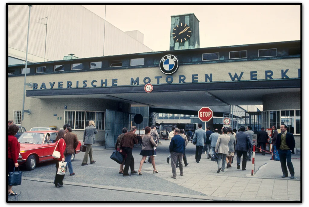
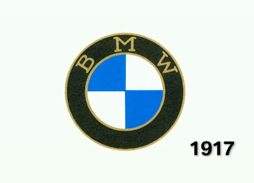
The BMW logo, introduced in 1917, has played a pivotal role in cementing this legacy. It has not merely acted as a visual identifier but has evolved into a symbol of trust, performance, and luxury across the globe. The circular emblem, with its blue and white color scheme, signifies more than just brand recognition; it represents a tradition of engineering excellence and innovation that has been nurtured through decades. For customers and enthusiasts alike, the BMW logo is synonymous with superior craftsmanship and driving pleasure. It is through this logo that BMW conveys its enduring brand values, offering a sense of connection to its German heritage while embracing the spirit of modernity.
The Birth of a Legend: The Founding of BMW
BMW’s inception dates back to the turbulent economic period of World War I. Initially conceived as a manufacturer of aircraft engines, BMW quickly gained a reputation for producing high-quality, reliable engines that propelled innovation during a time of great technological advancement. This focus on aeronautics equipped BMW with a keen understanding of precision engineering—a hallmark that would later define its vehicles.
In 1929, when BMW ultimately shifted its focus to automotive manufacturing, these core principles carried over. The company introduced its first motorcycle and subsequently, its first automobile, embodying the high-performance standards set by its aviation roots. This transition marked a pivotal moment for BMW, enabling it to pave a new path in the burgeoning automotive market. The strategic shift allowed BMW to adopt technological advancements from the aviation industry into car manufacturing, establishing a new standard for performance and luxury in the automotive world.
The brand quickly carved out a niche for itself, lauded for its dynamic designs and innovation-driven approach. The name BMW became synonymous with driving excellence, a reputation carefully curated through meticulous engineering and forward-thinking design. The BMW logo, debuting in 1917, became an integral part of this identity. It served not only as a badge of quality but also as a symbol of BMW’s commitment to pushing the boundaries of automotive technology.
Tracing the Origins of the BMW Logo
The inception of the BMW logo in 1917 heralded the beginning of what would become an iconic symbol recognized worldwide. This emblem’s significance goes beyond aesthetics—it embodies BMW’s core values and serves as a testament to the company’s historic journey.
The Design Elements of the BMW Logo
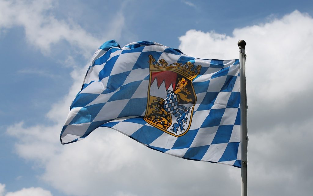
The BMW logo is best known for its distinct blue and white quadrants. These colors are derived from the Bavarian flag, creating a visual linkage to the region of Bavaria, where BMW was founded. Despite being over a century old, the design has undergone only subtle refinements, preserving its essence while allowing it to remain contemporary with each passing decade.
The circle that frames the logo offers a clean, geometric form that is both timeless and modern. Simplicity is key; the design eschews complex imagery for a minimalist aesthetic that fosters brand recognition and memorability. This geometric purity keeps the logo adaptable across various mediums—be it on the chrome surface of a car or the digital screens of modern marketing platforms.
Yet, there is more to the emblem than its general aesthetic appeal. The logo epitomizes BMW’s dedication to blending tradition with innovation. It works as a visual representation of BMW’s ethos, driving imagination and innovation while respecting its heritage. Each element of the logo, from the color choice to its circular form, reflects a painstakingly deliberate design decision, encapsulating BMW’s storied history and broad ambition.
The Propeller Story: The Myth and Reality
One of the most enduring myths surrounding the BMW logo is the “propeller” story. Due to BMW’s aviation history and the visual nature of the logo, many have speculated that the emblem represents a spinning airplane propeller, cutting through a blue sky. This interpretation, although widely accepted by many, emerged primarily through marketing campaigns after World War II, rather than from any deliberate design choice.
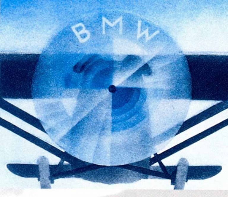
In reality, the blue and white checked pattern was intended to symbolize the Bavarian flag rather than an aircraft propeller. However, BMW has embraced this misconception over the years, recognizing its alluring connection to the brand’s early aviation roots. The propeller myth adds a layer of storytelling to the already rich narrative of BMW’s history, illustrating how brand perceptions can sometimes diverge from original intentions.
Emphasizing BMW’s dual focus on performance and heritage, the myth underscores the company’s success in pioneering high-speed, high-performance technologies. The symbolic intertwine of aviation heritage with automotive prowess effectively reinforces BMW’s image as a brand committed to engineering excellence, whether on the tarmac or the open road.
Visual Components and Stylistic Evolution
The Stylistic Evolution of the BMW Emblem
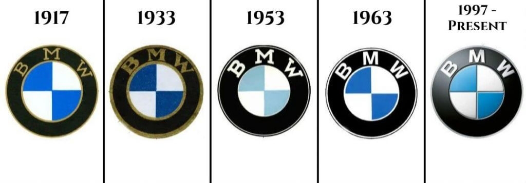
The BMW emblem has witnessed several stylistic evolutions, ensuring its relevance in different eras while maintaining its fundamental identity. Each update reflects a mindful balance between contemporary trends and classic heritage, preserving the brand’s visual identity across generations.
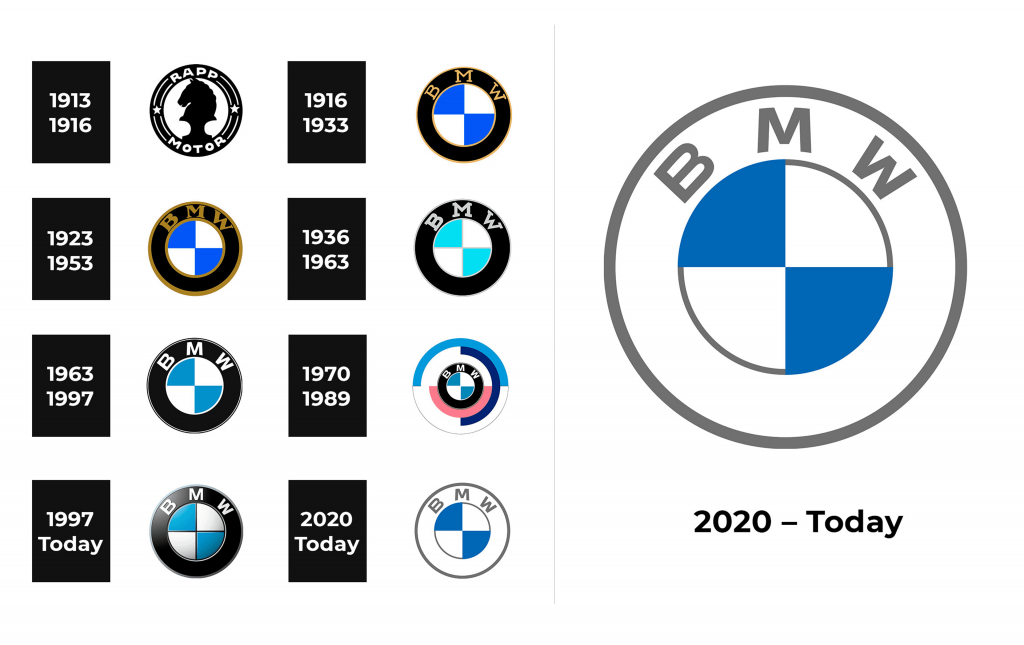
- 1929: The introduction of the BMW Roundel came with the establishment of the company’s automotive division. This iteration underscored BMW’s aspirations in the automotive sphere, laying down the foundation for what would become a visually influential logo in the car industry.
- 1953 to 2000s: These decades marked significant transitions for the emblem, with refinements that accommodated the tastes and technologies of each period. By simplifying the design elements and enhancing color vibrancy, BMW ensured that the logo remained versatile across both print and electronic media.
Throughout its evolution, the BMW logo retained its minimalist essence, a strategic decision allowing it to effortlessly align with global branding dynamics. The logo’s consistent elements served as visual constants that customers and enthusiasts could identify with, even as the company innovated in the automotive domain.
Notable Transformations Over the Decades
Over the years, BMW has capitalized on its logo’s evolving identity to communicate broader brand narratives. Each transformation reflects a momentous phase in BMW’s storied journey, adapting to shifts in cultural and technological landscapes.
The modifications, though subtle, have played an influential role in distinguishing the brand in highly competitive markets. Whether through slight typographic changes or enhancements to the color palette, each alteration carries specific intent, signaling BMW’s commitment to innovation without abandoning its core visual principles.
By tailoring its logo through technological advancements, BMW not only emphasizes its adaptability but also its dedication to staying keenly attuned to consumer preferences. The logo’s progression from three-dimensional renditions to sleek, flat designs reflects broader industry trends while maintaining the minimalist elegance that has always been at the heart of BMW’s visual language.
The BMW Logo Today: A Global Brand’s Visual Identity
The Current BMW Logo and Its Global Recognition
As of today, the BMW logo continues to be a symbol of global recognition, embodying the brand’s essence of luxury and performance. In its current form, the logo retains its traditional blue and white colors, underscoring the heritage and pride of the Bavarian roots from which it originated.
The digital landscape has further amplified the logo’s recognizability, enabling BMW to maintain consistency across a wide array of platforms—from traditional signage on car dealerships to high-resolution displays on digital devices. This omnipresence upholds BMW’s identity as a pioneering force in automotive excellence, while simultaneously accommodating the fast-paced evolution of visual marketing.

The BMW logo’s current iteration is more than just an emblem on the bonnet—it’s an integral part of brand communication strategies. It beckons customers around the globe to associate it with quality, innovation, and precision. As consumers’ interactions with brands become increasingly digital, the logo remains a crucial touchpoint, representing the continuity of BMW’s commitment to superior design and engineering.
The Logo’s Role in Brand Perception and Racing Heritage
For BMW, the logo extends beyond being a design element; it plays a substantive role in shaping brand perception. Central to this perception is BMW’s storied legacy in motorsports—a domain where the logo shines as a symbol of speed, agility, and victory.
With its roots deeply entrenched in racing heritage, BMW has utilized the emblem to communicate its unyielding commitment to engineering perfection. Whether emblazoned on racing cars or merchandise, the logo signifies achievement and driving pleasure. It articulates BMW’s devotion to building machines that deliver high performance, capturing the imagination of enthusiasts who view the brand as a conduit to exhilarating driving experiences.
In the competitive arena of motor racing, the BMW logo functions as a badge of honor, embodying the technical finesse and strategic vision that fans and drivers have come to expect from the brand. Its role in fostering a powerful brand association among stakeholders underscores BMW’s mastery in nurturing a perception of excellence across different spheres of automotive innovation.
Designing the BMW Logo with AI Logo Creator
Advances in artificial intelligence have revolutionized the design landscape, providing tools that allow brands to craft sophisticated logos that echo the heritage and aspirations of pioneering companies like BMW.

Steps to Create a Logo Inspired by BMW with AILogocreator.io
The creation process for a BMW-inspired logo using AI technology like AILogocreator.io involves several strategic stages:
- Text to Logo: This initial phase captures the essence of the brand’s textual identity, converting iconic phrases and mission statements into visual elements that embody the brand ethos. Through AI, these words transform into bespoke designs that align with BMW’s narrative of innovation and luxury.
- Style and Color Selection: AI tools offer a palette of choices that helps refine the design to closely match BMW’s traditional color scheme while introducing complementary tones that resonate with contemporary aesthetics. Selection is meticulous, ensuring each shade and style reflects the intelligence and dynamism emblematic of BMW.
- Customization and Digital Strategies: Customizing the logo involves marrying the brand’s historic appeal with modern visual dynamics. AI permits unique adjustments to layouts and graphics, tailoring the logo to meet BMW’s high standards and market objectives.
- Preview, Fine-Tune, and Download: The final stages involve previewing the logo across different platforms and media, making fine adjustments to details for optimal clarity and impact. Once perfected, these AI-created logos are readily accessible, facilitating immediate deployment across both digital and traditional channels.
By leveraging AI, brands not only ensure a more efficient design process but also enhance the quality and impact of their visual identities, empowering them to resonate with contemporary audiences while upholding traditional values.
The BMW Logo: A Testament to Timeless Design
The Enduring Appeal of the BMW Logo
The BMW logo’s allure lies in its timeless design—a marvel of minimalism and symbol of unwavering quality. Year after year, it continues to captivate enthusiasts and consumers with its sleek and understated elegance. This enduring appeal is no accident; it is the result of a deliberate design strategy focused on consistency and clarity.
The emblem’s simplicity enables it to transcend language and cultural barriers, making it universally recognizable and accessible. This adaptability is crucial in an era of globalization, where brands vie for prominence in diverse markets. The BMW logo’s consistent elements anchor it within the brand identity, while subtle periodic updates keep it aligned with current design trends.
For BMW, the logo’s lasting impact is a testament to its success in marrying tradition with innovation. As the company continues to pioneer developments in automotive technology, the logo’s resonance remains a constant reminder of BMW’s storied past and bright future. Its visual presence persists as a beacon for engineering excellence and driving pleasure, just as compelling today as it was over a century ago.
BMW’s AI Logo Creator: Empowering Brands with Intelligent Design
In today’s digital age, tools like AILogocreator.io exemplify the integration of AI in brand development. By harnessing artificial intelligence, brands can explore unprecedented levels of precision and customization in logo design, achieving outcomes that not only reflect their ethos but also anticipate future trends.
The advantages of AI in design are manifold: automation streamlines the creative process; adaptive algorithms enhance flexibility; and sophisticated data analytics enable brands to tailor designs based on market insights and consumer preferences. This intelligence empowers brands to craft logos that are both visually appealing and strategically aligned with their mission.

Real-world applications showcase numerous success stories, where AI has facilitated the creation of logos that embody both artistic merit and commercial viability. In automotive and beyond, the capacity to innovate through AI positions brands to remain at the forefront of visual and cultural transformation.
Enigmatic Essence of the BMW Logo
The Ever-Lasting Legacy of the BMW Logo
Despite shifting trends and technologies, the BMW logo has maintained a hallmark of continuity and relevance. This is due in part to BMW’s dedication to evolving the logo with careful consideration of its longstanding symbolism and market position.
Each iteration of the logo balances BMW’s heritage with contemporary design sensibilities, evangelizing a sense of continuity that resonates with both long-time fans and new generation customers. The enduring legacy of the logo reflects not only its visual strength but also its integration into the broader BMW narrative—a testament to the brand’s pursuit of excellence in every facet of its business.
Shaping BMW’s Future Through Design
As BMW continues to innovate, the logo remains a central element in communicating the brand’s vision for the future. The ongoing alignment of its design with evolving trends in mobility and technology underscores BMW’s commitment to progressive values. Whether through electric vehicle technology or sustainability initiatives, the logo stands as a symbol of BMW’s dedication to shaping the future of the automotive industry.
Strategic evolutions in the logo will continue to reinforce BMW’s positioning as a leader in automotive innovation and a custodian of luxury and performance standards. Through this ongoing journey, the BMW logo will serve as a legacy emblem, echoing the brand’s past achievements while heralding future accomplishments.
FAQs
How Did the BMW Logo Originate, and What Does It Symbolize?
The BMW logo, introduced in 1917, originated from the company’s Bavarian roots, symbolizing pride and excellence through its blue and white color scheme. Originally intended to reflect regional identity, the logo went on to become an emblem of global renown, recognized for its premium craftsmanship and engineering prowess.
What Are the Key Design Changes in the BMW Logo?
The BMW logo has witnessed notable design changes, particularly during pivotal periods such as 1929 and 1953. These transformations facilitated the logo’s adaptation to modern visual contexts while preserving its inherent simplicity and heritage. Refinements over the decades have reflected broader shifts in design philosophy, aligning with digital mediums and consumer expectations.
How Has the BMW Logo Influenced Global Branding?
The BMW logo’s influence extends beyond the automotive sector; it serves as an icon of luxury, precision, and performance in the global market. Emblematic of superior engineering and unforgettable driving experiences, the logo enhances brand equity by evoking trust and admiration worldwide.
How Is AI Being Used in Modern Logo Design?
AI has become a transformative force in modern logo design, offering unparalleled tools for crafting logos that are both strategic and visually compelling. Through AI platforms like AILogocreator.io, brands can achieve design innovation faster and more efficiently, utilizing data-driven insights to inform creative decisions and ensure successful brand representation.
What Does the Circular Shape of the BMW Logo Represent?
The circular shape of the BMW logo signifies unity and continuity, symbolizing BMW’s holistic approach to quality and innovation. It evokes the brand’s commitment to perpetual progress and its adherence to a forward-looking vision that honors its rich legacy while pursuing new horizons.


CommentsTake the first comment