The airline industry, particularly in the United States, is not only about transportation but also about creating a brand identity that resonates with consumers. Among the various elements that contribute to a successful airline’s brand identity, the logo is perhaps the most visible and enduring. Acting as a visual representation of a company’s mission and values, logos play a crucial role in establishing trust, recognition, and loyalty among passengers.
American Airlines, Delta Airlines, United Airlines, Southwest Airlines, and JetBlue Airways are five of the most prominent airlines in the U.S., not only because of their extensive networks and number of routes but also due to their impactful branding. These airlines dominate the skies with significant market shares and have crafted logos that are both iconic and representative of their heritage and aspirations.
American Airlines: A Legacy in Flight
History and Influence
American Airlines, founded in 1930, stands as one of the most storied and recognizable names in aviation history. With a vast network spanning domestic and international routes, American Airlines commands significant market influence. The airline’s expansion over the decades reflects not just a growth in destinations served but also a commitment to innovation in customer service and striving to be at the forefront of aviation technology.

From its inception, American Airlines has played a pivotal role in shaping airline industry standards, from introducing the first electronic booking system in the form of SABRE to providing luxurious and innovative in-flight experiences. These pioneering efforts have cemented its position as a leader in aviation, underscoring the airline’s enduring influence in the market.
Logo Design Evolution
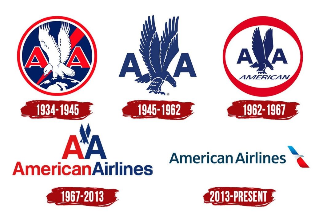
The evolution of American Airlines’ logo encapsulates its rich history and vision for the future. Initially, the logo featured an eagle as a powerful national symbol, aligned with the patriotic ethos of the company. Over the years, the logo has undergone several redesigns to keep up with contemporary branding trends and consumer expectations.
In 2013, American Airlines unveiled the “Flight Symbol,” an updated logo that beautifully fuses elements of an eagle, a star, and the letter “A.” This design reflects a modern approach while maintaining the traditional American colors—red, white, and blue. It signifies the airline’s forward-looking vision and commitment to service excellence, while preserving its heritage.
Design Elements
- Color Scheme: American Airlines’ iconic red, white, and blue colors serve dual purposes: reflecting the brand’s American roots and imbuing a sense of trust, unity, and patriotic pride. These colors ensure high recognition and differentiation from other global carriers.
- Typography: The transition to a sleek, modern typeface has elevated the brand’s sophistication, aligning with its status as an industry leader. The use of uppercase letters reflects strength and reliability while maintaining readability across various media formats.
Symbolism
The “Flight Symbol” is a harmonious blend of modern design and historical homage. The abstract eagle and star suggest flight and aspiration, while the subtle “A” integrates seamlessly, signifying American Airlines. This logo symbolizes resilience, innovation, and a journey towards new frontiers—core principles that guide the airline’s operations and brand ethos.
Impact and Recognition
Globally recognized, the updated logo enhances brand visibility, reinforcing American Airlines’ image as a trusted and forward-thinking carrier. It plays a critical role in international and domestic marketing, customer engagement, and brand loyalty initiatives. The logo’s adaptability to digital formats ensures consistent branding across traditional and modern platforms, from aircraft liveries to mobile apps.
Delta Airlines: Leadership in Innovation
History and Market Presence
Delta Airlines, established in 1925, has showcased remarkable resilience and adaptability in the ever-changing aviation landscape. It operates one of the largest fleets globally, with comprehensive services across both domestic and international routes. Delta’s market presence is defined by its strategic partnerships and emphasis on customer experience, which have contributed to a loyal customer base.
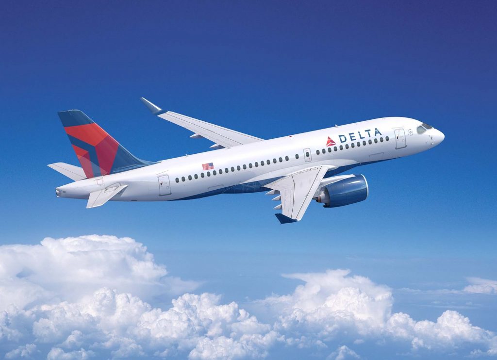
As a pioneer in various technological advancements, Delta was one of the first airlines to offer mobile boarding passes and has consistently prioritized sustainability by investing in fuel-efficient aircraft. Such initiatives highlight Delta’s commitment to innovation and environmental responsibility, reflecting its leadership role in the industry.
Logo Evolution
Delta’s logo has transformed significantly over the years, transitioning from a “propeller-inspired motif” to a more abstract representation of the Greek letter “delta”. The current logo features a dynamic red triangular shape, symbolizing “forward momentum” and embodying Delta’s spirit of progression and innovation.
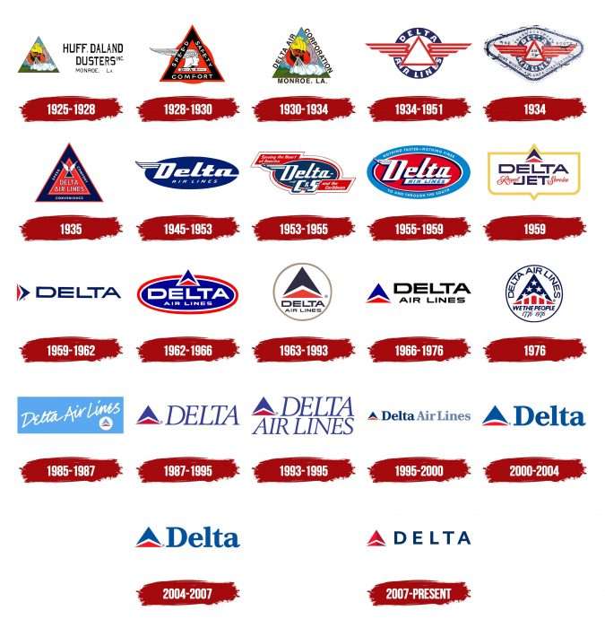
This geometric design was introduced in 2007 as part of a comprehensive rebranding strategy, aiming to modernize Delta’s visual identity and align with its broader business objectives. The visual metaphor of a “delta” not only represents technical precision but also reflects Delta’s strategic positioning and adaptability in the aviation market.
Design Elements
- Color and Shape: The bold use of red signifies energy, passion, and determination—qualities essential for a pioneering company. The triangular form mirrors both the aerodynamics of flight and progressiveness in business strategy.
- Typography: Delta’s typeface underwent refinement to achieve a polished, professional look. This evolution is critical to ensuring clear communication and reinforcing confidence among consumers.
Symbolism
Delta Airlines’ logo encapsulates a commitment to innovation and technical excellence. The triadic angles suggest dynamic motion, aligning with the airline’s branding narrative of efficiency and connectivity. The design successfully inspires confidence in Delta’s ability to connect passengers to the world efficiently and reliably.
Brand Impact
The logo enhances Delta’s brand equity by visually representing its innovation-centric ethos and customer-centric policies. Global recognition of the emblem is a testament to its efficacy in symbolizing the quality of service and modernity that Delta offers, making it a trusted brand across diverse markets.
United Airlines: Connection Across the Globe
Historical Background
Tracing its roots back to 1926, United Airlines has grown into one of the world’s largest and most diverse carriers. It boasts a wide-reaching global network serving over 350 destinations across continents. United’s growth strategy has often included successful mergers, most notably with Continental Airlines, boosting its capability and resources to serve international markets.
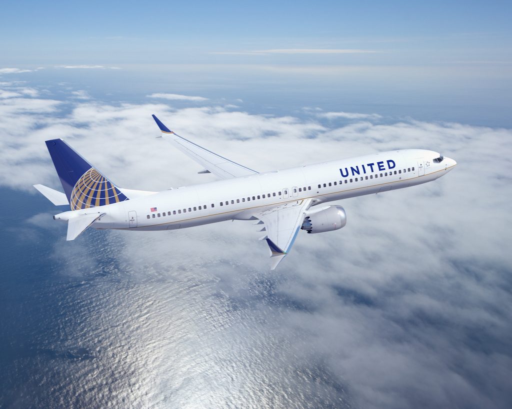
United Airlines has consistently championed service innovation, exemplified through amenities like premium cabin experiences and expansive in-flight entertainment options. These initiatives have reinforced its reputation as a major player in enhancing passenger experience and connectivity.
Logo Evolution
United’s logo evolution reflects a thoughtful balance between legacy and modernity. Its original shield design has undergone significant evolution, most notably adapting the globe motif post-merger with Continental Airlines. This design element underscores United’s expansive reach and global operations, emphasizing connectivity far and wide.
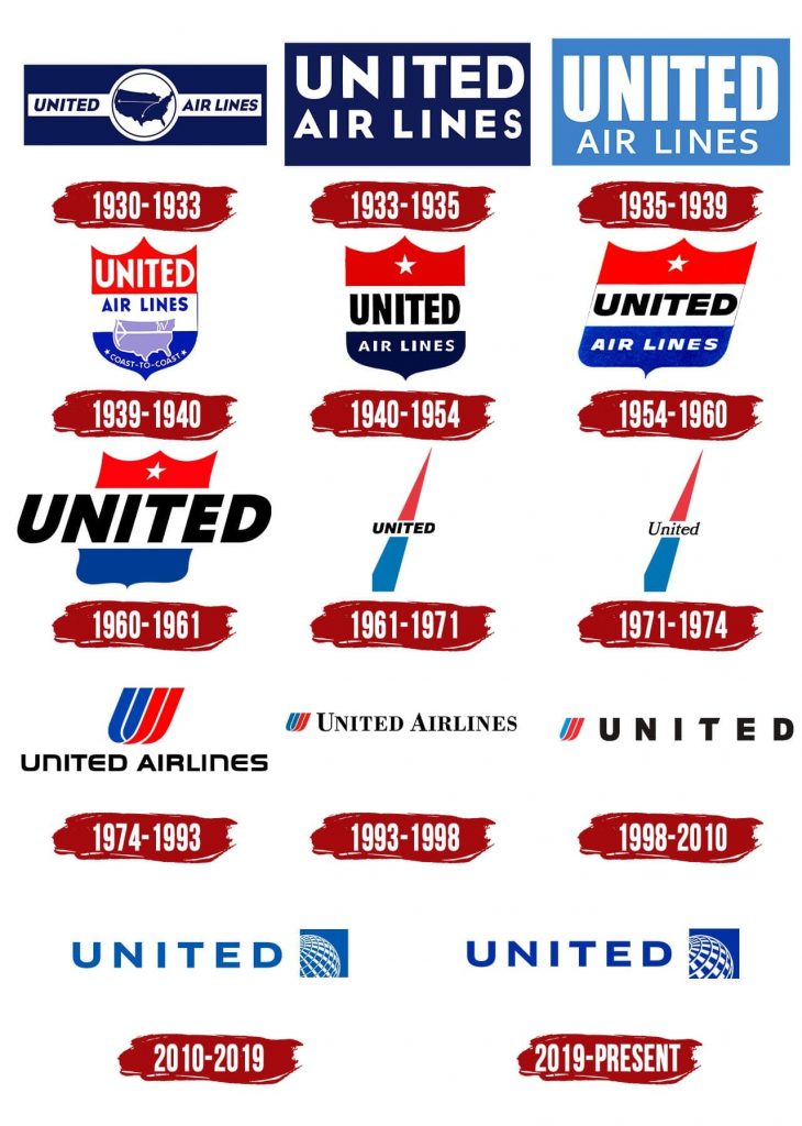
Introduced in 2010 alongside a stylized wordmark, the globe design heralds a new chapter for United, reflective of unity and inclusivity. This emblem suggests horizons without boundaries, symbolizing United’s role in bridging countries and cultures around the globe.
Design Elements
- Color Palette: The use of blue, white, and gray exudes professionalism, trustworthiness, and sophistication, resonating with passenger expectations for safe, reliable travel.
- Typography: Modernized font ensures good readability and enforces consistency with corporate branding, strengthening recognition in diverse markets.
Symbolism and Meaning
The globe in United’s logo signifies expansive global reach and connectivity, symbolizing a world without boundaries and the vast possibilities of air travel. This reinforces the airline’s core ethos of uniting people, places, and cultures.
Brand Impact
United’s logo has become a powerful visual communicator of its global brand proposition and reaffirms its stature as a leader in international air travel. By symbolizing connectivity and expansive reach, the logo bolsters passenger loyalty and enhances the company’s global market positioning.
Southwest Airlines: Spirit of Freedom
Company Overview
Founded in 1967, Southwest Airlines has cemented its position in the U.S. as a leading low-cost carrier, renowned for its customer-friendly service and affordable pricing model. Its unique point-to-point network enables it to provide efficient services primarily within the domestic market, covering a comprehensive array of major cities.

Southwest’s distinctive customer service and no-frills approach, such as no additional fees for checked luggage, contribute to its strong brand identity. This approachable and friendly image reinforces the company’s commitment to making air travel accessible to all.
Logo Design Changes
Southwest’s logo evolution signifies its aspirations for energy and positivity. The transition from its original heart logo to the current vibrant and dynamic design reflects a modern interpretation focused on emotional connection with customers. The heart remains a central motif but is now coupled with a multicolored scheme that infuses warmth and friendliness.
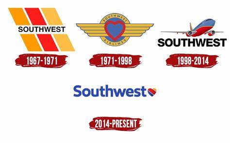
Implemented in 2014, the redesigned logo aligns with Southwest’s mission to go beyond transportation, symbolizing unity, acceptance, and love—all core tenets of Southwest’s brand philosophy.
Design Elements
- Color Use: The use of bright yellow, bold red, and serene blue suggests enthusiasm, reliability, and friendliness—key attributes of Southwest’s brand.
- Font Style: The logo’s approachable typography exudes warmth, embodying the airline’s commitment to maintaining genuine relationships with its customers.
Symbolism
The Southwest logo symbolizes freedom and customer love, reflecting its dedication to delivering joyful and stress-free travel experiences. The logo’s heart element evokes emotional resonance, reinforcing the airline’s promise to prioritize customer happiness and satisfaction.
Brand Perception
Southwest’s brand image is unequivocally supported by its logo, which communicates its dedication to creating uplifting and memorable passenger experiences. The design effectively underscores its identity as an approachable, reliable, and enjoyment-focused airline.
JetBlue Airways: Freshness and Modernity
Company and Market Introduction
JetBlue Airways, a leader in the premium low-cost niche, launched in 2000 with a mission to bring humanity back to air travel. Headquartered in New York City, JetBlue has rapidly gained recognition for its commitment to providing quality service and value at competitive prices.
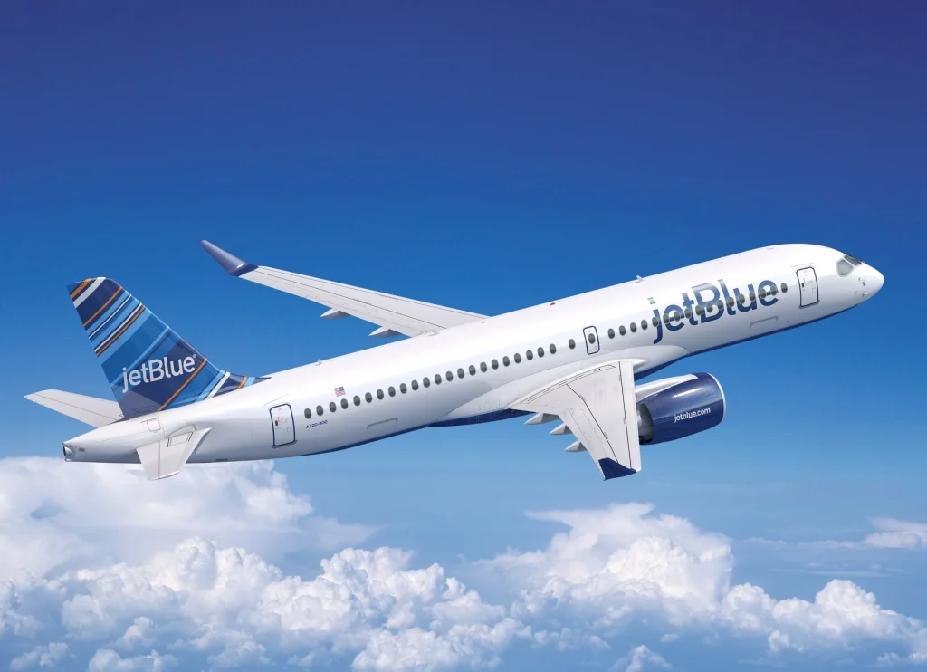
JetBlue’s market approach comprises selecting high-demand routes and offering enticing in-flight services, including live television and free Wi-Fi, which set new performance standards in its category. This innovative thinking continues to bolster JetBlue’s appeal to budget-conscious and experience-oriented travelers.
Logo Design Strategy
JetBlue’s logo epitomizes modernity and customer-centric philosophy. Unveiled during its inception, the logo has remained consistent, characterized by simplicity and freshness. It deploys clean typography and a minimalistic design that reflects the airline’s dedication to efficiency and customer satisfaction.
Design Elements
- Color Choices: Dominating blues symbolize trust, calmness, and stability while establishing a consistent brand image. These colors also evoke a sense of tranquility and reassurance—qualities that enhance passenger comfort.
- Font Style: The clean sans-serif typeface emphasizes modernity, aligning seamlessly with JetBlue’s mission to redefine air travel experiences with a blend of style and value.
Symbolism
JetBlue’s visuals embody a balance of innovation and reliability. The understated elegance of the logo reinforces a commitment to pioneering new services, while ensuring that each journey meets the highest standards of quality and comfort.

Branding Impact
JetBlue’s logo resonates with its modern audience, effectively communicating its unique approach to aviation service. The visual identity bolsters brand equity by consolidating JetBlue’s position as a beloved and pioneering carrier.
Summarize the Analysis
The Design Elements of Top US Airline Logos
Each of the top five airline logos demonstrates a keen understanding of design principles that foster lasting customer connections. These logos expertly capitalize on elements like color psychology, typography, and symbolic representation to convey distinct brand messages. Their designs rely on a synthesis of traditional elements and modern aesthetics to maintain brand relevance and foster engagement.
Color Psychology and Its Impact on Branding
Colors in airline logos are strategically selected to elicit specific emotional responses, enhance brand appeal, and ensure differentiation in a crowded market. For example, blue frequently symbolizes trust and reliability, while red indicates energy and confidence. These choices contribute significantly to how airline brands are perceived by audiences worldwide.
Typography and Font Choices in Airline Logos
Typography plays an integral role in shaping the perception of airline logos. Airlines employ clean and modern fonts to ensure readability across various media, while simultaneously mirroring the professionalism and sophistication inherent to their services. The strategic font choice is an influential aspect of logo design that enhances the overall brand narrative.
The Impact of Airline Logos on Aircraft Livery
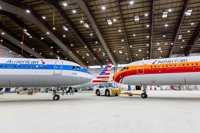
Airline logos are integral components of aircraft livery, facilitating brand recognition during flights. The distinct visual identity established through thoughtful logo design contributes to an impressionable travel experience. Logos positioned on aircraft tails and fuselages enhance visibility and serve as moving billboards that reinforce brand presence globally.
Role of Logos in Enhancing Brand Recognition During Flights
Distinctive logos contribute substantially to enhancing brand recognition during flights and in airport contexts. Logos effectively leverage color, shape, and symbolism to instill brand recall, even among casual observers. They encompass more than just visual identifiers; they are emblematic of the service ethos and standards each airline upholds.
Summary of the Top 5 Airline Logos’ Impact on Brand Identity and Customer Trust
The top five airline logos analyzed here reflect distinct brand identities rooted in legacy, innovation, and customer orientation. They serve as powerful tools for cultivating consumer trust, facilitating customer engagement, and nurturing brand loyalty. By leveraging consistent, modern, and resonant design elements, these logos drive distinct brand narratives and indelible consumer connections.
How to Design an Airline Logo?
A Brief Introduction to the Advantages of Using AI in Logo Design
Platforms like ailogocreator.io simplify the logo design process through advanced AI technology, offering efficiency and precision. By utilizing AI-driven tools, brands can swiftly generate logos that capture their essence and align with specific market goals without the need for extensive design expertise. This innovative approach revolutionizes traditional design methodologies by introducing speed and adaptability.

Step-by-Step Guide Using AILogocreator.io
- Input Keywords: Start with pertinent airline-related keywords, colors, and iconography to tailor the design process.
- Style and Color Selection: Leverage industry-specific styles to select colors that symbiotically reflect brand identity while ensuring visibility and distinction.
- Customization: The intuitive editing tools offered by ailogocreator.io allow users to refine typography, align symbols creatively, and maintain brand authenticity.
- Preview and Adjust: Through real-time previews, take advantage of AI suggestions to enhance design elements and perfect the finished product.
- Download: Finalize and download logo files in preferred formats suitable for various branding applications, ensuring agility across digital and physical platforms.
Through ailogocreator.io, brands can craft logos that encapsulate their narrative, seamlessly communicating their vision to a global audience.
Global Influence and Market Trends in Airline Logos
Impact on Global Recognition
Effective airline logos are fundamental to enhancing global brand recognition, often transcending language and cultural boundaries. Their design plays a vital role in projecting a brand’s ethos and solidifying their presence in international markets.
Market Trends
Current trends highlight a shift towards minimalism, the incorporation of dynamic design elements, and a growing emphasis on sustainability within airline branding. This movement reflects wider societal values and digital adaptability.
Logo Longevity and Evolution
Consistency in logo evolution ensures it remains relevant over time despite shifting consumer preferences. By regularly refreshing brand visuals to align with contemporary aesthetics, airlines maintain engagement and resonance with both loyal and new customers.
Looking Forward: The Future of Airline Branding
Brand Identity Evolution
Brand identity strategies are expected to prioritize seamless integration across digital touchpoints, balancing traditional recognition with digital innovation. Future logos may incorporate interactive features and adaptable elements suitable for evolving digital platforms.
Technological Innovations
As AI and augmented reality technologies continue to advance, logo usage may evolve to include interactive components that enhance user engagement. Virtual experiences, such as augmented reality on boarding passes or immersive digital campaigns, will likely play a growing role in branding strategies.
Sustainability and Corporate Responsibility
Airlines are anticipated to incorporate eco-friendly motifs and socially responsible messaging within their logos, reflecting broader corporate values. This aligns with growing consumer awareness and expectations for environmental stewardship and sustainable practices.
Frequently Asked Questions
What are the most recognizable airline logos in the US?
- American Airlines, Delta Airlines, United Airlines, Southwest Airlines, and JetBlue Airways are among the most recognizable due to their iconic designs and significant market presence.
What is the significance of colors in airline logos?
- Colors are crucial in airline logos as they communicate feelings of trust, reliability, and energy while also helping to differentiate a brand in a competitive market.
How has the design of airline logos evolved over time?
- Over the years, airline logos have shifted from complex designs to more streamlined and minimalist aesthetics, focusing on digital adaptability and modern visual messaging.
Why are airline logos important for brand identity?
- Airline logos are integral to brand identity as they convey key brand messages, build consumer trust, and foster emotional connections with passengers.
What are the key elements of a strong airline logo?
- Strong airline logos incorporate simplicity, memorability, strategic color use, typography, and alignment with the brand’s mission and values.
What are the top 4 airlines in the US?
- Based on various metrics including market share and brand recognition, the top U.S. airlines are American Airlines, Delta Air Lines, United Airlines, and Southwest Airlines.
What does the American Airlines logo mean?
- The American Airlines logo symbolizes tradition mixed with modernity, reflecting the airline’s commitment to innovation, strength, and national heritage.
What are the top 5 airlines in the world?
- Globally, Qatar Airways, Singapore Airlines, All Nippon Airways (ANA), Emirates, and Cathay Pacific are often ranked among the top due to their service excellence and strong branding.
What airline has a red, white, and blue logo?
- American Airlines prominently features the red, white, and blue color scheme emblematic of its commitment to its American roots and heritage.
What is the most beautiful airline logo?
While subjective, airlines like Singapore Airlines and Emirates are frequently noted for their elegantly designed logos that capture the essence of luxury and cultural heritage.


CommentsTake the first comment