Logos play a crucial role in shaping a company’s culture and promoting its brand. They serve as visual symbols that convey a brand’s identity and values. In technology companies, logos become even more significant. They not only represent innovation but also establish trust and recognition among consumers. A remarkable 94% of consumers believe logos are vital for brand recognition, while 42% say they convey a brand’s personality. What makes the logos of tech giants special? They often combine simplicity with creativity, making them memorable. For those looking to design impactful logos, tools like ailogocreator.io offer a new innovative solutions.
1. Apple
Logo Design Elements
Minimalist and Iconic
Apple’s logo stands as a testament to the power of minimalism. The design, a simple apple with a bite taken out, captures attention with its clean lines and straightforward form. This minimalist approach ensures that the logo remains easily recognizable across various platforms and mediums. The simplicity of the design allows it to be both timeless and adaptable, fitting seamlessly into the ever-evolving landscape of technology companies.
Use of Negative Space and Simplification
The use of negative space in Apple’s logo adds depth and intrigue. By incorporating a bite mark, the design cleverly plays with the concept of absence, making the logo more engaging. This element of simplification not only enhances the aesthetic appeal but also reinforces the brand’s commitment to innovation and user-friendly design. Over the years, the logo has evolved from a detailed drawing to a flat, elegant design, perfectly representing the brand’s ethos.
Brand Impact
Global Recognition
Apple’s logo enjoys global recognition, symbolizing quality and innovation. The logo’s evolution, including the introduction of the rainbow-colored apple during the Macintosh launch, marked a significant shift in the brand’s identity. This change helped Apple establish itself as a leader in the tech industry, with the logo becoming synonymous with cutting-edge technology and sleek design.
Association with Innovation
The association between Apple’s logo and innovation is undeniable. The brand consistently pushes the boundaries of technology, and its logo reflects this pioneering spirit. By removing the name ‘Apple’ from the logo, the company emphasized the strength of its visual identity. This bold move highlighted the brand’s confidence in its products and its ability to stand out in a crowded market. As a result, Apple’s logo has become a symbol of creativity and forward-thinking in technology companies worldwide.
2. Microsoft
Logo Design Elements
Colorful Squares
Microsoft‘s logo features four colorful squares, each representing a different aspect of the company’s diverse product offerings. The red, green, blue, and yellow squares symbolize the variety and vibrancy of Microsoft’s software and services. This design choice reflects the company’s commitment to providing a wide range of solutions to meet the needs of its global audience. The use of primary colors ensures that the logo remains visually appealing and easily recognizable.
Symbolism of Diversity
The colorful squares in Microsoft’s logo also symbolize diversity. They represent the company’s inclusive approach to technology, catering to a broad spectrum of users and industries. By incorporating multiple colors, Microsoft communicates its dedication to embracing different perspectives and ideas. This symbolism aligns with the company’s mission to empower every person and organization on the planet to achieve more.
Brand Impact
Innovation and Technology Leadership
Microsoft’s logo stands as a testament to the company’s innovation and leadership in the technology sector. Over the years, the logo has evolved to reflect the brand’s growth and transformation. The current design, introduced in 2012, marked a significant shift towards a more modern and streamlined look. This change signaled Microsoft’s commitment to staying at the forefront of technological advancements and adapting to the ever-changing landscape of technology companies.
Brand Trust and Reliability
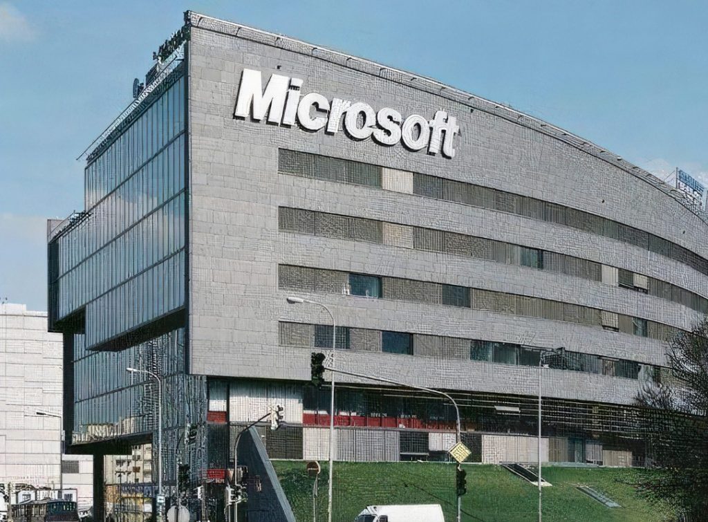
The Microsoft logo conveys trust and reliability, qualities that are essential for maintaining strong customer relationships. As one of the world’s leading technology companies, Microsoft has built a reputation for delivering high-quality products and services. The logo’s consistent design reinforces this perception, providing a sense of stability and dependability. Customers associate the logo with a brand that values excellence and innovation, further solidifying Microsoft’s position as a trusted leader in the industry.
3. Google
Logo Design Elements
Playful Typography
Google‘s logo stands out with its playful typography. The letters in the logo have a friendly and approachable feel. This design choice reflects Google’s mission to make information accessible and enjoyable for everyone. The rounded shapes of the letters convey a sense of openness and inclusivity. Sergey Brin, one of Google’s founders, initially crafted the logo in 1998 using the free graphics app Gimp. This anecdote highlights the simplicity and creativity that have always been at the core of Google’s brand identity.
Vibrant Colors
The vibrant colors in Google’s logo are instantly recognizable. Each letter in the logo features a different color, creating a lively and dynamic visual effect. This use of color symbolizes Google’s diverse range of services and its commitment to innovation. The bright hues capture attention and convey a sense of energy and enthusiasm. Google’s choice of colors also represents its desire to stand out in the crowded field of technology companies.
Brand Impact
Ubiquity in Search
Google’s logo has become synonymous with search. When people think of searching for information online, they often think of Google. The logo’s simplicity and memorability contribute to this ubiquity. As a result, Google’s position as a leader in the search engine market.
Representation of Information Access
The Google logo represents more than just a company; it embodies the concept of information access. The playful typography and vibrant colors reflect Google’s mission to organize the world’s information and make it universally accessible and useful. This mission is evident in the logo’s design, which communicates a sense of openness and curiosity. By consistently delivering on this promise, Google has established itself as a trusted source of information among technology companies.
4. Amazon
Logo Design Elements
Smile Arrow
Amazon‘s logo features a distinctive smile arrow that stretches from the letter “A” to “Z.” This clever design element symbolizes the company’s commitment to providing everything customers need, from A to Z. The arrow not only represents a smile, conveying customer satisfaction and happiness, but also highlights the company’s vast product range. This simple yet effective design choice makes Amazon’s logo easily recognizable and memorable among technology companies.

Representation of A to Z
The representation of “A to Z” in Amazon’s logo underscores the company’s mission to offer a comprehensive selection of products. This element communicates the idea that Amazon is a one-stop shop for all consumer needs. By incorporating this concept into the logo, Amazon effectively conveys its dedication to convenience and variety. The logo’s design reinforces the brand’s promise to deliver a wide array of products, enhancing its appeal to a global audience.
Brand Impact
Customer Satisfaction
Amazon’s logo plays a crucial role in conveying customer satisfaction. The smile arrow suggests a positive shopping experience, which aligns with the company’s focus on customer-centric services. A recognizable logo can significantly influence consumer behavior, as more than half of consumers prefer to shop with brands that have familiar logos. Amazon’s logo, with its friendly and approachable design, helps establish a strong connection with customers, fostering loyalty and trust.
E-commerce Leadership
The Amazon logo symbolizes the company’s leadership in the e-commerce sector. As a pioneer in online retail, Amazon has set the standard for convenience and efficiency. The logo’s design reflects this leadership by emphasizing the brand’s comprehensive product offerings and commitment to customer satisfaction. By maintaining a consistent and recognizable logo, Amazon reinforces its position as a dominant force in the world of technology companies, continually shaping the future of e-commerce.
5. Facebook
Logo Design Elements
Simplicity in Typography
Facebook‘s logo exemplifies simplicity through its typography. The design features a lowercase “f” in a clean, sans-serif font. This choice reflects the brand’s focus on accessibility and ease of use. By opting for a straightforward typeface, Facebook ensures that its logo remains easily recognizable across various platforms. The simplicity of the typography aligns with the company’s mission to connect people worldwide, making it a fitting representation of the brand’s core values.
Blue Color Scheme
The blue color scheme in Facebook’s logo plays a significant role in its identity. Blue symbolizes trust, reliability, and communication, which are essential elements for a social networking platform. This color choice helps convey a sense of calmness and stability, encouraging users to engage with the platform. The consistent use of blue across Facebook’s branding reinforces the company’s commitment to fostering a trustworthy and connected digital environment.
Brand Impact
Social Connectivity
Facebook’s logo has become synonymous with social connectivity. As one of the leading technology companies, Facebook revolutionized how people interact online. The logo represents a gateway to a vast network of friends, family, and communities. By maintaining a simple and recognizable design, Facebook effectively communicates its role in bringing people together. This emphasis on connectivity has made the logo a symbol of digital interaction and social engagement.
Digital Community Building
The impact of Facebook’s logo extends to digital community building. The platform empowers users to create and join groups, share experiences, and collaborate on projects. This sense of community is reflected in the logo’s design, which embodies the spirit of inclusivity and collaboration. Advertisers have leveraged Facebook’s community-building capabilities by integrating testimonials into ads. These ads enhance relatability and address potential customer pain points, leading to more successful campaigns. As a result, Facebook’s logo not only represents a social network but also a thriving digital ecosystem where people can connect and grow.
6. Samsung
Logo Design Elements
Bold Font
Samsung‘s logo features a bold font that captures attention and conveys strength. The design team intentionally chose this typography to reflect the company’s dynamic nature and commitment to innovation. The boldness of the font symbolizes Samsung’s confidence and leadership in the technology sector. By using a strong and assertive typeface, Samsung communicates its dedication to pushing boundaries and setting new standards in the industry.

Blue Oval
The blue oval in Samsung’s logo serves as a distinctive element that enhances brand recognition. This design choice not only adds a touch of elegance but also represents the company’s global reach and adaptability. The blue color signifies trust, reliability, and communication, aligning with Samsung’s mission to connect people through technology. The oval shape, combined with the bold font, creates a harmonious balance that reflects Samsung’s innovative spirit and commitment to excellence.
Brand Impact
Technological Innovation
Samsung’s logo plays a crucial role in reinforcing the brand’s association with technological innovation. The design elements, such as the bold font and blue oval, convey a sense of forward-thinking and progress. Samsung consistently introduces cutting-edge products and solutions, and its logo reflects this pioneering approach. By maintaining a strong and recognizable visual identity, Samsung positions itself as a leader in the technology industry, inspiring confidence and trust among consumers.
Global Electronics Market
In the global electronics market, Samsung’s logo stands as a symbol of success and prosperity. The design incorporates cultural elements, such as the three stars representing the founder’s Korean roots, to convey a sense of heritage and achievement. This connection to cultural values resonates with customers worldwide, enhancing brand loyalty and recognition. Samsung’s logo not only represents a technology company but also embodies a legacy of excellence and innovation that continues to shape the future of the electronics industry.
7. Intel
Logo Design Elements
Swirl Design
Intel‘s logo features a distinctive swirl design that captures attention and symbolizes motion and progress. This design element reflects Intel’s dynamic nature and its continuous drive for innovation. The swirl suggests movement, representing the company’s forward-thinking approach and its commitment to advancing technology. By incorporating this unique design, Intel effectively communicates its role as a leader in the semiconductor industry.
Blue Color
The blue color in Intel’s logo plays a significant role in its brand identity. Blue conveys trust, reliability, and intelligence, qualities that align with Intel’s mission to deliver high-performance computing solutions. The choice of blue also reflects the company’s focus on creating technology that connects people and enhances their lives. This color choice reinforces Intel’s reputation as a dependable and innovative technology company.
Brand Impact
Processor Dominance
Intel’s logo symbolizes its dominance in the processor market. As a pioneer in semiconductor technology, Intel has consistently delivered cutting-edge processors that power a wide range of devices. The logo’s design elements, such as the swirl and blue color, reinforce the brand’s association with high-performance computing. By maintaining a strong and recognizable visual identity, Intel positions itself as a leader in the technology industry, inspiring confidence and trust among consumers.
Association with Computing Power
The Intel logo represents more than just a company; it embodies the concept of computing power. The swirl design and blue color reflect Intel’s commitment to pushing the boundaries of technology and delivering innovative solutions. This association with computing power has made Intel a trusted name in the industry, known for its ability to provide reliable and efficient processors. By consistently delivering on this promise, Intel has established itself as a key player among technology companies, shaping the future of computing.
8. IBM
Logo Design Elements
Striped Letters
IBM‘s logo features distinctive striped letters that immediately catch the eye. The stripes create a sense of movement and dynamism, reflecting IBM’s continuous drive for innovation. This design choice symbolizes the company’s commitment to progress and adaptability in the ever-evolving world of technology companies. The stripes also add a unique texture to the logo, making it easily recognizable and memorable.
Blue Color
The blue color in IBM’s logo plays a crucial role in its brand identity. Blue represents trust, reliability, and professionalism, qualities that align with IBM’s mission to provide cutting-edge business solutions. This color choice reinforces the company’s reputation as a dependable leader in the technology sector. The consistent use of blue across IBM’s branding helps convey a sense of stability and confidence, essential for maintaining strong customer relationships.
Brand Impact
Legacy in Computing
IBM’s logo stands as a symbol of its legacy in computing. As one of the pioneers in the technology industry, IBM has played a significant role in shaping the future of computing. The logo’s design elements, such as the striped letters and blue color, reflect the brand’s rich history and its ongoing commitment to innovation. IBM’s influence extends beyond its products, as the company has consistently set the standard for excellence and leadership in the technology sector.
Business Solutions Leadership
The IBM logo represents the company’s leadership in providing business solutions. IBM has established itself as a trusted partner for organizations seeking to enhance their operations through technology. The logo’s design communicates IBM’s dedication to delivering high-quality solutions that meet the needs of its clients. According to a recent survey, 94% of respondents believe their IBM i server provides better ROI than other servers. This high level of satisfaction underscores IBM’s reputation as a leader in the field. By maintaining a strong and recognizable visual identity, IBM continues to inspire confidence and trust among its customers, solidifying its position as a key player in the world of technology companies.
9. Sony
Logo Design Elements
Simple Typography
Sony‘s logo showcases simple typography. The design uses a clean, sans-serif font that emphasizes clarity and readability. This choice reflects Sony’s focus on delivering straightforward and reliable products. The simplicity of the typography ensures that the logo remains easily recognizable across various platforms. By opting for a minimalist typeface, Sony effectively communicates its commitment to quality and innovation in the technology sector.
Black and White Scheme
The black and white color scheme in Sony’s logo plays a crucial role in its brand identity. Black represents sophistication and elegance, while white symbolizes purity and simplicity. This combination creates a timeless and versatile design that can adapt to different contexts. The monochromatic palette also highlights Sony’s dedication to creating products that blend seamlessly into any environment. This color scheme reinforces the brand’s reputation for producing high-quality electronics and entertainment solutions.
Brand Impact
Entertainment and Electronics
Sony’s logo stands as a symbol of excellence in entertainment and electronics. The company has established itself as a leader in these industries, offering a wide range of products that cater to diverse consumer needs. From gaming consoles to audio equipment, Sony consistently delivers innovative solutions that enhance the user experience. The logo’s design elements, such as the simple typography and black and white scheme, reflect the brand’s commitment to providing cutting-edge technology that enriches people’s lives.
Innovation in Media
The Sony logo represents the company’s pioneering spirit in media innovation. Sony has played a significant role in shaping the future of entertainment, introducing groundbreaking technologies that have transformed how people consume content. The logo’s design communicates Sony’s dedication to pushing the boundaries of what’s possible in the media landscape. By maintaining a strong and recognizable visual identity, Sony continues to inspire confidence and trust among consumers, solidifying its position as a key player in the world of technology companies.
10. Cisco
Logo Design Elements
Bridge Symbolism
Cisco‘s logo features a unique design that symbolizes a bridge. This element represents the company’s role in connecting people and technology. The bridge imagery reflects Cisco’s mission to create seamless communication networks. It highlights the company’s commitment to building connections across the globe. The bridge design also signifies strength and stability, qualities that Cisco embodies as a leader in the networking industry.
Blue Color
The blue color in Cisco’s logo plays a vital role in its brand identity. Blue conveys trust, reliability, and professionalism. These qualities align with Cisco’s mission to provide dependable networking solutions. The choice of blue also reflects the company’s focus on innovation and technology. This color reinforces Cisco’s reputation as a trusted leader among technology companies. The consistent use of blue across Cisco’s branding helps convey a sense of stability and confidence.
Brand Impact
Networking Solutions
Cisco’s logo stands as a symbol of excellence in networking solutions. The company has established itself as a leader in this field, offering a wide range of products that cater to diverse consumer needs. From routers to switches, Cisco consistently delivers innovative solutions that enhance connectivity. The logo’s design elements, such as the bridge symbolism and blue color, reflect the brand’s commitment to providing cutting-edge technology that connects people and businesses.
Global Connectivity
The impact of Cisco’s logo extends to global connectivity. The company empowers organizations to create and maintain robust communication networks. This sense of connectivity is reflected in the logo’s design, which embodies the spirit of inclusivity and collaboration. Cisco’s logo not only represents a technology company but also a thriving digital ecosystem where people can connect and grow. By maintaining a strong and recognizable visual identity, Cisco continues to inspire confidence and trust among consumers, solidifying its position as a key player in the world of technology companies.
Commonly used design methods
Symmetry
Interpretation
Symmetry in design refers to the balanced distribution of visual elements. It creates harmony and order, making designs aesthetically pleasing. When I look at symmetrical designs, I see a sense of stability and structure. Symmetry often involves mirroring elements on either side of a central axis. This technique helps in creating a cohesive and unified appearance.

Consider the logo of MasterCard. The two overlapping circles create a symmetrical design. This symmetry conveys balance and equality. The logo’s simplicity and symmetry make it easily recognizable. It effectively communicates the brand’s reliability and trustworthiness.
Minimalism
Interpretation
Minimalism focuses on simplicity and functionality. It involves using the least number of elements to convey a message. I appreciate how minimalism strips away unnecessary details, leaving only the essentials. This approach enhances clarity and allows the core message to shine through. Minimalist designs often use clean lines and ample white space.

The Nike logo exemplifies minimalism. The simple swoosh design is both iconic and memorable. It conveys motion and speed without any extra embellishments. This minimalist approach aligns with Nike’s brand identity of athleticism and performance. The logo’s simplicity ensures it remains timeless and versatile.
Contrast
Interpretation
Contrast in design involves using opposing elements to create visual interest. It highlights differences in color, size, or shape. I find that contrast draws attention and emphasizes key aspects of a design. It helps in guiding the viewer’s eye and enhancing readability. Effective use of contrast can make a design more dynamic and engaging.
The FedEx logo uses contrast effectively. The bold purple and orange colors stand out against each other. This contrast makes the logo eye-catching and memorable. Additionally, the clever use of negative space creates an arrow between the “E” and “x,” symbolizing speed and precision. The contrast in colors and design elements reinforces FedEx’s brand message of fast and reliable delivery.
Proportion
Interpretation
Proportion in design refers to the relationship between elements in terms of size and scale. It ensures that all parts of a design work together harmoniously. When I consider proportion, I think about how different elements relate to each other in size. This balance creates a sense of unity and coherence in the design. Proper proportion helps in guiding the viewer’s eye and emphasizing important aspects of the design.
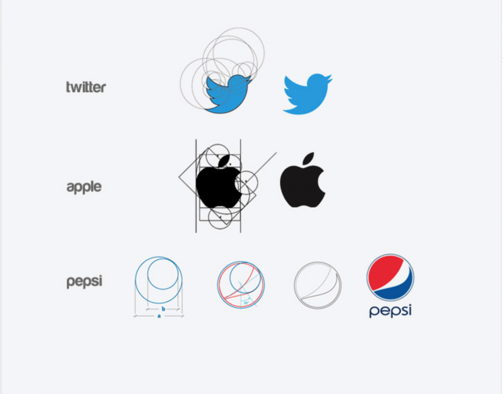
The Twitter logo exemplifies the use of proportion. The bird icon is designed using a series of circles that create a balanced and harmonious shape. This proportional design makes the logo visually appealing and easily recognizable. The careful consideration of proportion in the Twitter logo reflects the brand’s focus on simplicity and clarity in communication.
Consistency
Interpretation
Consistency in design involves maintaining uniformity across various elements. It ensures that a design looks cohesive and professional. I find that consistency helps in building brand recognition and trust. By using consistent colors, fonts, and styles, a brand can create a strong visual identity. This uniformity makes it easier for consumers to recognize and remember the brand.
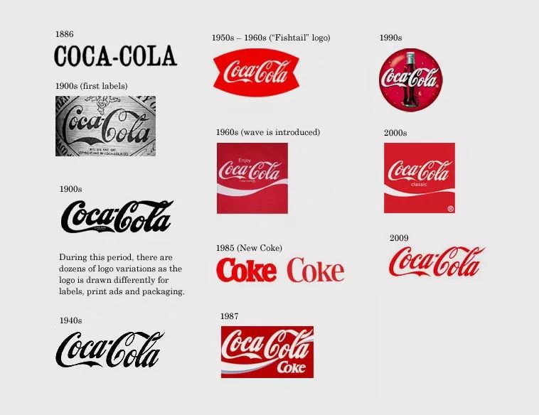
The Coca-Cola logo is a prime example of consistency. The brand has maintained its iconic script font and red color scheme for decades. This consistency has helped Coca-Cola build a strong and recognizable brand identity. The uniformity in design elements reinforces the brand’s message of tradition and reliability.
Hierarchy
Interpretation
Hierarchy in design refers to the arrangement of elements to show their importance. It guides the viewer’s attention to the most critical parts of the design. When I think about hierarchy, I consider how size, color, and placement can emphasize certain elements. Effective hierarchy helps in creating a clear and organized design that communicates the intended message.
Case
The New York Times logo demonstrates the use of hierarchy. The bold and prominent typeface of the newspaper’s name draws immediate attention. This emphasis on the name establishes its importance and authority. The hierarchy in the logo design reflects the publication’s commitment to delivering credible and impactful news.
How to design a stunning technology company logo with AI?
Creating a logo for a technology company can be a daunting task. However, with the advent of AI, this process has become more accessible and efficient. Let’s explore how AI can revolutionize logo design.

AI has the potential to surpass designers
AI technology is advancing rapidly. It offers innovative solutions that can potentially surpass traditional design methods. AI algorithms analyze vast amounts of data to generate designs that are both aesthetically pleasing and functional. This capability allows AI to create logos that resonate with audiences on a deeper level.

The use of AI in design is becoming more widespread. Many technology companies are adopting AI-powered design tools to streamline their design processes. These tools offer a range of features, from generating initial concepts to refining final designs. By leveraging AI, companies can produce logos that are not only visually appealing but also aligned with their brand identity.
Suitable for small and medium-sized companies
AI-powered design tools are particularly beneficial for small and medium-sized companies. These businesses often face budget constraints and may not have access to professional design services. AI provides an affordable alternative, enabling them to create high-quality logos without breaking the bank.
Brand design and brand upgrading become more manageable with AI. Companies can easily update their logos to reflect changes in their brand strategy or market positioning. This flexibility ensures that their visual identity remains relevant and impactful.

Cost savings are another significant advantage of using AI for logo design. Traditional design processes can be time-consuming and expensive. AI tools automate many aspects of design, reducing the time and resources required. This efficiency translates into cost savings, allowing companies to allocate their budgets more effectively.
AI design effects
AI-generated designs can be used directly or as a reference. Some companies choose to adopt AI-created logos as they are, while others use them as inspiration for further refinement. This versatility makes AI an invaluable tool in the design process.
Designers understand the psychological impact of every element of logo design. AI tools incorporate these insights to create logos that are easy on the eyes, scalable, and proportionate. This attention to detail ensures that the final design resonates with the target audience and effectively communicates the brand’s message.
How to design a Logo with AI?
ailogocreator Brief introduction
When I first explored ailogocreator, I discovered a tool that simplifies the logo design process for technology companies. This platform uses advanced AI algorithms to generate unique and impactful logos. It caters to both beginners and experienced designers, offering a user-friendly interface that makes logo creation accessible to everyone. The tool analyzes various design elements to ensure that the logos it produces are visually appealing and aligned with the brand’s identity.

Features of ailogocreator
ailogocreator offers several features that enhance the logo design experience:
- Intuitive Interface: The platform provides a straightforward interface that guides users through each step of the design process. This ease of use ensures that even those with no design background can create professional-looking logos.
- Customization Options: Users can personalize their logos by selecting colors, fonts, and icons that reflect their brand’s personality. This flexibility allows technology companies to create logos that stand out in a competitive market.
- AI-Powered Suggestions: The tool offers design suggestions based on current trends and user preferences. These recommendations help users make informed decisions and create logos that resonate with their target audience.
- Scalability and Proportion: The AI ensures that logos are scalable and proportionate, making them suitable for various applications, from business cards to billboards.

Design steps
Creating a logo with ailogocreator involves a few simple steps:
- Define Your Brand Identity: Start by identifying the core values and mission of your technology company. This understanding will guide the design process and ensure that the logo accurately represents your brand.
- Choose Design Elements: Select the colors, fonts, and icons that align with your brand’s identity. Consider how these elements will convey your brand’s message and appeal to your target audience.
- Generate Logo Concepts: Use ailogocreator’s AI-powered engine to generate a variety of logo concepts. Review the options and select the ones that best capture your brand’s essence.
- Customize and Refine: Personalize the chosen logo by adjusting the design elements. Experiment with different combinations to find the perfect balance that reflects your brand’s personality.
- Finalize and Download: Once satisfied with the design, finalize the logo and download it in various formats. This flexibility ensures that your logo is ready for use across multiple platforms and mediums.

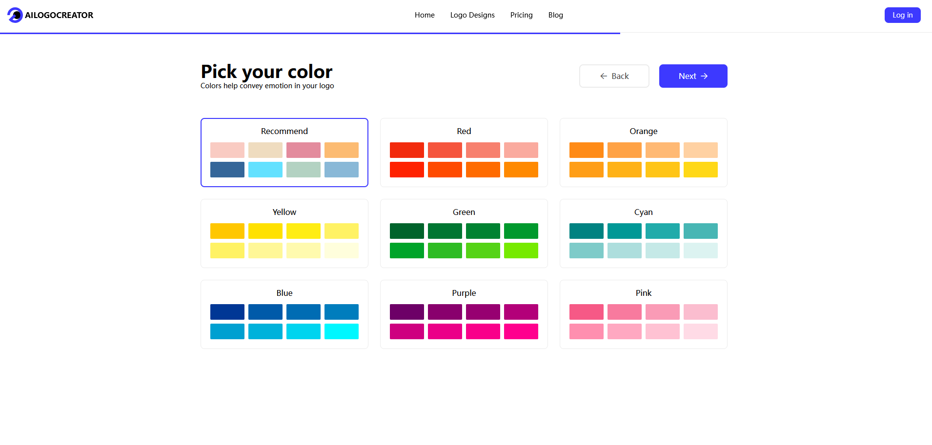
By following these steps, technology companies can create stunning logos that effectively communicate their brand’s identity and values. The use of AI in logo design not only streamlines the process but also ensures that the final product is both aesthetically pleasing and functional.
FAQ
What other tech giants are more famous for their logos?
Several tech giants have logos that are instantly recognizable worldwide. Alphabet Inc., the parent company of Google, has a logo that represents its diverse range of services and its commitment to innovation. The logo’s simplicity and vibrant colors make it memorable. Meta Platforms, formerly known as Facebook, also boasts a well-known logo. The lowercase “f” in a blue circle symbolizes connectivity and communication. These logos, like those of Apple and Microsoft, play a crucial role in establishing brand identity and recognition.
What are the key points in the evolution of the Microsoft logo?
Microsoft’s logo has undergone several transformations since its inception. Initially, the logo featured a stylized “M” with a futuristic look, reflecting the company’s focus on technology. In 1987, Microsoft introduced a more streamlined design with a bold typeface, emphasizing its growing influence in the tech industry. The most significant change occurred in 2012 when Microsoft adopted the current logo with four colorful squares. This design symbolizes the company’s diverse product offerings and its commitment to innovation and inclusivity. Each iteration of the logo reflects Microsoft’s evolution and its adaptability to the changing landscape of technology.
What impact does the design of the Apple logo have on modern design?
The Apple logo has significantly influenced modern design. Its minimalist approach, characterized by a simple apple with a bite taken out, has set a standard for elegance and simplicity. This design philosophy has inspired countless brands to adopt minimalism in their logos, emphasizing clarity and functionality. Apple’s use of negative space and clean lines has become a hallmark of contemporary design, encouraging designers to focus on essential elements. The logo’s global recognition and association with innovation have made it a benchmark for companies seeking to create impactful and memorable visual identities.
What do these tech company logo designs have in common?
When I examine the logos of major tech companies, I notice several common elements that contribute to their effectiveness. First, simplicity stands out. These logos often use minimalistic designs, which make them easy to recognize and remember. For example, Apple’s logo features a simple apple shape with a bite taken out, while Google’s logo uses straightforward typography with vibrant colors.
Another commonality is the use of color to convey brand identity. Many tech companies choose colors that evoke specific emotions or associations. Blue, for instance, is prevalent in logos like IBM and Intel, symbolizing trust and reliability. Meanwhile, Google’s use of multiple colors represents diversity and creativity.
Additionally, these logos often incorporate symbolism that reflects the company’s mission or values. Amazon’s smile arrow, for instance, signifies customer satisfaction and a comprehensive product range from A to Z. Similarly, Cisco’s bridge design symbolizes connectivity and communication.
Is the user interface of AI Logo Creator intuitive and easy to use, even for users with no design background?
From my experience with AI Logo Creator, I find the user interface to be highly intuitive. The platform guides users through each step of the design process, making it accessible even for those without a design background. The interface features clear instructions and helpful prompts, ensuring that users can easily navigate the tool.
One of the standout features is the drag-and-drop functionality, which simplifies the customization process. Users can effortlessly select and modify design elements such as colors, fonts, and icons. This ease of use allows anyone to create professional-looking logos without needing extensive design knowledge.
Moreover, AI Logo Creator offers real-time previews, enabling users to see how their logo will appear across different platforms. This feature helps users make informed decisions and ensures that the final design aligns with their brand identity.
What levels of personalization can users make during the design process, such as colors, fonts, icons, etc.?
AI Logo Creator provides a wide range of personalization options, allowing users to tailor their logos to reflect their brand’s unique identity. Users can choose from an extensive palette of colors to convey specific emotions or associations. This flexibility ensures that the logo resonates with the target audience.
In terms of typography, the platform offers a variety of fonts to suit different brand personalities. Whether a company wants to project a modern, playful, or traditional image, AI Logo Creator has font options to match. Users can experiment with different typefaces to find the perfect fit for their brand.
Icons and symbols are another area where users can personalize their logos. The platform provides a vast library of icons, enabling users to select elements that align with their brand’s mission or values. This level of customization ensures that the final logo is not only visually appealing but also meaningful and representative of the brand’s identity.
How does AI Logo Creator ensure the security and privacy of user data?
I often wonder about the safety of my data when using online tools. AI Logo Creator prioritizes user data security and privacy. The platform employs advanced encryption techniques to protect sensitive information. This ensures that unauthorized parties cannot access your data.
AI Logo Creator also adheres to strict privacy policies. These policies comply with international standards, safeguarding user information. The platform collects only essential data, minimizing exposure to potential risks. Regular audits and updates further enhance security measures.
“AI tools can accelerate UX-research workflows and improve the dissemination of research findings within organizations.” – nngroup.com
This quote highlights the efficiency of AI tools. AI Logo Creator leverages similar technology to streamline its processes. This efficiency extends to maintaining robust security protocols. Users can confidently create logos, knowing their data remains secure.
Does the user own the full copyright of the logo after purchase and can use it without royalties?
Ownership of a logo is crucial for any business. AI Logo Creator ensures users receive full copyright of their logos upon purchase. This means you can use your logo freely, without worrying about royalties. The platform provides a clear licensing agreement, outlining your rights as the owner.
The ability to customize logos efficiently and cost-effectively, as noted by wix.com, empowers users. You can create unique designs that truly represent your brand. Once purchased, these designs become your intellectual property. This ownership allows you to use your logo across various platforms and mediums.
In summary, AI Logo Creator not only offers innovative design solutions but also prioritizes user security and ownership rights. This commitment ensures a seamless and trustworthy experience for all users.
Logos hold immense significance in technology branding. They serve as visual ambassadors, encapsulating a brand’s identity and values. I encourage you to explore ailogocreator.io for crafting impactful logos. This tool simplifies the design process, offering customization options that align with your brand’s essence. Logos play a pivotal role in establishing brand identity. They create a lasting impression and foster recognition. By leveraging AI tools, you can design logos that resonate with your audience and elevate your brand’s presence in the competitive tech landscape.


CommentsTake the first comment