
In the bustling world of United States catering, standing out is no small feat. With the restaurant industry contributing significantly to the U.S. economy, brand identity becomes crucial. A logo serves as the face of a brand, encapsulating its essence in a single image. In United States catering, logos are more than just symbols; they are powerful tools that communicate a brand’s story and values. An iconic logo is memorable, timeless, and instantly recognizable. Over the years, the evolution of food and beverage brand logos, like McDonald’s golden arches or Starbucks’ mermaid, showcases the importance of adapting to trends while maintaining core identity. These logos have become synonymous with their brands, illustrating the pivotal role design plays in United States catering.
McDonald’s
The historical origin of the brand logo
The origin and development of logos
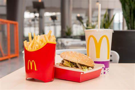
When we think of McDonald’s, the golden arches immediately come to mind. These arches didn’t just appear overnight. They have a rich history that dates back to the early days of the brand. In 1961, Jim Schindler crafted the first version of the iconic logo. He ingeniously combined two arches into an ‘M’ shape, creating a symbol that would soon become synonymous with fast food worldwide. This design marked the beginning of McDonald’s journey toward becoming one of the most recognizable brands globally.
From the original “Speedee Service System” to the evolution of the Golden Arch
Before the golden arches, McDonald’s had a different mascot: Speedee, representing their “Speedee Service System.” However, as the brand evolved, so did its logo. The transition from Speedee to the golden arches symbolized a shift in focus. The arches not only represented the letter ‘M’ but also embodied the brand’s commitment to quality and efficiency. Over the years, the logo has undergone several updates, each time refining its design while maintaining its core identity.
Design elements and meanings
The symbolism of the golden arch
The golden arches are more than just a letter ‘M.’ They symbolize warmth, comfort, and familiarity. When I see those arches, I think of a place where I can grab a quick meal and enjoy a moment of relaxation. The arches have become a beacon for travelers and locals alike, offering a sense of consistency no matter where you are in the world.
The role of color and shape in brand communication
Color and shape play crucial roles in how we perceive brands. McDonald’s uses a bright yellow for its arches, a color that evokes happiness and energy. The rounded shape of the arches adds a friendly and approachable feel. Together, these elements communicate a message of joy and accessibility, inviting customers to step inside and enjoy a meal.
Analysis of the characteristics of the logo
Simplicity and recognizability
One of the key strengths of the McDonald’s logo is its simplicity. The clean lines and bold colors make it easy to recognize, even from a distance. This simplicity ensures that the logo remains timeless, unaffected by changing design trends. It’s a testament to the power of minimalism in branding.
A balance between globalization and localization
McDonald’s has mastered the art of balancing globalization with localization. While the golden arches remain consistent worldwide, the brand adapts its offerings to suit local tastes and preferences. This adaptability is reflected in the logo’s design, which maintains its core elements while allowing for subtle variations to resonate with different cultures. This balance ensures that McDonald’s remains relevant and beloved across the globe.
KFC
The historical origin of the brand logo
The image of the founder, Colonel Harlan Sanders, is combined with the brand logo
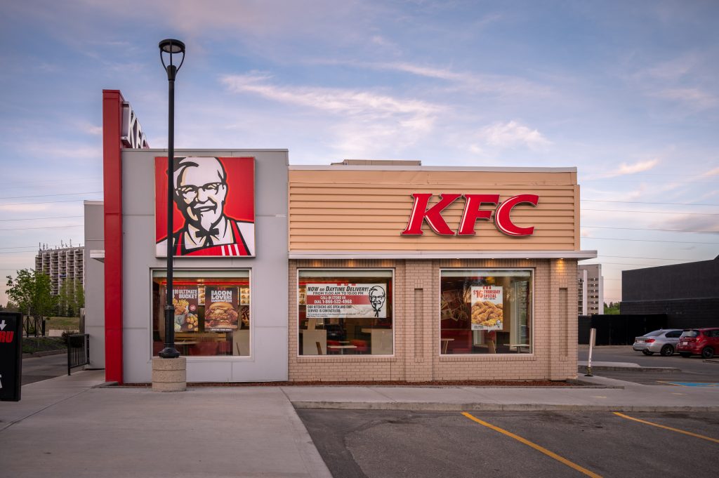
When I think of KFC, the image of Colonel Harlan Sanders immediately pops into my mind. His face has been an integral part of the KFC logo since 1952. This wasn’t just a random choice. By incorporating the Colonel’s visage, KFC added a personal touch to its brand. It symbolized a guarantee of quality and taste. The Colonel’s smiling face has remained constant through various logo changes, maintaining a strong and recognizable global image. His presence in the logo strengthens the connection with customers and emphasizes authenticity and heritage.
The evolution of logos
KFC’s logo has evolved over the years, but the essence remains unchanged. The original logo depicted Colonel Sanders alongside bold KFC lettering. This design emphasized tradition and quality. Over time, the logo underwent several updates, each refining its elements while keeping the Colonel’s image at the forefront. This evolution reflects KFC’s commitment to staying relevant while honoring its roots. KFC’s logo has evolved.
Design elements and meanings
The affinity and trust of the colonel’s image
The Colonel’s image in the KFC logo isn’t just about aesthetics. It represents trust and affinity. When I see his face, I think of a promise of delicious, high-quality food. His iconic white suit and black string tie convey a sense of tradition and reliability. This image has become synonymous with KFC’s brand values, reinforcing the idea that customers can always expect a satisfying meal.
The use of red and white in the brand
KFC’s use of red and white in its logo plays a crucial role in brand communication. Red catches attention and evokes feelings of warmth and excitement. White adds a touch of simplicity and cleanliness. Together, these colors create a striking contrast that enhances visual impact. This color scheme not only makes the logo memorable but also emphasizes KFC’s commitment to providing authentic, high-quality food.
Analysis of the characteristics of the logo
Personalization of the persona
KFC’s logo stands out because of its personalized approach. By featuring Colonel Sanders, the brand creates a persona that customers can relate to. This personalization adds depth to the brand’s identity, making it more than just a fast-food chain. It tells a story of heritage and dedication, inviting customers to be part of that narrative.
Color contrast and visual impact
The color contrast in KFC’s logo contributes significantly to its visual impact. The bold red and crisp white create a dynamic and eye-catching design. This contrast not only makes the logo easily recognizable but also reinforces the brand’s message of quality and tradition. It’s a perfect example of how thoughtful design can enhance brand perception and leave a lasting impression. color contrast in KFC’s logo.
Starbucks
The historical origin of the brand logo
The transformation from the original two-tailed mermaid to the modern green round logo
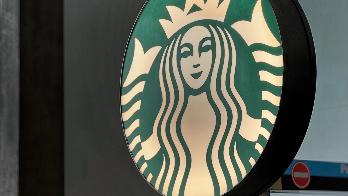
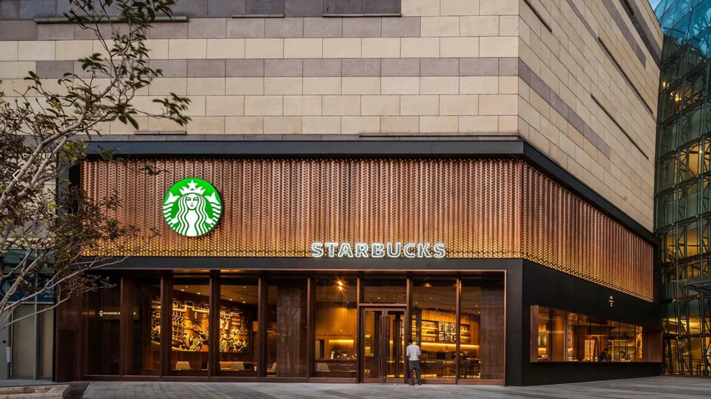
When I think of Starbucks, the iconic green mermaid logo immediately comes to mind. But did you know that this logo has undergone several transformations? Originally, in 1971, Starbucks introduced a two-tailed mermaid, or siren, in brown. This design drew inspiration from a 16th-century Norse woodcut. Over the years, the logo evolved, reflecting the brand’s growth and changing identity. By 1987, the logo had shifted to a more streamlined version, incorporating green to symbolize freshness and growth. In 1992, further refinements were made, and by 2011, Starbucks unveiled the modern green round logo we recognize today. This transformation highlights the brand’s journey from a local coffee shop to a global powerhouse.
Historical background of logo design
The evolution of the logo over the years reflects Starbucks’ ability to adapt while staying true to its core values.
Design elements and meanings
The mystery of green and twin-tailed mermaids
The green color in the Starbucks logo isn’t just for show. It represents growth, freshness, and sustainability. When I see that green, I think of a brand that’s committed to the environment and quality. The twin-tailed mermaid adds an element of mystery and allure. This mythical creature invites customers to explore and discover the unique flavors and experiences Starbucks offers. Together, these elements create a logo that’s both intriguing and inviting.
The connection between the marine element in the logo and the brand story
The marine element in the Starbucks logo isn’t accidental. It ties back to the brand’s Seattle roots and its connection to the sea. This connection is more than just geographical; it speaks to the brand’s adventurous spirit and dedication to sourcing the finest coffee beans from around the world. The mermaid symbolizes this journey, inviting customers to embark on a flavorful adventure with every cup. It’s a powerful reminder of the brand’s commitment to quality and exploration.
Analysis of the characteristics of the logo
A combination of cultural symbolism and brand storytelling
Starbucks’ logo is a masterclass in combining cultural symbolism with brand storytelling. The mermaid, a figure steeped in mythology, adds a layer of intrigue and depth to the brand.
The environmental protection and natural association of green logo
The green color in the Starbucks logo isn’t just a design choice; it’s a statement. It reflects the brand’s commitment to environmental protection and sustainability. When I see that green, I think of a brand that’s dedicated to making a positive impact on the planet. This natural association reinforces Starbucks’ values and resonates with customers who share those values. It’s a powerful reminder that a logo can be more than just a symbol; it can be a beacon of the brand’s mission and vision.
Pizza Hut
The historical origin of the brand logo
The origin of the logo and the idea of pizza slicing
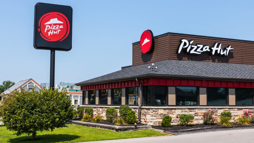
When I think of Pizza Hut, the iconic red roof immediately comes to mind. This logo has a fascinating history. The original design featured the brand name in a simple sans serif typeface. Over time, the logo evolved, reflecting the brand’s growth and modernization. The idea of pizza slicing played a crucial role in shaping the logo’s design. The red roof symbolizes the warmth and comfort of home, much like sharing a pizza with family and friends. This connection between the logo and the brand’s core product creates a sense of familiarity and trust.
Brand expansion and logo modernization
Pizza Hut’s logo has undergone several transformations to keep up with the times. In 1999, the brand introduced a modern emblem with fancy lettering and a sleek style. This version included a yellow touch and a green dot above the letter ‘I’, adding a playful element to the design. The red hat gained a thick black outline, enhancing its visual appeal. In 2019, Pizza Hut reverted to the classic 1974 logo, designed by the Lippincott bureau. This decision reflected the brand’s commitment to its roots while maintaining a professional image. The logo’s evolution showcases Pizza Hut’s ability to adapt and stay relevant in a competitive market.
Design elements and meanings
Red roof with the warmth of home
The red roof in the Pizza Hut logo isn’t just a design choice. It represents warmth, protection, and love towards customers. When I see that red roof, I think of a cozy place where I can enjoy a delicious pizza with loved ones. This element adds a personal touch to the brand, making it more than just a fast-food chain. It invites customers to experience the comfort and joy of sharing a meal together.
A direct connection between pizza slicing and the brand’s core product
The Pizza Hut logo cleverly incorporates the idea of pizza slicing into its design. The red roof resembles a slice of pizza, directly connecting the logo to the brand’s core product. This intuitive design element reinforces the brand’s identity and makes it easily recognizable. It tells a story of quality and tradition, inviting customers to indulge in a satisfying pizza experience.
Analysis of the characteristics of the logo
The intuitiveness of the brand logo
One of the standout features of the Pizza Hut logo is its intuitiveness. The design elements, such as the red roof and pizza slice motif, create a clear connection to the brand’s offerings. This simplicity ensures that the logo remains timeless and easily recognizable. It’s a testament to the power of thoughtful design in branding.
A blend of modernity and intimacy
Pizza Hut’s logo strikes a perfect balance between modernity and intimacy. The sleek design elements reflect the brand’s commitment to staying current, while the red roof adds a touch of warmth and familiarity. This blend of modernity and intimacy creates a strong emotional connection with customers, making the logo memorable and impactful. It’s a prime example of how a well-designed logo can elevate a brand’s identity and resonate with its audience.
Taco Bell
The historical origin of the brand logo
The origin of the logo blends with elements of Mexico culture
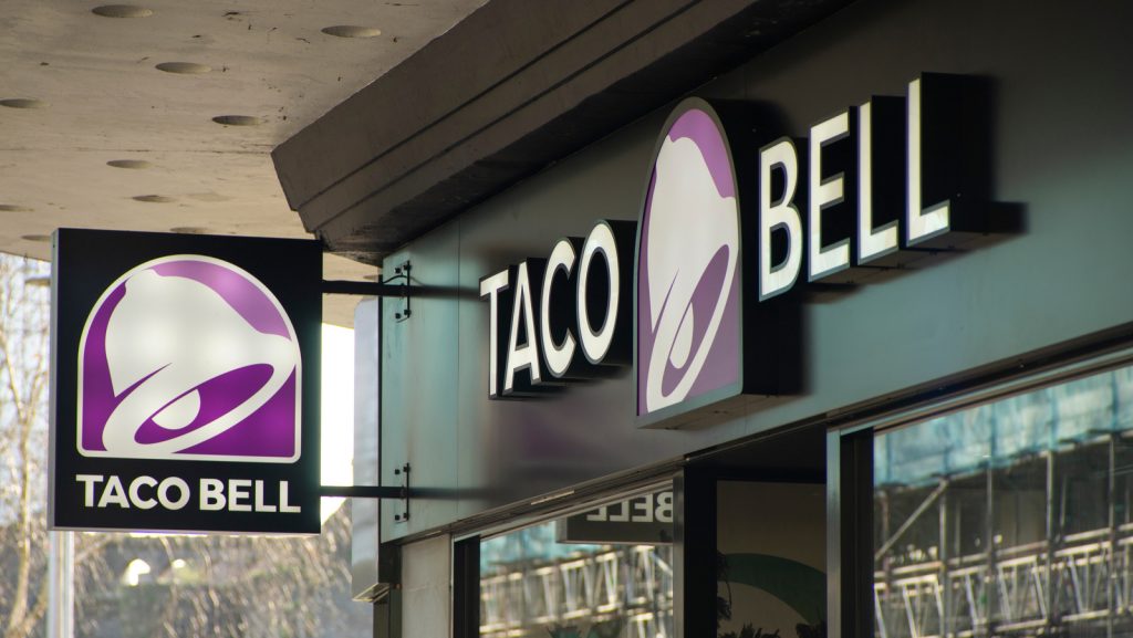
When I think of Taco Bell, I picture vibrant colors and playful designs. The brand’s logo reflects its deep connection to Mexican culture. Glen Bell founded Taco Bell in 1962, and the original logo incorporated elements that celebrated this cultural heritage. The design featured a bell, a nod to the founder’s name, and a sombrero, symbolizing the brand’s Mexican-inspired cuisine. This blend of cultural elements set the stage for Taco Bell’s unique identity in the fast-food industry.
The evolution of the logo and the adjustment of the brand positioning
Taco Bell’s logo has evolved significantly over the years. The current version, introduced in 1992, marked a shift in the brand’s positioning. The logo adopted a more modern and streamlined look, moving away from the traditional elements. The font transitioned from a bold Macbeth-like style to a sleek Helvetica-like font. This change reflected Taco Bell’s desire to appeal to a younger, more dynamic audience. The evolution of the logo mirrors the brand’s journey from a local favorite to a global sensation.
Design elements and meanings
Taco shapes and brand features
The Taco Bell logo cleverly incorporates taco shapes into its design. The bell, a central element, resembles a taco shell, directly connecting the logo to the brand’s core product. This intuitive design choice reinforces Taco Bell’s identity and makes the logo easily recognizable. It tells a story of fun and flavor, inviting customers to indulge in a delicious taco experience.
The vitality of color and the positioning of the young market
Color plays a vital role in Taco Bell’s logo. The vibrant hues convey energy and excitement, appealing to a youthful audience. When I see those colors, I think of a brand that’s lively and adventurous. This color scheme not only makes the logo memorable but also positions Taco Bell as a go-to destination for young, fun-loving customers. It’s a perfect example of how thoughtful design can enhance brand perception and attract a specific market segment.
Analysis of the characteristics of the logo
The dynamism and playfulness of the brand logo
Taco Bell’s logo stands out for its dynamism and playfulness. The design elements, such as the bell and vibrant colors, create a sense of movement and fun. This playful approach adds depth to the brand’s identity, making it more than just a fast-food chain. It invites customers to be part of a lively and enjoyable dining experience. The logo’s dynamic nature ensures that it remains relevant and engaging in a competitive market.
The trend of rejuvenation in color and shape
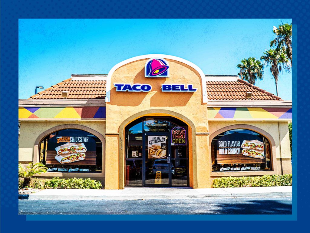
The trend of rejuvenation is evident in Taco Bell’s logo. The sleek design and vibrant colors reflect the brand’s commitment to staying fresh and modern. This rejuvenation keeps the logo appealing to new generations of customers. It’s a testament to Taco Bell’s ability to adapt and innovate while maintaining its core identity. The logo’s youthful energy and contemporary style make it a powerful symbol of the brand’s ongoing evolution.
Burger King
The historical origin of the brand logo
Background and history of the founding of Burger King
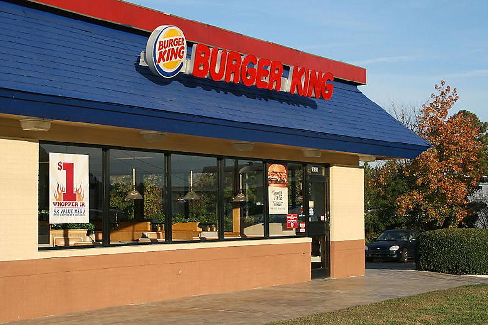
When I think of Burger King, I picture a brand with a rich history. It all began in 1953 when the first Burger King logo made its debut. This logo featured a rising sun, with sunrays stylized as triangles around a half disk. The brand name appeared in bold, all-caps letters. Back then, it was a simple black-and-white design. This logo set the stage for Burger King’s journey in the fast-food industry.
Logo iteration and update
Burger King’s logo has seen several transformations over the years. The very first logo, introduced in 1953, only lasted a few months. In 1999, the brand underwent a significant redesign. The wordmark found its place between bun-halves, now positioned diagonally. The buns took on a yellow hue with white strokes, while the red lettering grew larger and adopted a modern sans-serif typeface. These changes reflected Burger King’s commitment to staying fresh and relevant in a competitive market.
Design elements and meanings
Flame-grilled techniques and color palette inspiration for fresh ingredients
Burger King’s logo isn’t just about aesthetics; it tells a story. The color palette draws inspiration from the brand’s flame-grilled techniques. The yellow buns symbolize the warmth and freshness of their ingredients. When I see those colors, I think of a delicious, flame-grilled burger. This connection between the logo and the brand’s core product reinforces its identity and makes it easily recognizable.
The affinity of the rounded and cute font with the brand image
The font used in Burger King’s logo plays a crucial role in brand communication. The rounded and cute font adds a friendly and approachable feel. It aligns perfectly with the brand’s image, inviting customers to enjoy a satisfying meal. This font choice enhances the logo’s visual appeal and strengthens the connection with the audience.
Analysis of the characteristics of the logo
Rebranding and modernity
Burger King’s logo stands out for its ability to balance rebranding with modernity. The sleek design elements reflect the brand’s commitment to staying current. This modern approach ensures that the logo remains relevant and engaging in a fast-paced industry. It’s a testament to Burger King’s ability to adapt and innovate while maintaining its core identity.
The affinity of the rounded font with the brand image
The rounded font in Burger King’s logo isn’t just a design choice; it represents the brand’s personality. This font adds a touch of warmth and friendliness, making the logo more than just a symbol. It invites customers to experience the joy of a delicious burger. This affinity between the font and the brand image creates a strong emotional connection, making the logo memorable and impactful.
Domino’s pizza
The historical origin of the brand logo
The original logo design and the visual identity of the brand when it was founded
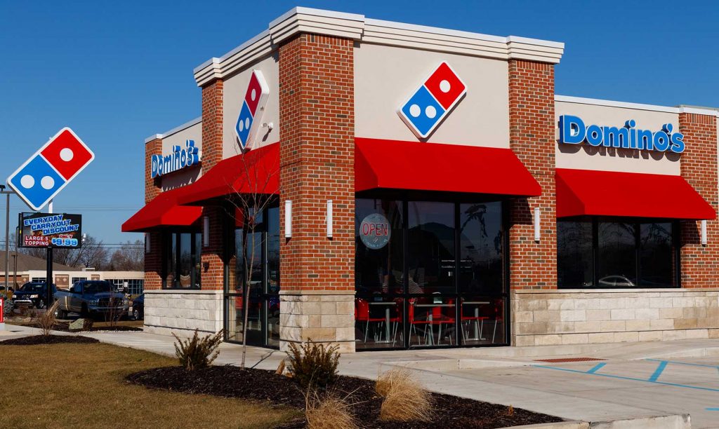
When I think of Domino’s, the iconic domino tile comes to mind. This symbol has been a part of the brand since its early days. In 1965, Domino’s introduced a new logo featuring a red wordmark with a bold black ‘Pizza’ tagline. This design placed the text next to a red and white emblem depicting a domino with solid white dots. This logo set the stage for Domino’s visual identity, emphasizing simplicity and clarity.
The strategic considerations and market reaction behind each change
Domino’s has always been strategic about its logo updates. In 1975, the brand revamped its logo by placing the ‘Domino’s Pizza’ wordmark on a vertical plane in a rectangle box alongside the domino. This formed a square with brighter red and blue colors and lighter, thinner letters. The changes reflected Domino’s commitment to modernity while maintaining its core identity. In 2012, Domino’s made another significant update. They placed the light blue ‘Domino’s’ wordmark on the right of a diagonally located red and blue rectangular emblem with three white dots. This redesign marked a shift towards a more streamlined and contemporary look, aligning with the brand’s evolution and market demands.
Design elements and meanings
A combination of a domino motif and the brand’s name
The domino motif in the logo isn’t just a clever design choice. It directly connects to the brand’s name and core product. When I see that domino, I think of a brand that’s all about delivering quality and consistency. This motif reinforces Domino’s identity and makes the logo easily recognizable. It’s a perfect example of how a simple design element can convey a powerful message.
The red and blue color scheme reflects the vitality of the brand
Color plays a crucial role in Domino’s logo. The red and blue color scheme reflects the brand’s vitality and energy. Red evokes excitement and passion, while blue adds a touch of trust and reliability. Together, these colors create a dynamic and memorable logo that resonates with customers. It’s a testament to the power of thoughtful design in branding.
Analysis of the characteristics of the logo
The creativity of the domino pattern
One of the standout features of Domino’s logo is the creativity of the domino pattern. This design element not only connects to the brand’s name but also adds a playful touch to the logo. When I see that pattern, I think of a brand that’s innovative and fun. This creativity ensures that the logo remains engaging and relevant in a competitive market.
The role of logos in promoting brand image
Domino’s logo plays a vital role in promoting the brand’s image. The simplicity and clarity of the design communicate a message of quality and reliability. When I see that logo, I think of a brand that’s committed to delivering a great experience every time. This strong visual identity helps Domino’s stand out and reinforces its position as a leader in the pizza industry.
Subway
The historical origin of the brand logo
The origin of the logo is associated with the arrow
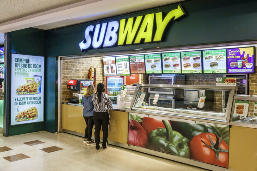
When I think of Subway, the arrow in its logo immediately comes to mind. This arrow isn’t just a design element; it represents the brand’s commitment to speed and efficiency. The original logo, introduced in 1968, featured an arrow that symbolized the fast service Subway promised its customers. This clever design choice connected the logo to the brand’s core value of providing quick and fresh meals.
The background and goals of the logo update and each revision during the critical period
Subway’s logo has undergone several updates over the years. Each revision aimed to align with the brand’s evolving identity and market demands. In the early days, the logo emphasized simplicity and clarity. As Subway grew, the logo evolved to reflect its commitment to freshness and quality. The introduction of the ‘Eat Fresh’ slogan marked a significant shift in branding strategy. This update reinforced Subway’s dedication to providing healthy and delicious options. The most recent logo, unveiled in 2016, features a modern and streamlined design. It highlights Subway’s focus on innovation and customer satisfaction.
Design elements and meanings
The association of arrows with velocity
The arrow in Subway’s logo isn’t just a decorative element. It represents velocity and movement, reflecting the brand’s promise of quick service. When I see that arrow, I think of a brand that’s committed to delivering fresh and tasty meals in no time. This association reinforces Subway’s identity and makes the logo easily recognizable. It’s a perfect example of how a simple design element can convey a powerful message.
Simplicity of the logo and brand expansion
Simplicity plays a crucial role in Subway’s logo design. The clean lines and bold colors create a straightforward and memorable image. This simplicity ensures that the logo remains timeless and adaptable to different markets. As Subway expanded globally, the logo’s straightforward design allowed for easy recognition across diverse cultures. This adaptability has been key to Subway’s success as one of the most popular fast-food chains worldwide.
Analysis of the characteristics of the logo
The simplicity and intuitiveness of the arrow pattern
One of the standout features of Subway’s logo is the simplicity and intuitiveness of the arrow pattern. This design element creates a clear connection to the brand’s offerings. The arrow not only symbolizes speed but also guides the eye, making the logo easy to understand and remember. It’s a testament to the power of thoughtful design in branding.
Brand expansion and globalization adaptability
Subway’s logo excels in its adaptability to global markets. The straightforward design and universal symbolism of the arrow make it easily recognizable worldwide. This adaptability has allowed Subway to maintain a consistent brand image while catering to diverse customer preferences. The logo’s ability to resonate with audiences across the globe highlights Subway’s commitment to quality and innovation.
Cheesecake Factory
The historical origin of the brand logo
The origin of the logo is directly linked to cheesecake
When I think of the Cheesecake Factory, the logo immediately brings to mind a sense of indulgence and warmth. The logo’s design directly links to its signature offering—cheesecake. The golden hue of the logo evokes the richness and decadence of a freshly baked cheesecake. This color choice isn’t just about aesthetics; it represents the brand’s commitment to quality and luxury. The logo’s design elements create an inviting atmosphere, much like the experience of enjoying a slice of their famous cheesecake.
Design elements and brand features
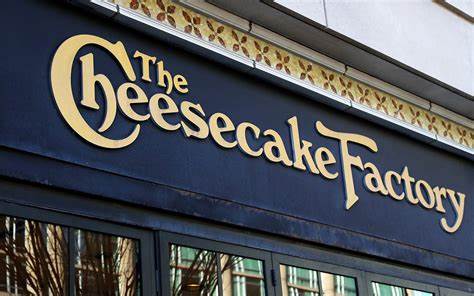
The Cheesecake Factory logo features stylized cursive letters that flow with an almost calligraphic elegance. This design choice adds a touch of sophistication and charm. The bold, capitalized “THE” anchors the design, giving it a sense of authority and tradition. The word “Cheesecake” stands out in a larger, inviting script, highlighting the restaurant’s signature dish. Meanwhile, the word “Factory” maintains a simpler typeface, balancing the logo’s overall whimsy with a touch of simplicity. This combination of design elements reflects the brand’s identity and its dedication to providing a delightful dining experience.
Design elements and meanings
Cheesecake elements and brand features
The Cheesecake Factory logo isn’t just a name; it’s a visual representation of the brand’s essence. The airiness of the signs significantly lightens the emblem, hinting at the pleasant taste of their signature products. The sand-beige color resembles freshly baked goods, adding to the logo’s appeal. This color choice not only enhances the logo’s visual impact but also reinforces the brand’s commitment to quality and indulgence. The logo’s design elements work together to create a sense of warmth and comfort, inviting customers to indulge in a memorable dining experience.

A combination of design elements and a brand story
The Cheesecake Factory logo tells a story of tradition and indulgence. The elegant cursive letters and the bold “THE” create a sense of authority and heritage. This combination of design elements reflects the brand’s journey from a small bakery to a renowned dining destination. The logo’s design captures the essence of the brand’s story, inviting customers to be part of that narrative. It’s a perfect example of how thoughtful design can elevate a brand’s identity and create a lasting impression.
Analysis of the characteristics of the logo
Classic charm
The Cheesecake Factory logo exudes classic charm with its elegant design and warm color palette. The stylized cursive letters add a touch of sophistication, while the golden hue evokes a sense of luxury and indulgence. This classic charm makes the logo timeless and memorable, ensuring that it remains relevant in a competitive market. It’s a testament to the power of thoughtful design in branding.
Font style
The font style in the Cheesecake Factory logo plays a crucial role in brand communication. The elegant cursive letters add a touch of sophistication and charm, aligning perfectly with the brand’s image. This font choice enhances the logo’s visual appeal and strengthens the connection with the audience. It’s a perfect example of how a well-designed font can elevate a brand’s identity and create a strong emotional connection with customers.
Dunkin’ Donuts
The historical origin of the brand logo
Background and history of the establishment of Dunkin’ Donuts
When I think of Dunkin’ Donuts, I picture a brand that has been around for decades. It all started in 1948 when William Rosenberg opened his first coffee and donut shop. Initially, it went by different names until it officially became Dunkin’ Donuts in 1950. The original logo featured a crimson wordmark in a handwriting-like cursive script. This design set the stage for Dunkin’ Donuts’ journey in the food and beverage industry.
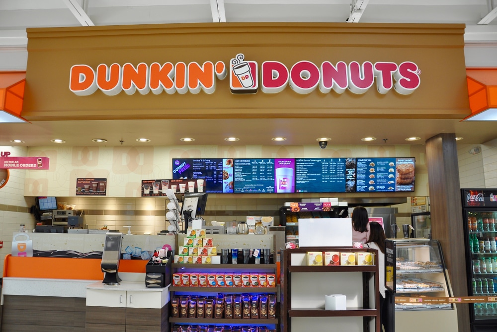
Rebranding, a shift from “Dunkin’ Donuts” to “Dunkin'”
In 2018, Dunkin’ Donuts made a bold move by rebranding itself as just “Dunkin’.” This change reflected the brand’s evolution and its focus on beverages and quick-service meals. By 2019, the rebranding was complete in all worldwide stores. This shift marked a new era for Dunkin’, emphasizing its commitment to innovation and customer satisfaction.
Design elements and meanings
The choice of brand colors and the brand story behind them
Dunkin’ Donuts’ logo is known for its vibrant colors. The bright orange and pink hues have been a part of the brand since 1976. These colors aren’t just for show; they represent energy and excitement. When I see those colors, I think of a brand that’s lively and inviting. This color scheme not only makes the logo memorable but also reinforces Dunkin’s identity as a fun and dynamic brand.
The design features of the new logo and its impact on the brand positioning
The new Dunkin’ logo features a simplified design with the word “Dunkin'” in bold, modern lettering. This change reflects the brand’s shift towards a beverage-led, ready-to-eat concept. The streamlined design enhances the logo’s visual appeal and strengthens its connection with the audience. It’s a perfect example of how thoughtful design can elevate a brand’s identity and create a strong emotional connection with customers.
Analysis of the characteristics of the logo
Simplification and modernization of the new logo
One of the standout features of Dunkin’s new logo is its simplicity. The clean lines and bold colors create a straightforward and memorable image. This simplification ensures that the logo remains timeless and adaptable to different markets. It’s a testament to the power of minimalism in branding.
A strategy to transform the brand into a beverage-led, ready-to-eat brand
Dunkin’s rebranding strategy focuses on transforming the brand into a beverage-led, ready-to-eat destination. The new logo plays a crucial role in this transformation. By simplifying the design and emphasizing the word “Dunkin’,” the brand communicates its commitment to providing quick and convenient options for customers. This strategy has helped Dunkin’ maintain its position as a leader in the fast-food industry.
How to design a logo for a restaurant brand
Creating a logo for a restaurant brand involves more than just picking colors and fonts. It’s about crafting a visual identity that resonates with your audience and reflects your brand’s values. Let’s dive into the essential elements and strategies for designing a standout logo.
Essential Elements
Color Psychology
Colors play a crucial role in how we perceive brands. They can influence emotions and decisions. For instance, studies show that color can increase brand recognition by up to 80%. When I choose colors for a logo, I think about the emotions I want to evoke. Red might convey excitement and energy, while blue often represents trust and reliability. Selecting the right color can make your logo memorable and impactful.
Font Selection
Fonts speak volumes about a brand’s personality. A playful font might suit a family-friendly restaurant, while a sleek, modern typeface could be perfect for a high-end dining experience. I always consider readability and how the font aligns with the brand’s image. The right font can enhance the logo’s appeal and ensure it communicates the desired message.
Iconic Imagery
Imagery in a logo should be simple yet powerful. It should capture the essence of the brand. Think of McDonald’s golden arches or Starbucks’ mermaid. These images are instantly recognizable and tell a story. When designing a logo, I focus on creating an image that’s unique and meaningful, something that customers will remember.
Brand Identity Integration
Reflecting Values
A logo should reflect the core values of the brand. If sustainability is a key value, incorporating green elements might be effective. I believe a logo should tell a story about what the brand stands for. This connection helps build trust and loyalty among customers.
Target Audience Alignment
Understanding the target audience is vital in logo design. A logo for a trendy café might differ significantly from one for a traditional steakhouse. I always consider who the brand is trying to reach and tailor the design to appeal to that demographic. This alignment ensures the logo resonates with the intended audience.
Use AI design tools to design logos for F&B brands
Advantages of AI-generated logos
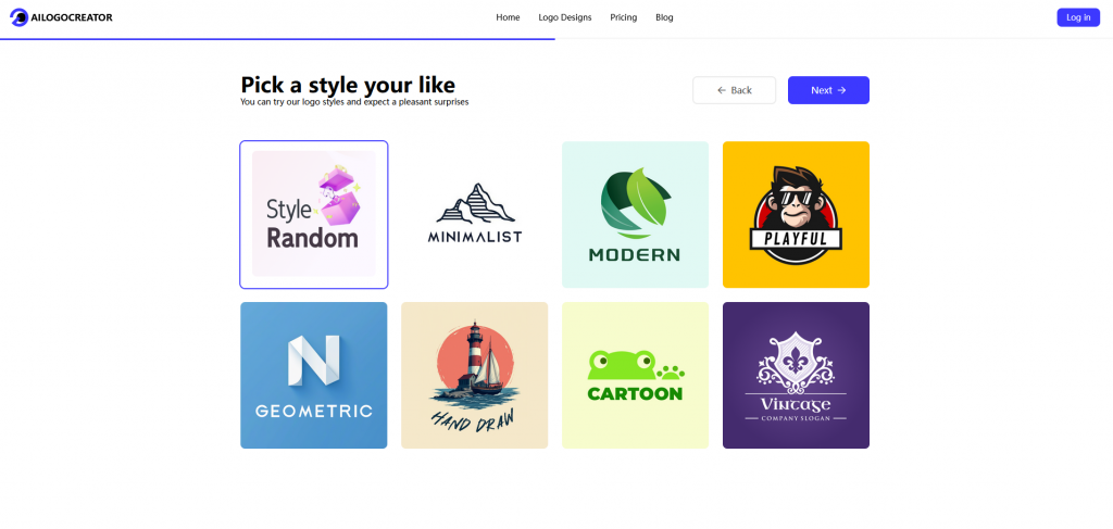
AI design tools offer several advantages. They can generate multiple design options quickly, allowing for experimentation with different styles and elements. I find these tools particularly useful for exploring creative possibilities and refining ideas. They can save time and provide inspiration during the design process.
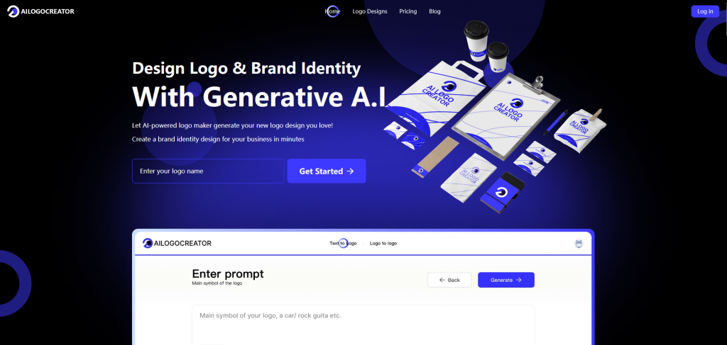
ailogocreator.io advantages
One tool I recommend is ailogocreator.io. It offers user-friendly features that make logo design accessible to everyone, even those without a design background. The platform provides a variety of templates and customization options, enabling users to create professional-looking logos with ease. It’s a great resource for anyone looking to design a logo that stands out in the competitive restaurant industry.
Reflecting on these iconic logos, I see a few key elements that make them stand out. First, simplicity reigns supreme. Whether it’s McDonald’s golden arches or Domino’s domino motif, these logos are easy to recognize and remember. They connect with audiences by being straightforward yet meaningful.
Branding plays a crucial role in the catering industry. A well-designed logo communicates a brand’s values and fosters loyalty. It becomes a visual symbol of quality and trust. As you consider your own branding efforts, think about how design impacts perception. A memorable logo can elevate your brand and create lasting connections with your audience.


CommentsTake the first comment