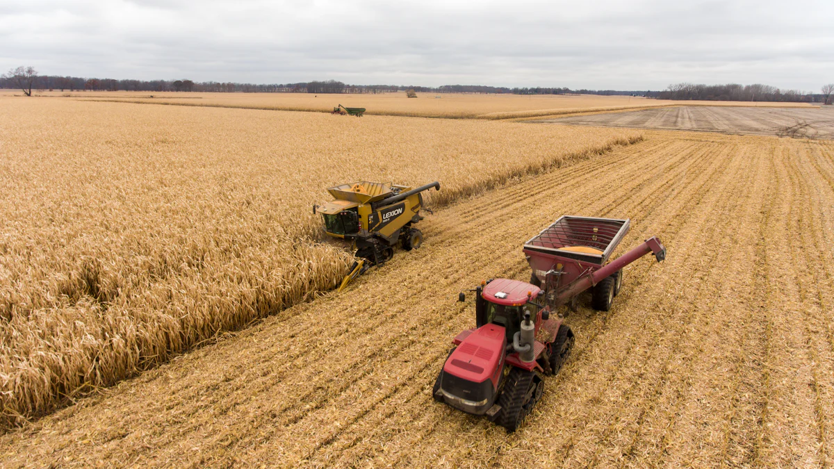
Agriculture plays a vital role in the American economy and culture. It directly supports nearly 24 million jobs and contributes significantly to economic output. Logos in the agricultural industry hold immense importance. They serve as powerful tools for brand recognition and marketing. A strong visual identity helps consumers identify and trust agricultural brands.
Agricultural logos often feature nature-inspired designs, with green being the most prevalent color. These logos reflect the values and missions of the top 10 agricultural brands. Trends in logo design continue to evolve, embracing simplicity and modern aesthetics to resonate with consumers.
1. John Deere
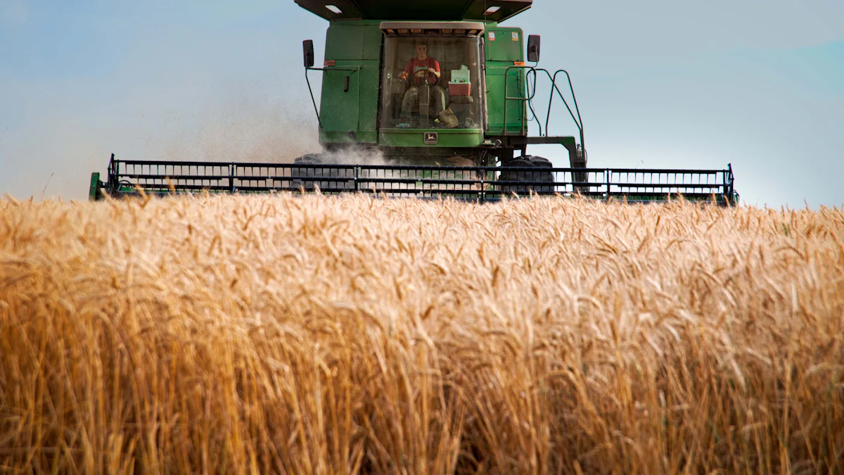
John Deere stands as a giant in the agricultural industry, renowned for its innovative machinery and equipment. Founded in 1837, this American company has become synonymous with quality and reliability. Its logo plays a crucial role in its brand identity, making it one of the top 10 agricultural brands in the United States.
Logo Design Elements
Color Scheme
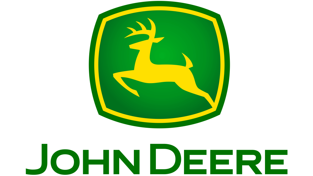
The John Deere logo features a distinctive green and yellow color scheme. Green symbolizes growth, renewal, and the agricultural landscape, while yellow represents energy and optimism. This combination not only reflects the company’s commitment to agriculture but also makes the logo easily recognizable.
Iconography
The iconic leaping deer in the logo embodies strength and agility. This imagery aligns with John Deere’s mission to provide robust and efficient machinery. The deer, poised and dynamic, suggests forward movement and progress, resonating with the company’s innovative spirit.
Symbolism and Meaning
Historical Significance
John Deere’s logo has evolved over the years, yet it retains its core elements. The leaping deer first appeared in 1876, symbolizing the company’s long-standing heritage in the agricultural sector. This historical significance reinforces John Deere’s reputation as a pioneer among the top 10 agricultural brands.
Brand Values
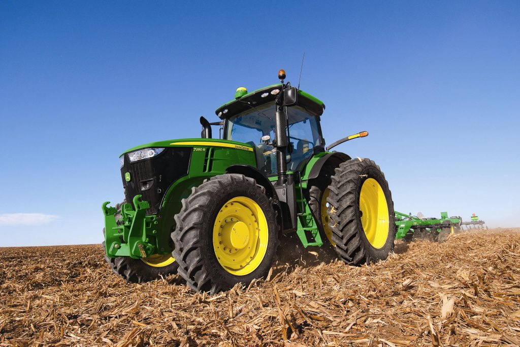
The logo encapsulates John Deere’s brand values of quality, integrity, and innovation. By consistently delivering high-performance machinery, John Deere has built trust with farmers worldwide. The logo serves as a visual testament to these values, ensuring that consumers associate the brand with excellence and reliability.
2. Cargill
Cargill ranks among the top 10 agricultural brands in the United States. Known for its vast network and influence, Cargill plays a pivotal role in the global food supply chain. Its logo reflects the company’s core values and mission, making it a recognizable symbol in the agricultural sector.
Logo Design Elements
Simplicity
Cargill’s logo stands out for its simplicity. The design features clean lines and minimalistic elements, which make it easy to recognize and remember. This straightforward approach ensures that the logo remains timeless and adaptable across various platforms and media. Simplicity in design often translates to clarity in communication, which is crucial for a brand with a global presence.

Color Usage
The logo incorporates a green leaf, a nod to Cargill’s commitment to sustainability and agriculture. Green, a color often associated with nature and growth, reinforces the brand’s dedication to environmental stewardship. This color choice not only highlights Cargill’s focus on sustainable practices but also aligns with the visual trends seen in other top 10 agricultural brands.
Symbolism and Meaning
Global Reach
Cargill’s logo symbolizes its extensive global reach. As one of the top 10 agricultural brands, Cargill operates in numerous countries, impacting millions of lives. The simplicity and clarity of the logo make it universally recognizable, reflecting the company’s ability to connect with diverse markets and cultures. This global presence underscores Cargill’s role as a leader in the agricultural industry.
Sustainability Focus
The green leaf in the logo represents Cargill’s focus on sustainability. This element signifies the company’s efforts to promote environmentally friendly practices and support sustainable agriculture. By incorporating this symbol, Cargill communicates its commitment to preserving natural resources and fostering a healthier planet. This focus on sustainability sets Cargill apart from other top 10 agricultural brands, highlighting its dedication to responsible growth and innovation.
3. Syngenta
Syngenta, a prominent name among the top 10 agricultural brands, stands out for its commitment to innovation and sustainability. Its logo plays a crucial role in conveying these values to consumers.
Logo Design Elements
Modern Aesthetics
Syngenta’s logo embraces modern aesthetics, which sets it apart from other agricultural brands. The design features sleek lines and a contemporary font, reflecting the company’s forward-thinking approach. This modern look appeals to a wide audience, making it easily recognizable and memorable. By adopting a fresh and updated design, Syngenta communicates its dedication to staying at the forefront of agricultural advancements.

Color Psychology
The color scheme of Syngenta’s logo predominantly features green, a choice that resonates deeply with its brand identity. Green symbolizes nature, growth, and freshness—core components of agriculture. This color choice not only aligns with the company’s mission but also connects with consumers on an emotional level. By using green, Syngenta reinforces its commitment to sustainable practices and environmental stewardship, which are essential values for any leading agricultural brand.
Symbolism and Meaning
Innovation
Innovation lies at the heart of Syngenta’s mission, and its logo reflects this focus. The sleek and modern design elements convey a sense of progress and cutting-edge technology. Syngenta consistently pushes the boundaries of agricultural science, striving to enhance productivity and efficiency. The logo serves as a visual representation of this innovative spirit, reminding consumers of the brand’s dedication to advancing agriculture.
Environmental Responsibility
Syngenta’s logo also embodies its commitment to environmental responsibility. The green color and modern design elements symbolize the company’s efforts to promote sustainable agriculture and protect natural resources. By incorporating these elements into its logo, Syngenta communicates its dedication to creating a healthier planet. This focus on environmental responsibility distinguishes Syngenta from other top 10 agricultural brands, highlighting its role as a leader in sustainable practices.
4. Archer Daniels Midland
Archer Daniels Midland (ADM) stands tall among the top 10 agricultural brands in the United States. Known for its extensive reach and influence, ADM has carved a niche in the agriculture industry by blending traditional values with modern technologies. This approach is evident in their logo, which reflects both their agricultural heritage and commitment to modernization.
Logo Design Elements
Geometric Shapes
ADM’s logo prominently features geometric shapes, which symbolize stability and precision. These shapes convey a sense of order and efficiency, aligning with the company’s mission to provide high-quality agricultural products and services. The use of geometric elements not only enhances the logo’s visual appeal but also reinforces ADM’s reputation as a leader in the agriculture sector. By incorporating these shapes, ADM communicates its dedication to structured growth and innovation, setting it apart from other top 10 agricultural brands.
Font Style
The font style in ADM’s logo exudes professionalism and clarity. It employs clean lines and a straightforward design, making the logo easily recognizable and memorable. This choice of font reflects ADM’s focus on transparency and reliability, key attributes that resonate with consumers and partners alike. The font style complements the geometric shapes, creating a cohesive visual identity that underscores ADM’s role as a trusted name in the agriculture industry.
Symbolism and Meaning
Agricultural Heritage
ADM’s logo pays homage to its rich agricultural heritage. The design elements reflect the company’s deep-rooted connection to the farming community and its longstanding commitment to supporting agricultural practices. By emphasizing its heritage, ADM strengthens its position among the top 10 agricultural brands, showcasing its dedication to preserving traditional values while embracing modern advancements.
Modernization
While honoring its past, ADM’s logo also signifies its focus on modernization. The sleek design and contemporary elements highlight the company’s efforts to integrate cutting-edge technologies into its operations. This balance between tradition and innovation positions ADM as a forward-thinking leader in the agriculture industry. By modernizing its logo, ADM communicates its readiness to adapt to changing market demands and continue its legacy of excellence.
5. Corteva
Corteva stands out among the top 10 agricultural brands with its vibrant and modern logo design. This company, known for its innovative approach to agriculture, effectively communicates its brand values through its visual identity.
Logo Design Elements
Vibrant Colors
Corteva’s logo bursts with vibrant colors that immediately catch the eye. These colors symbolize energy and vitality, reflecting the company’s dynamic approach to agriculture. By using bold hues, Corteva ensures that its logo remains memorable and easily recognizable. This choice of colors not only highlights the brand’s commitment to innovation but also sets it apart from other top 10 agricultural brands.
Modern Design
The modern design of Corteva’s logo speaks volumes about its forward-thinking philosophy. Clean lines and contemporary elements create a sleek and polished look. This design choice aligns with Corteva’s mission to integrate cutting-edge technologies into agriculture. The logo’s modern aesthetic appeals to a broad audience, reinforcing the brand’s position as a leader in the agricultural industry.
Symbolism and Meaning
Scientific Advancement
Corteva’s logo symbolizes its dedication to scientific advancement. The vibrant colors and modern design elements convey a sense of progress and innovation. Corteva consistently pushes the boundaries of agricultural science, striving to enhance productivity and efficiency. The logo serves as a visual representation of this commitment, reminding consumers of the brand’s role in advancing agriculture.
Agricultural Progress
Agricultural progress lies at the heart of Corteva’s mission, and its logo reflects this focus. The dynamic design elements suggest movement and growth, aligning with the company’s efforts to drive agricultural advancements. By incorporating these elements into its logo, Corteva communicates its dedication to fostering a more sustainable and productive agricultural industry. This focus on progress distinguishes Corteva from other top 10 agricultural brands, highlighting its role as a pioneer in modern agriculture.
6. Bayer
Logo Design Elements
Cross and Circle
Bayer‘s logo features a distinctive cross and circle design. This iconic symbol represents unity and balance, reflecting the company’s holistic approach to health and agriculture. The cross signifies Bayer’s commitment to improving lives through science, while the circle embodies inclusivity and global reach. Together, these elements create a harmonious logo that resonates with consumers worldwide.
Color Palette
The color palette of Bayer’s logo primarily includes blue and green. Blue conveys trust, reliability, and professionalism, aligning with Bayer’s reputation as a leader in the agricultural and pharmaceutical industries. Green symbolizes growth, nature, and sustainability, highlighting Bayer’s dedication to environmental stewardship. This combination of colors not only enhances the logo’s visual appeal but also reinforces the brand’s core values.
Symbolism and Meaning
Health and Agriculture
Bayer’s logo embodies its dual focus on health and agriculture. The cross and circle design reflects the company’s mission to bridge the gap between these two vital sectors. Bayer strives to improve human health and agricultural productivity through innovative solutions. Their Climate FieldView platform, developed by Bayer’s subsidiary Climate Corporation, exemplifies this commitment. By providing farmers with real-time insights and actionable recommendations, Bayer empowers them to make data-driven decisions that enhance crop production and promote sustainable farming practices.
Crop Yield Improvement
Improving crop yields stands at the heart of Bayer’s mission. The logo symbolizes the company’s dedication to advancing agricultural science and technology. Bayer’s innovative solutions, such as the Climate FieldView platform, help farmers optimize their operations and increase productivity. By integrating cutting-edge sensors, advanced data analytics, and predictive modeling, Bayer supports farmers in achieving higher yields while minimizing environmental impact. This focus on crop yield improvement underscores Bayer’s role as a leader in the agricultural industry, setting it apart from other top brands.
7. Pioneer
Pioneer stands as a beacon of innovation and tradition in the agricultural sector. Its logo plays a pivotal role in conveying these values to consumers, making it one of the most recognizable symbols in the industry.
Logo Design Elements
Iconic Imagery
Pioneer’s logo features iconic imagery that resonates with its audience. The design incorporates a stylized “P” alongside a sun motif. This imagery symbolizes growth and vitality, reflecting Pioneer’s commitment to seed innovation. The sun, a universal symbol of life and energy, aligns with the brand’s mission to enhance agricultural productivity. This combination of elements creates a powerful visual identity that captures the essence of Pioneer’s brand values.
Font Choice
The font choice in Pioneer’s logo complements its iconic imagery. It employs a bold and clean typeface, ensuring clarity and readability. This straightforward design choice reflects Pioneer’s focus on transparency and reliability. The font’s simplicity enhances the logo’s overall impact, making it easily recognizable across various platforms. By choosing a font that exudes professionalism, Pioneer reinforces its reputation as a trusted name in the agricultural industry.
Symbolism and Meaning
Agricultural Innovation
Innovation lies at the heart of Pioneer’s mission, and its logo embodies this focus. The dynamic imagery and bold font convey a sense of progress and forward-thinking. Pioneer consistently pushes the boundaries of agricultural science, striving to develop cutting-edge seed technologies. The logo serves as a visual representation of this innovative spirit, reminding consumers of the brand’s dedication to advancing agriculture.
Legacy and Tradition
While embracing innovation, Pioneer’s logo also pays homage to its rich legacy and tradition. The design elements reflect the company’s deep-rooted connection to the farming community and its longstanding commitment to supporting agricultural practices. By emphasizing its heritage, Pioneer strengthens its position among the top agricultural brands, showcasing its dedication to preserving traditional values while embracing modern advancements.
8. Land O’Lakes

Logo Design Elements
Visual Storytelling
Land O’Lakes excels in visual storytelling through its logo. The design captures the essence of its farmer-owned roots, a narrative that resonates deeply with its audience. Founded by Minnesota dairy farmers in 1921, Land O’Lakes has always emphasized its cooperative nature. The logo reflects this heritage, showcasing elements that tell the story of community and shared values. By incorporating imagery that speaks to its origins, Land O’Lakes effectively communicates its brand story, making it relatable and memorable.

Color Harmony
The color harmony in the Land O’Lakes logo plays a crucial role in its appeal. The palette features warm and inviting colors that evoke feelings of trust and quality. These colors not only enhance the visual appeal but also align with the brand’s identity as a producer of wholesome dairy products. The harmonious blend of colors creates a sense of balance and unity, reinforcing the cooperative spirit that defines Land O’Lakes. This thoughtful use of color ensures that the logo remains distinctive and easily recognizable.
Symbolism and Meaning
Community Focus
Community focus stands at the heart of Land O’Lakes’ mission, and its logo embodies this commitment. As a farmer-owned cooperative, the company prioritizes the well-being of its members and the communities they serve. The logo symbolizes this dedication by incorporating elements that represent collaboration and mutual support. By highlighting its community-driven approach, Land O’Lakes strengthens its connection with consumers who value brands that prioritize social responsibility and community engagement.
Quality and Purity
Quality and purity are core values for Land O’Lakes, and the logo reflects these principles. The design elements convey a sense of freshness and authenticity, aligning with the brand’s reputation for producing high-quality dairy products. By emphasizing these attributes, the logo assures consumers of the brand’s commitment to delivering pure and wholesome products. This focus on quality and purity sets Land O’Lakes apart from other agricultural brands, reinforcing its position as a trusted name in the industry.
9. CHS Inc.
CHS Inc. stands as a prominent player in the agricultural sector, known for its cooperative structure and leadership. Its logo plays a crucial role in conveying these values to consumers, making it one of the most recognizable symbols in the industry.
Logo Design Elements
Minimalism
CHS Inc.’s logo embraces minimalism, which sets it apart from other agricultural brands. The design features clean lines and a straightforward layout, reflecting the company’s focus on simplicity and efficiency. This minimalist approach ensures that the logo remains timeless and adaptable across various platforms. By adopting a simple design, CHS Inc. communicates its dedication to clarity and transparency, key attributes that resonate with its cooperative nature.

Typography
The typography in CHS Inc.’s logo exudes professionalism and reliability. It employs a bold and clear typeface, ensuring readability and recognition. This choice of font reflects CHS Inc.’s commitment to straightforward communication and trustworthiness. The typography complements the minimalist design, creating a cohesive visual identity that underscores CHS Inc.’s role as a leader in the agricultural industry.
Symbolism and Meaning
Cooperative Spirit
Cooperative spirit lies at the heart of CHS Inc.’s mission, and its logo embodies this commitment. As a farmer-owned cooperative, the company prioritizes collaboration and mutual support among its members. The logo symbolizes this dedication by incorporating elements that represent unity and shared values. By highlighting its cooperative nature, CHS Inc. strengthens its connection with consumers who value brands that prioritize community engagement and social responsibility.
Agricultural Leadership
CHS Inc.’s logo also signifies its role as a leader in the agricultural sector. The minimalist design and professional typography convey a sense of authority and expertise. CHS Inc. consistently pushes the boundaries of agricultural innovation, striving to enhance productivity and sustainability. The logo serves as a visual representation of this leadership, reminding consumers of the brand’s dedication to advancing agriculture. This focus on leadership distinguishes CHS Inc. from other agricultural brands, highlighting its position as a trusted name in the industry.
10. ConAgra Foods
ConAgra Foods, a major player in the food industry, has a logo that effectively communicates its brand identity. This logo plays a crucial role in connecting with consumers and showcasing the company’s commitment to innovation and growth.
Logo Design Elements
Brand Recognition
ConAgra Foods’ logo stands out for its strong brand recognition. The design features a bold and distinctive typeface that makes it easily identifiable. This choice of font ensures that the logo remains memorable and instantly recognizable across various platforms. By prioritizing brand recognition, ConAgra Foods reinforces its position as a trusted name in the food industry.

Visual Appeal
The visual appeal of ConAgra Foods’ logo lies in its simplicity and elegance. The clean lines and balanced composition create a harmonious design that captures attention. This visual appeal not only enhances the logo’s attractiveness but also aligns with the company’s focus on delivering high-quality products. By maintaining a visually appealing logo, ConAgra Foods communicates its dedication to excellence and consumer satisfaction.
Symbolism and Meaning
Consumer Connection
ConAgra Foods’ logo symbolizes its strong connection with consumers. The design elements reflect the company’s commitment to understanding and meeting consumer needs. By incorporating elements that resonate with its audience, ConAgra Foods builds trust and loyalty among its customers. This focus on consumer connection sets ConAgra Foods apart from other brands, highlighting its dedication to creating meaningful relationships with its audience.
Innovation and Growth
Innovation and growth lie at the heart of ConAgra Foods’ mission, and its logo embodies these values. The sleek design and modern elements convey a sense of progress and forward-thinking. ConAgra Foods consistently pushes the boundaries of food innovation, striving to enhance product offerings and expand its market presence. The logo serves as a visual representation of this commitment, reminding consumers of the brand’s role in driving industry advancements.
Analysis of common features and differences
Common features of the mark of excellence
Agricultural logos in the United States share several common features that contribute to their effectiveness and recognition. These logos often incorporate nature-inspired elements, such as leaves, animals, or landscapes, which resonate with the agricultural theme. The use of green is prevalent, symbolizing growth, renewal, and a connection to nature. This color choice aligns with the values of sustainability and environmental stewardship, which are crucial in the agricultural sector.
Another common feature is simplicity. Many top agricultural logos utilize clean lines and minimalistic designs, making them easily recognizable and memorable. This simplicity ensures that the logos remain timeless and adaptable across various platforms. For instance, Cargill’s logo stands out for its straightforward design, which communicates clarity and focus.
Typography also plays a significant role in these logos. Brands like ADM and CHS Inc. use bold and clear typefaces that convey professionalism and reliability. This choice of font enhances readability and reinforces the brand’s identity.
Differentiation between different logos
While agricultural logos share common features, they also exhibit unique characteristics that set them apart. Color palettes vary significantly among brands. While green dominates, other colors like black, white, blue, red, yellow, and brown also appear in industry leaders’ branding. For example, Bayer’s logo incorporates blue to convey trust and reliability, while Land O’Lakes uses warm colors to evoke feelings of trust and quality.
Iconography is another area of differentiation. John Deere’s iconic leaping deer symbolizes strength and agility, reflecting its commitment to high-quality machinery. In contrast, Pioneer’s logo features a stylized “P” and sun motif, emphasizing seed innovation and agricultural advancement.
The storytelling aspect of logos also varies. Land O’Lakes excels in visual storytelling by highlighting its farmer-owned roots, while ConAgra Foods focuses on consumer connection and innovation. These narratives help brands connect with their audience on a deeper level, fostering loyalty and trust.
Future Trends in Agricultural Logo Design
Predict the future direction of agricultural logo design.
Agricultural logo design is evolving, and several trends are shaping its future. One significant trend is the increasing use of minimalistic designs. Companies are opting for simple, clean logos that convey their message with clarity. This approach not only enhances brand recognition but also ensures adaptability across various digital platforms.
Another trend is the incorporation of nature-inspired elements. As consumers become more environmentally conscious, brands are using symbols like leaves, trees, and animals to emphasize their commitment to sustainability. These elements resonate with audiences who value eco-friendly practices.
Color psychology continues to play a crucial role in logo design. Green remains dominant in agriculture logos, symbolizing growth and renewal. However, brands are experimenting with secondary colors to differentiate themselves. For instance, blue might be used to convey trustworthiness and intelligence, aligning with the brand’s personality traits.
Discuss how technological advancements are impacting agricultural logo design.
Technological advancements are revolutionizing agricultural logo design. With the rise of artificial intelligence (AI), designers can now create logos that are not only visually appealing but also data-driven. AI tools analyze consumer preferences and industry trends to generate designs that resonate with target audiences.
Digital platforms have also influenced logo design. Logos must now be versatile enough to look good on websites, social media, and mobile apps. This requirement has led to the adoption of scalable vector graphics (SVGs), which ensure logos maintain their quality across different screen sizes.
The growth of the cannabis industry offers insights into how new sectors impact logo design trends. As this industry expands, a variety of design styles emerge to appeal to diverse audiences. This trend highlights the importance of tailoring logo designs to specific market segments.
How to design an agriculture brand logo
Creating a standout agricultural brand logo can seem daunting, but using the latest AI technology makes it easier. Let’s explore how AI can revolutionize logo design and how you can use it to your advantage.
The challenge is to use the latest AI technology to design a logo
Designing a logo with AI presents unique opportunities and challenges. AI tools can analyze vast amounts of data to create designs that resonate with your target audience. Here’s why AI is a game-changer:
Advantages of AI
- Efficiency: AI speeds up the design process by generating multiple logo options in minutes. Designers can focus on refining the best ideas rather than starting from scratch.
- Data-Driven Insights: AI tools use data to understand trends and consumer preferences. This ensures your logo aligns with current market demands and stands out in the crowded agricultural sector.
- Customization: AI allows for high levels of customization. You can tweak colors, fonts, and symbols to match your brand’s identity, ensuring a unique and personalized logo.
- Cost-Effective: Traditional design processes can be expensive. AI reduces costs by automating parts of the design process, making professional logos accessible to smaller agricultural businesses.
ailogocreator.io of the presentation
ailogocreator.io offers a user-friendly platform for designing logos with AI. It provides a seamless experience, guiding users through each step of the design process. Here’s what makes it stand out:
- Intuitive Interface: The platform’s interface is easy to navigate, even for those with no design experience. Users can experiment with different design elements effortlessly.
- Diverse Templates: ailogocreator.io offers a wide range of templates tailored to the agricultural industry. These templates serve as a starting point, allowing users to customize them to fit their brand.
- Real-Time Feedback: The platform provides instant feedback on design choices, helping users make informed decisions. This feature ensures that the final logo aligns with brand values and market trends.
Use ailogocreator.io to design your logo
Ready to create your agricultural brand logo? Follow these steps to get started with ailogocreator.io:
- Sign Up: Create an account on ailogocreator.io. This gives you access to all the design tools and templates.
- Choose a Template: Browse through the available templates and select one that resonates with your brand’s identity. Remember, this is just a starting point.
- Customize Your Design: Use the platform’s tools to adjust colors, fonts, and symbols. Make sure your logo reflects your brand’s values and mission.
- Get Feedback: Take advantage of the real-time feedback feature. Make adjustments based on the insights provided to ensure your logo is both appealing and effective.
- Download and Use: Once satisfied with your design, download the logo in various formats. Use it across your marketing materials to establish a strong brand presence.
By leveraging AI technology, you can create a compelling agricultural brand logo that captures your brand’s essence and appeals to your target audience. Give it a try and watch your brand identity come to life!
Agricultural logos play a vital role in shaping brand identity and consumer perception. They serve as visual ambassadors, conveying the essence of a brand’s values and mission. The choice of colors, like the prevalent green, often symbolizes growth and nature, aligning with agricultural themes. However, strategic color selection remains crucial to reflect desired brand traits effectively. These logos not only enhance recognition but also build trust among consumers. As you explore branding, consider how design elements can communicate your brand’s story and values. Embrace creativity and let your logo speak volumes about your brand’s identity.


CommentsTake the first comment